Padding & Margins
Padding and margins are the spacing tools that define the structure and rhythm of a page. They control how close content sits to its container and how much breathing room exists between sections, which directly affects readability, balance, and visual hierarchy. Because spacing needs vary from one section to the next, you can adjust padding and margins individually on any block and widget to fine-tune the layout.
Padding and margin settings are responsive, which means changes apply only to the view you are currently editing. If you adjust spacing in the desktop view, it will not automatically carry over to tablet or mobile, and the same is true in reverse. To keep your layout consistent across devices, review and fine-tune padding and margins in each view separately: desktop, tablet, and mobile. For more details, read the Responsive Design article.
What Are Paddings & Margins
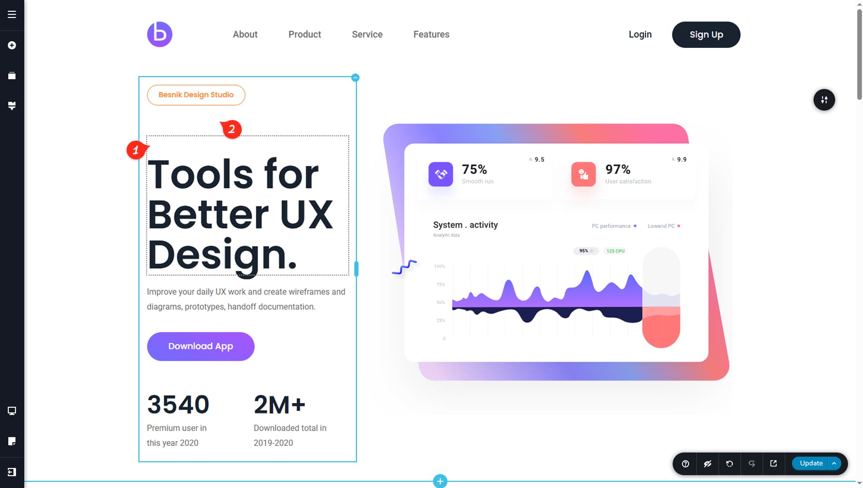
Padding
Padding is the space inside an element, between its content and its edges. If you add padding to a block, the text, images, and buttons inside it move away from the block’s borders, creating comfortable breathing room. Think of padding as the internal cushion that makes content feel less cramped and easier to scan.
Margin
Margin is the space outside an element, separating it from other elements around it. If you add margin to a widget or block, you push it away from neighboring content, which helps group related items and prevent sections from colliding visually. Think of margin as the external gap that controls distance and separation between pieces of the layout.
Controlling Padding & Margin in the Styling Panel
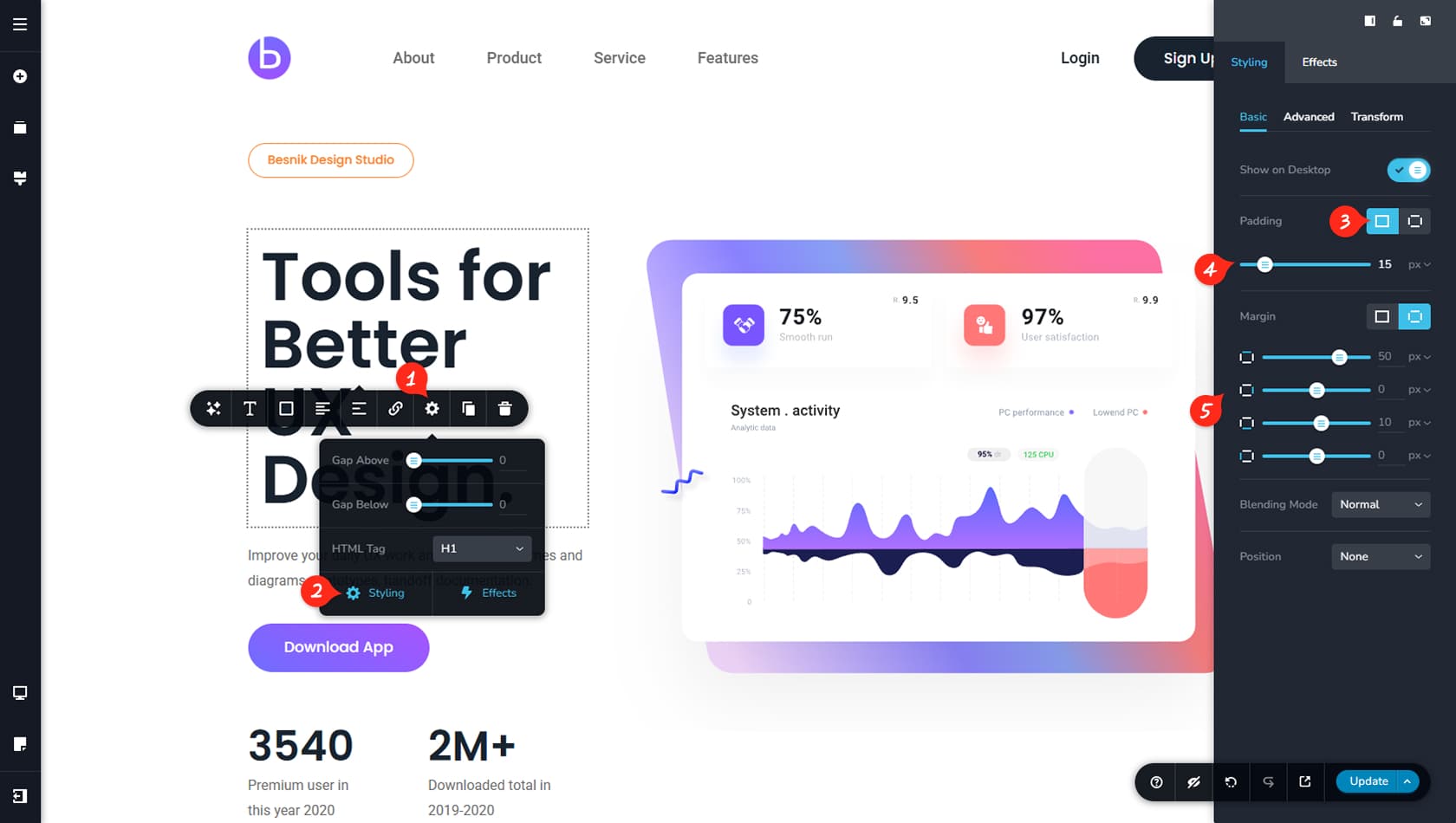
Styling Icon
From here, you can open the Styling panel for any block or widget.
Styling Panel
From here, you can open the Styling panel on the right, where you can adjust padding and margin values. Make sure you are in the Basic tab to access these spacing controls.
Link All Sides
This toggle is essential for spacing edits. It lets you apply the same padding or margin to all four sides at once (top, right, bottom, left), or switch to separate controls to fine-tune each side individually.
In most cases, we recommend adjusting each side separately, since it gives you more flexibility and control over the final layout.
Paddings
From here, you can adjust the padding for a widget or block. Use the slider to set a value between 0 and 100 pixels, or type an exact number in the field to the right of the slider.
Margins
From here, you can adjust the margin for a widget or block. Use the slider to set a value between -100 and 100 pixels, or type an exact number in the field to the right of the slider.
Overlap Widgets With Negative Margin

Overlapping widgets can add depth and create more striking section designs. To achieve this effect, you will typically use negative margins.