Line
The Line widget is a simple yet effective design element used to visually separate sections, organize content, and improve readability across a page. By allowing control over thickness, width, color, and even the addition of a centered icon, it helps create clear visual hierarchy without overwhelming the layout. Separator lines can guide the user’s eye, emphasize transitions between content blocks, and add subtle stylistic accents that keep the overall design clean and structured.
Line Options
Line Options
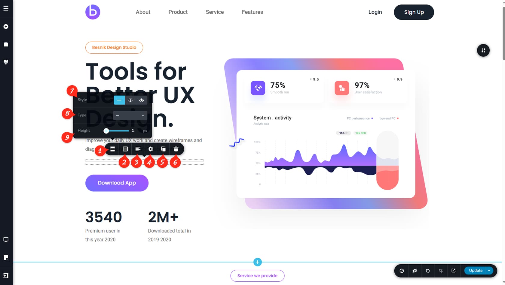
After dragging and dropping the Line widget into your desired location, click it to open the toolbar. The first icon on the left opens the line customization options.
Line’s Colors
The second control lets you adjust the line’s color and hover color.
Line’s Alignment
The third control aligns the line to the left, right, or center.
Settings Panel
This setting allows you to define the line’s width and access the Styling and Effects panels, where you can add margins, padding, animations, and more.
When referring to the Styling Panel of the widget, please see the Widgets Styling article for more details and an in-depth guide. Note that most widgets share similar styling options, with slight variations depending on the specific widget.
Duplicate Line
This control duplicates the line.
Delete Line
This control deletes the line.
Line Style
Within the Line options panel, you can choose the line style, such as a standard line, a centered icon, or centered text.
Line Type
Here you can select the line type, including solid, dotted, double lines, and other available shapes.
Line Height
This option adjusts the line’s height in pixels, which determines its thickness.