Gallery
The Gallery widget makes it easy to present multiple images in a clean, organized layout, helping showcase portfolios, products, or visual content in a more engaging way. By grouping images into a structured display, it improves visual storytelling while keeping pages tidy and easy to navigate. With flexible styling options, you can control layout, spacing, and visual effects to ensure the gallery blends seamlessly with your project’s overall design.
Gallery Options
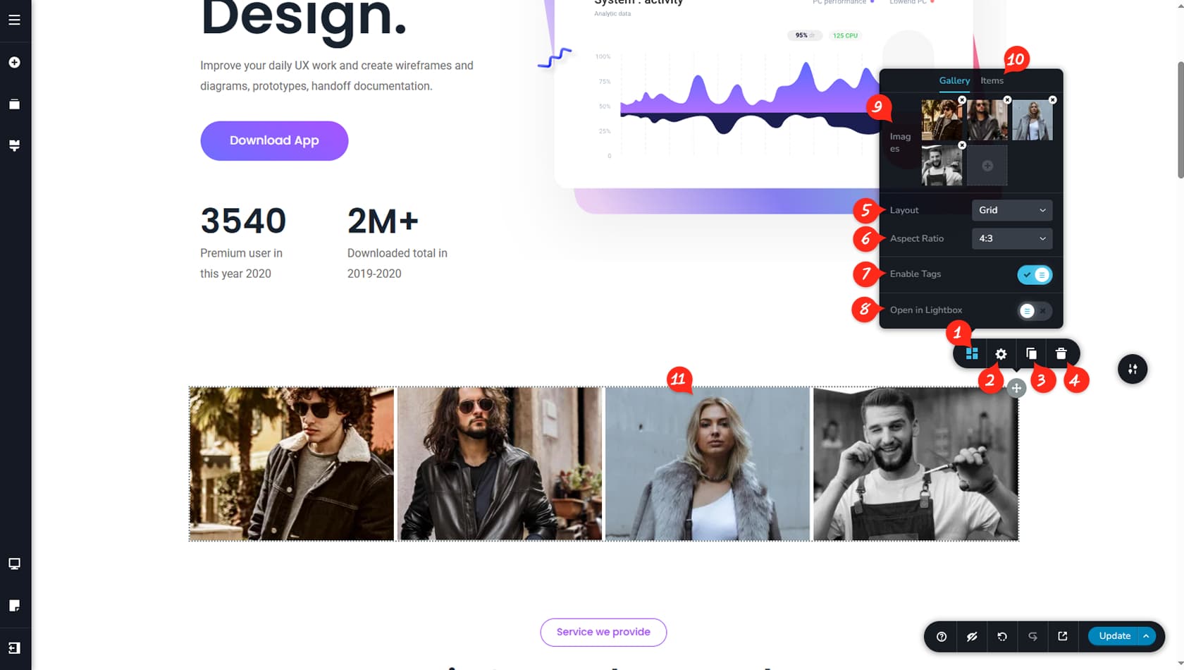
Gallery Options
After dragging and dropping the Gallery widget, you can begin customizing it by clicking the grey icon in the top-right corner of the widget. Select the left-most icon in the toolbar to open the Gallery panel.
Gallery Styling
This option opens the Styling panel, where you can adjust padding, margins, and other visual settings.
When referring to the Styling Panel of the widget, please see the Widgets Styling article for more details and an in-depth guide. Note that most widgets share similar styling options, with slight variations depending on the specific widget.
Duplicate Gallery
This control duplicates the Gallery widget.
Delete Gallery
This control deletes the Gallery widget.
Gallery Layout
This setting allows you to change the overall layout of the gallery between Grid, Justified, Masonry, or Big Image. Grid lets you define a specific aspect ratio for images, Justified aims to maintain a consistent height, Masonry arranges images freely next to each other, and Big Image highlights one main image with others displayed beneath it.
Layout Options
When using the Grid layout, this option controls the aspect ratio, though the available settings may change depending on the selected gallery layout.
Tabs
This toggle enables tabs for the gallery.
Lightbox
This option opens images in a lightbox when selected.
Choose Gallery Images
Here you can choose images for the gallery from the Media Library and reorder them by dragging and dropping within the panel.
More Items Settings
Within the Items tab, you can define the number of columns and adjust the spacing between them.
Image Options
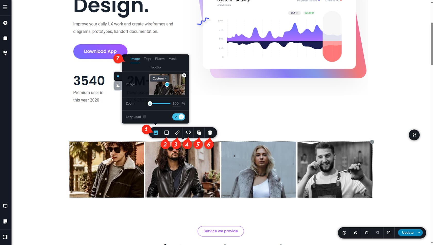
You can adjust image-specific settings directly from the widget by selecting an image within the gallery.
Image Panel
Here you can select an image within the widget and replace it from the Media Library, edit its tags, adjust filters, apply a mask, or add a tooltip on click.
Color Settings
This option allows you to apply a color overlay, border, or shadow to the image.
Image Link
Here you can assign a link to the image.
Reorder Images
The arrows allow you to change the image’s position to the left or right.
Duplicate Image
This control duplicates the selected image within the widget.
Delete Image
This control deletes the selected image from the widget.
More Image SEttings
These tabs control more image settings from Tags, Filters, Mask and Tooltip.