Timeline
The Timeline widget provides a structured way to present content in a clear, connected sequence, making it ideal for showcasing events, steps, milestones, or storytelling elements. Each item combines a title, icon, and fully editable content area linked by visual lines, helping guide the viewer’s attention while keeping information organized. Because the content sections are completely customizable, the widget can be used for much more than timelines, offering a flexible layout that supports creative designs, feature highlights, or any structured presentation that benefits from a visually connected flow.
Timeline Options
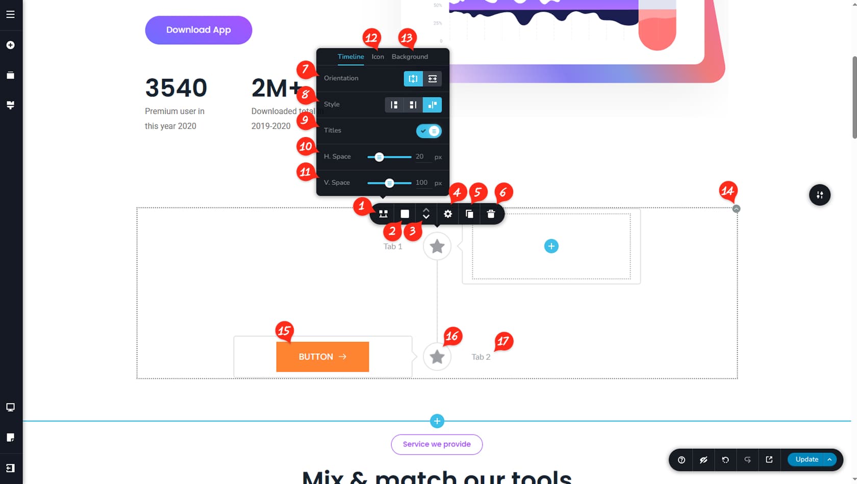
Timeline Options
After dragging and dropping the Timeline widget, you will see a simple structure made of a title, an icon, and a content area connected by lines. Unlike most widgets, the options are accessed by clicking the icon located in the center of each timeline item rather than the top-right corner. From this toolbar, select the first icon on the left to open the timeline options.
Timeline Colors
Here you can customize the colors of the background, icon, border, shadow, and connecting line, as well as adjust the weight of the line and border.
Reorder Timeline Sections
This option allows you to reorder timeline sections using the arrow controls.
Timeline Items Width
Here you can define the width of the left and right sections of the timeline and open the Styling panel to manage paddings.
Duplicate Timeline Section
This control duplicates timeline sections.
This feature also allows you to add additional timeline sections.
Delete Timeline Section
This option deletes the selected timeline section.
Timeline Orientation
Here you can switch the timeline orientation between vertical and horizontal. Changing the orientation unlocks additional settings, such as defining the number of columns and adjusting horizontal or vertical spacing behavior.
Timeline Layout
This setting lets you change the timeline layout style. For vertical timelines, items can appear on the left, right, or alternate between both sides. For horizontal timelines, you can choose top, bottom, or alternating placement.
Timeline Title Toggle
This toggle enables or disables the display of titles.
Timeline Horizontal Spacing
This setting controls the horizontal spacing between the icon and the content area. In vertical orientation, it defines the distance between timeline sections.
Timeline Vertical Spacing
This setting controls the vertical spacing between timeline sections. In vertical orientation, it defines the distance between the icon and the content area.
Timeline Icon
The Icon tab provides options to change the icon and adjust its size.
Timeline Icon Background
Within the Background tab, you can control the icon’s background size and corner styling.
Widget Settings
The main Timeline widget settings are minimal, allowing access to the Styling panel where you can adjust paddings, margins, animations, and more, as well as duplicate or delete the entire widget.
When referring to the Styling Panel of the widget, please see the Widgets Styling article for more details and an in-depth guide. Note that most widgets share similar styling options, with slight variations depending on the specific widget.
Timeline Content Area
The content area is fully editable, allowing you to add and customize widgets freely by dragging and dropping them into place.
Timeline Customization
Clicking the icon opens the primary toolbar used to customize each timeline item.
Timeline Section Title
The title area supports direct text editing along with typography, color, and spacing controls relative to the icon.