Widgets Styling
The Widgets Styling panel is a central tool for refining the visual appearance and positioning of elements across your project, giving you precise control over spacing, corners, layering, and advanced customization options. By managing paddings, margins, corner radius, z-index, custom CSS, and other styling features from a single interface, it helps maintain consistency while allowing detailed design adjustments. Because many widgets rely on this panel for deeper customization, understanding how to use it effectively is essential for building polished layouts and achieving full creative control within the builder.
In this article, you’ll learn how to use the Styling panel through the Image widget, as it includes most of the available options, though some widgets may add or remove specific settings. The key focus is understanding how the Styling panel works and how to use it effectively.
Basic Styling
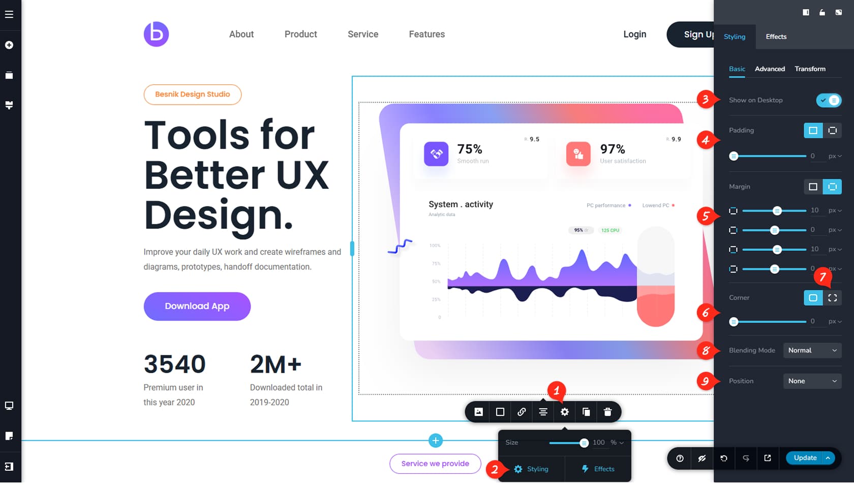
Widget Settings
To access the Styling panel for any widget, first click the Settings icon, represented by a cogwheel in the widget’s toolbar.
Styling Button
Then select the Styling button to open the panel on the right side of the builder. We will begin with the Basic tab.
Show on Desktop
Inside the Basic tab, the first option is “Show on Desktop.” This option is enabled by default, but disabling it hides the widget from desktop resolution while keeping it visible on tablet and mobile views. The widget will disappear from the editor area, but you can make it visible again by using the Unhide button in the bottom-right toolbar, which displays hidden elements in a blurred but editable state.
Paddings
Here you can adjust the widget’s paddings by entering values or linking all sides together. More details can be found in the Padding & Margins article.
Margins
This option allows you to control the widget’s margins individually or link all sides together. More information is available in the Padding & Margins article.
Corners
Here you can modify the widget’s corner radius using the slider or by entering a specific value. You can also switch between pixels and percentages using the arrow on the right.
Toggle Corners
This control lets you apply the same corner radius to all four corners or set individual values for each corner.
Blending Mode
Blending defines how an image interacts visually with elements behind it by combining pixels instead of simply overlaying them. Available blending modes include normal, color, color burn, darken, difference, exclusion, hue, lighten, luminosity, multiply, overlay, saturation, and screen.
Position
Here you can choose the widget’s position: none, absolute, or fixed. With “none,” the widget follows the normal page layout flow. With “absolute,” the widget can be placed freely relative to its nearest positioned container without affecting surrounding elements. With “fixed,” the widget stays anchored to a specific position on the screen even while scrolling.
Advanced Styling
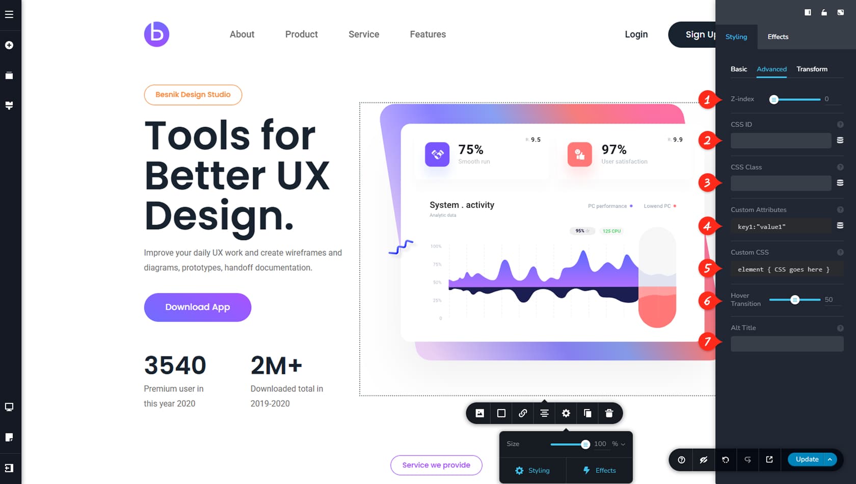
The Advanced tab mostly covers features for advanced users and developers.
Z-Index
Here you can control the element’s Z-Index. Z-Index is an important HTML property that defines how elements are layered along the depth axis. In simple terms, when two widgets overlap, the one with the higher Z-Index will appear above the other.
Custom ID
From here, you can add a Custom CSS ID to the widget.
Custom Class
From here you can add a Custom CSS Class to the widget.
Custom Attribute
From here, you can add Custom attributes to your widget. CSS attributes are properties that influence the styling and layout of HTML elements. Each property controls a small part of the overall style.
Custom CSS
Here you can add custom CSS that affects the widget or elements inside it. If you are using an existing class, enter your styles using the “.widget-class” selector or the name you assigned. If you prefer not to assign a class, you can use the “element” selector instead.
Hover Transition Speed
The Hover Transition controls how quickly hover effects are applied to your widget. For example, if a background color is set on hover, a transition value of 0 makes the change instant, while a value of 100 makes the effect appear gradually.
Alt Title
Here you can specify an Alternate text for the image, if it cannot be displayed.
Transformation Styling
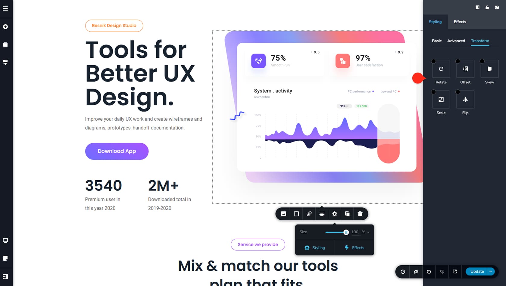
The Transform tab allows you to modify your widget’s appearance using various transformations. You can rotate, offset, skew, scale, or flip the widget, with certain options providing X-Y axis controls, anchor points, and alignment settings for more precise adjustments.