Global Styling
Global styles are one of the biggest time-savers in any web project because they keep design consistent while making site-wide updates effortless. Global colors and global typography act as the shared foundation for the entire look and feel, so pages do not drift into slightly different shades, fonts, or sizing over time. When a widget uses a color or text style from the global set, it stays linked to that choice, so updating a global color or typography style instantly updates every widget that references it. This creates a clean, unified visual system, speeds up redesigns and iterations, and makes long-term maintenance much easier as the site grows.
To open the Global Settings panel on your UI, click on the Brush icon that mentions Styling.
Global Colors & How to Use Them
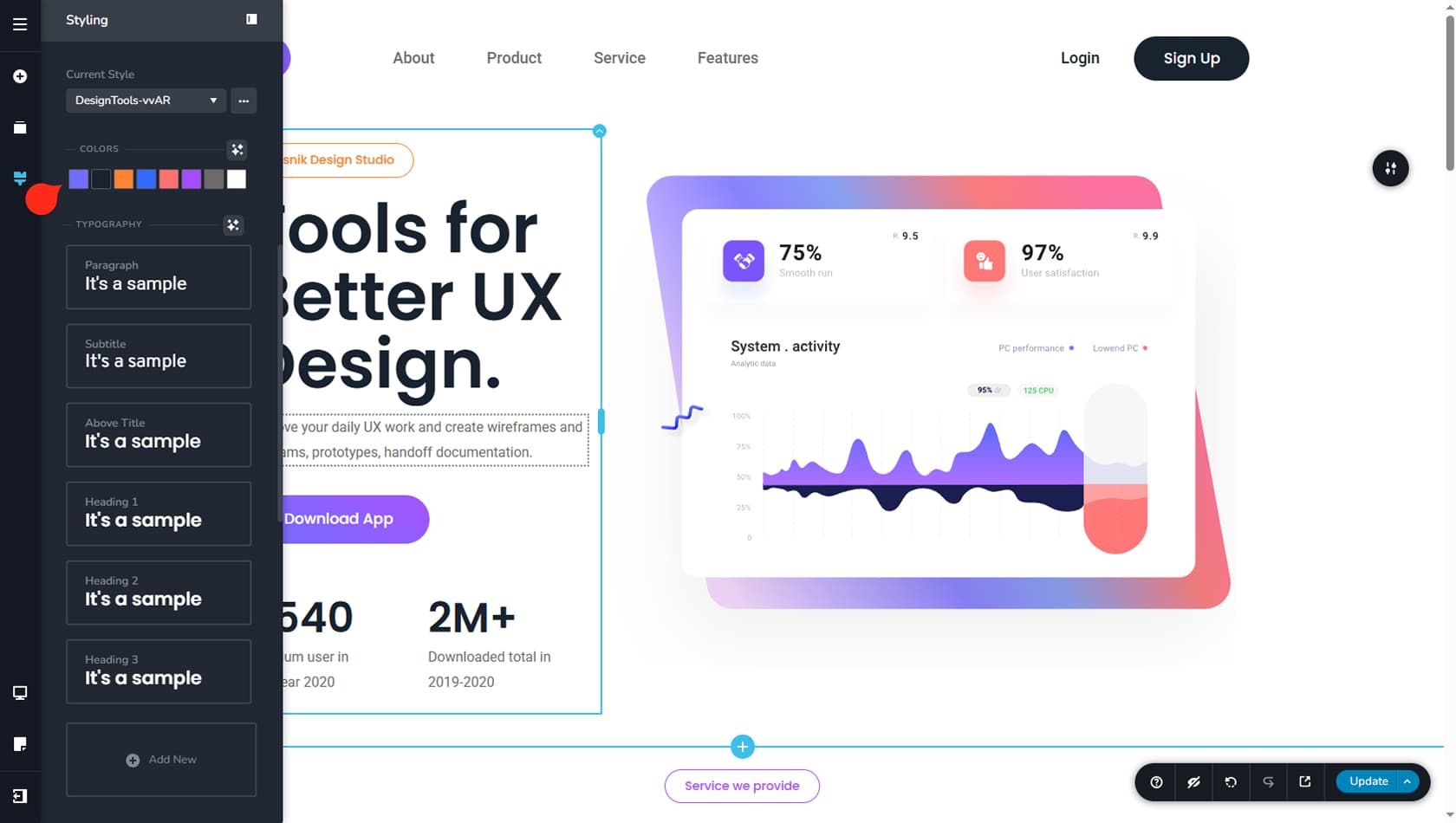
Once the panel is open, you will see several options for setting up global styles. We will start with global colors. You have up to eight global color slots that can be reused across the entire site. To set a color, click a slot and pick a value from the color picker or paste a hex code, and it is ready to use.
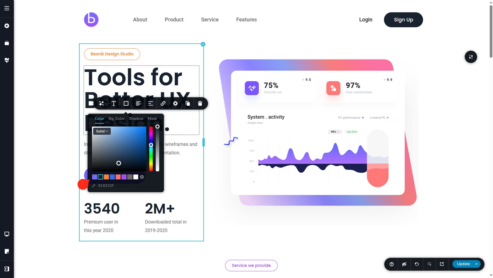
After you choose your eight colors, you can apply them anywhere a widget offers color settings by selecting from your Global Colors list.
You will also see extra settings such as opacity, masks, filters, and other widget-specific options, and using them does not change your selected global color itself.
Global Typography & How to Use It
Existing Presets
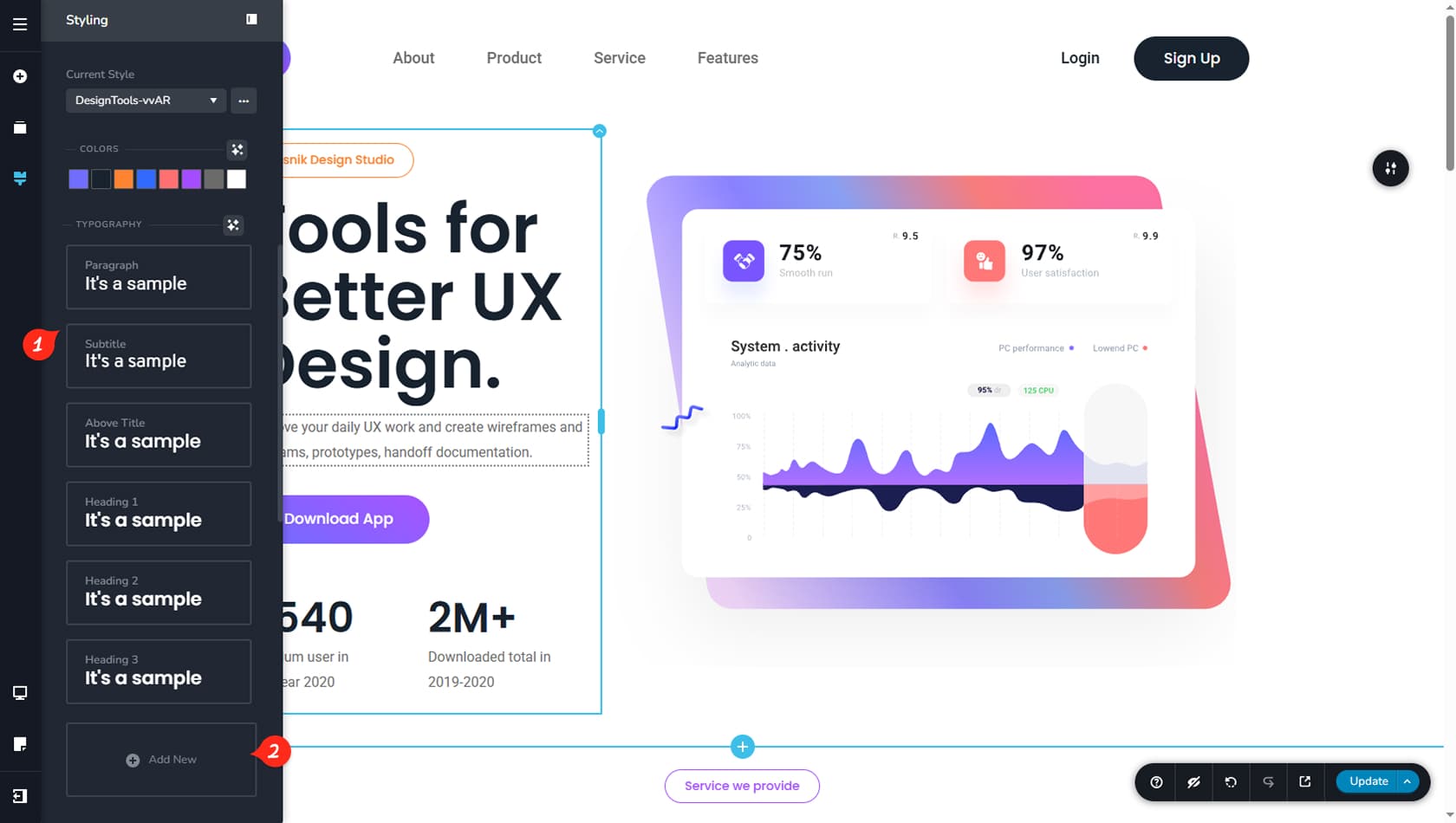
Global Typography includes a set of ready-made presets to help you get started quickly. You will find options like Paragraph, Subtitle, Above Title, Headings 1 through 6, and Button. To adjust a preset, select it and edit its settings until it matches your preferences.
Add A New Presets
If the default presets are not enough for your project, you can create additional ones using Add New. You can rename each new preset for clarity, then customize it the same way as the built-in styles.
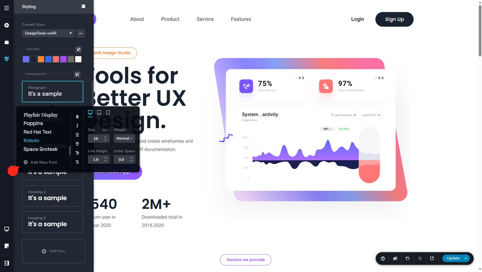
To edit a global font, select it to open its settings panel. For more guidance on font editing, see the Fonts article.
From this panel, you can also create responsive versions of your global font styles. It helps to set these up early so your typography stays consistent across desktop, tablet, and phone, and you can fine-tune them later as you work through each device view. More details are covered in the Responsive Design article.
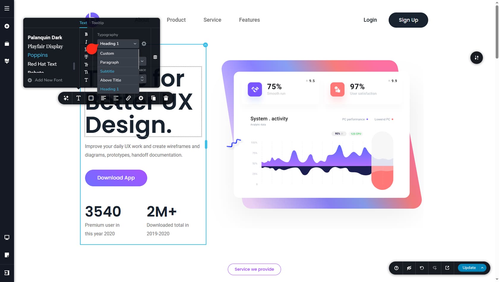
After your global font styles are in place, you can apply them to any text-based widget on your page. Select the widget, open the Typography settings, and choose one of your global presets. From that moment, the widget stays linked to the chosen preset, so any updates you make to global typography will automatically update every widget using that same style.
Any changes you make to a widget’s typography settings will switch it to Custom and disconnect it from the selected global typography preset, so it will no longer update automatically when that preset changes.
Premade Style Kits
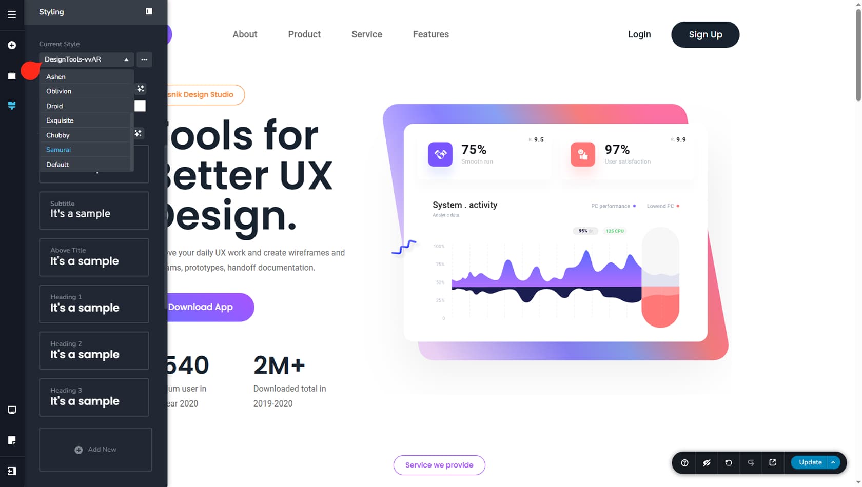
At the top of the Global Styling panel, you will also find a set of prebuilt style presets, including the one currently applied to your project. You can switch to a different preset at any time, and it will update your project’s colors and typography accordingly. Your previous settings are not lost, so you can always switch back to restore the earlier look. You can treat these presets as ready-made global style kits that you can customize, duplicate, rename, and reuse whenever it suits your workflow.