Flipbox
The Flipbox widget is an interactive layout element that presents two sides of content within the same space, revealing additional information through a smooth flip animation on hover or click. It’s ideal for showcasing features, services, team members, or call-to-action sections where you want to keep the design compact while still providing extra details. By combining visual interaction with flexible content editing on both sides, the Flipbox helps create engaging user experiences without adding clutter to the layout.
Flipbox Options
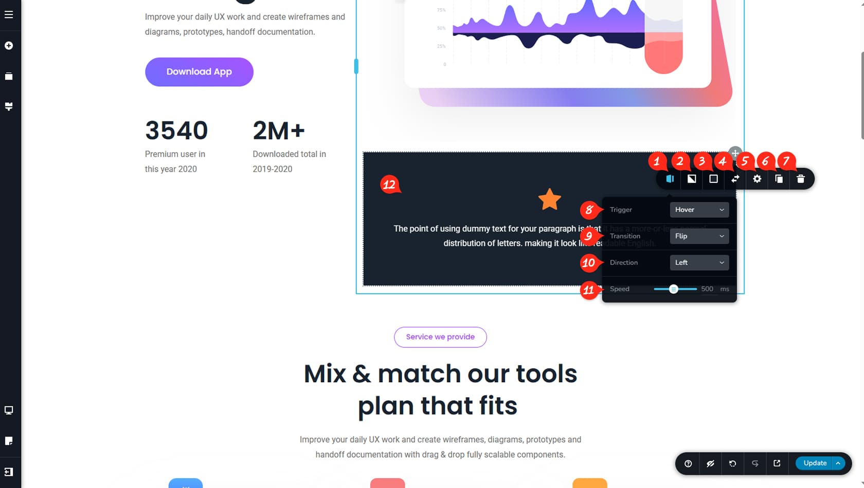
Since the flipbox consists of two sides, any changes you make will apply only to the currently selected side.
Flipbox Options
After dragging and dropping the Flipbox widget, you can open its toolbar using the grey icon in the top-right corner. Select the left-most icon to access the widget’s unique options.
Flipbox Background Image
Here you can set a background image for the selected flipbox side and apply filters such as brightness, contrast, or saturation.
Flipbox Colors
This option allows you to define background colors for the flipbox side.
Flipbox Sides
This control lets you switch between the two flipbox sides so you can edit each one individually.
Flipbox Size
Here you can configure the widget height, choosing between automatic or custom values. You can also vertically align the content and open the Styling and Effects panels to adjust paddings, margins, corners, animations, and more.
When referring to the Styling Panel of the widget, please see the Widgets Styling article for more details and an in-depth guide. Note that most widgets share similar styling options, with slight variations depending on the specific widget.
Duplicate Widget
This control duplicates the widget.
Delete Widget
This control deletes the widget.
Flipbox Trigger
Here you can choose whether the flipbox activates on hover or click.
Flipbox Animation
This setting allows you to select the animation type. In addition to flipping, you can choose slide, push, zoom, or fade transitions.
Flipbox Direction
Here you can define the animation direction, including left, right, top, or bottom.
Animation Speed
This option controls the animation speed.
Flipbox Content Area
The content area of the flipbox is fully editable, allowing you to drag and drop any widgets inside and customize them just like any other section in the builder.