Video
A video widget adds powerful storytelling and engagement capabilities to your website by allowing you to integrate dynamic visual content directly into your layouts. Whether embedding YouTube videos or using custom media files, video helps present information in a more immersive and accessible way, making it ideal for tutorials, presentations, promotional content, or background visuals. With customizable player settings and flexible display options, the video widget ensures that media can be seamlessly adapted to match your design while maintaining consistent performance across devices.
Video Options
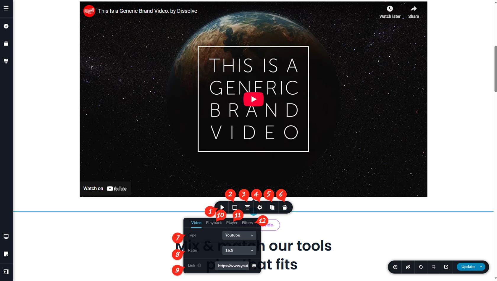
Widget Options
In the Video toolbar, select the icon on the left to open the widget’s settings.
Video Colors
Here you can customize the video widget’s background color, border, shadow, and apply a mask, along with separate hover colors.
Video Alignment
This setting controls the alignment of the video.
Settings Panel
This opens the Settings Panel, where you can adjust the video widget’s width and access the Styling and Effects panels.
When referring to the Styling Panel of the widget, please see the Widgets Styling article for more details and an in-depth guide. Note that most widgets share similar styling options, with slight variations depending on the specific widget.
Duplicate Video
You can duplicate the video widget using this control.
Delete Video
This option deletes the video widget.
Video Type
Inside the Video Options panel, you can choose the video type to display, including YouTube, Vimeo, a URL, or a file from the Media Library.
Aspect Ratio
This setting allows you to select the video’s aspect ratio from the available dropdown options.
Custom aspect ratios are not supported for videos; you can only select from six preset options: 1:1, 3:2, 4:3, 9:16, 16:9, or 21:9.
Video URL
For YouTube, Vimeo, and URL sources, you can paste the video link here. For Custom, you can select a file from your Media Library.
Playback
Within the Playback tab, you can enable Mute, Loop, Suggest videos, or define custom start and end times by entering values in seconds.
Player
The Player tab allows detailed customization of the video player. More information is provided below.
Filters
In the Filters tab, you can adjust the video’s contrast, depth, hue, and saturation.
Player Customizations
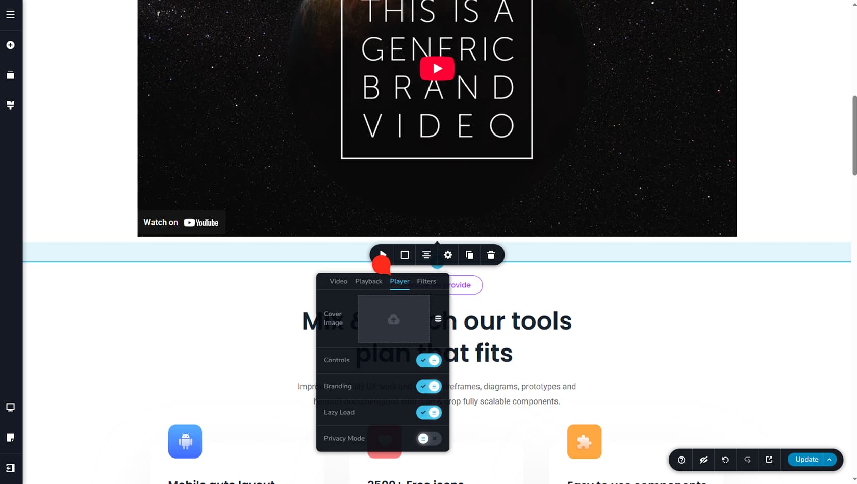
If you have not set a cover image for your video, the thumbnail will default to the one provided by the original video source. The player controls will also match those of the original platform, though you can toggle Controls on or off from this panel. Additional options allow you to enable or disable branding, activate Lazy Loading so the video loads only when in the viewport, or enable Privacy Mode.
If you choose to set a custom cover image, several player options will change accordingly.
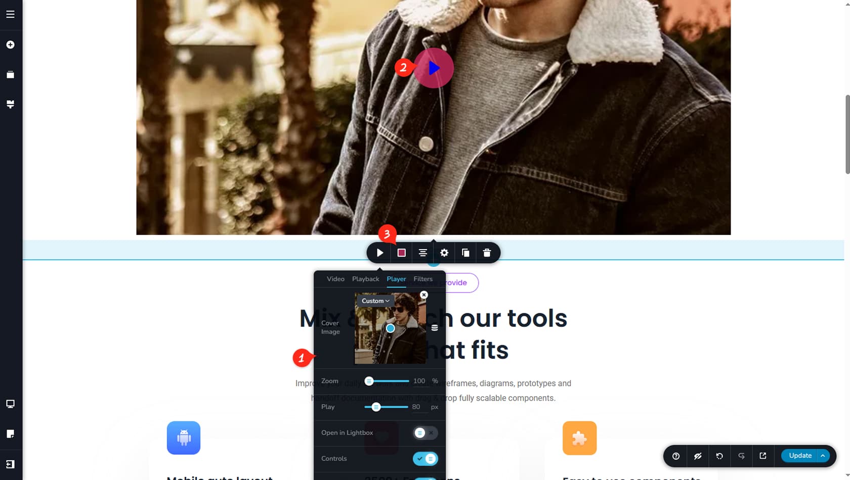
After adding a cover image, you can select one from your Media Library, and the video thumbnail will update to display the new cover image within the selected aspect ratio.
New Player Options
You can now adjust the zoom level of the video thumbnail, set the size of the play button, and choose to open the video in a new tab when play is clicked.
New Player Controls
The original source player controls will no longer appear and are replaced by the builder’s play icon, whose size can be adjusted in the Video Player options mentioned earlier.
New Player Colors
Additional settings in the Colors panel allow you to customize the play icon’s color as well as its background.