Rating
The Rating widget is a simple visual tool used to represent feedback, quality, or performance at a glance. By displaying a clear star-based score with an optional label, it helps communicate opinions or evaluations quickly without requiring lengthy explanations. This makes it especially useful for testimonials, reviews, product highlights, or feature comparisons, adding clarity and trust while keeping the layout clean and minimal.
Rating Options
Rating Options
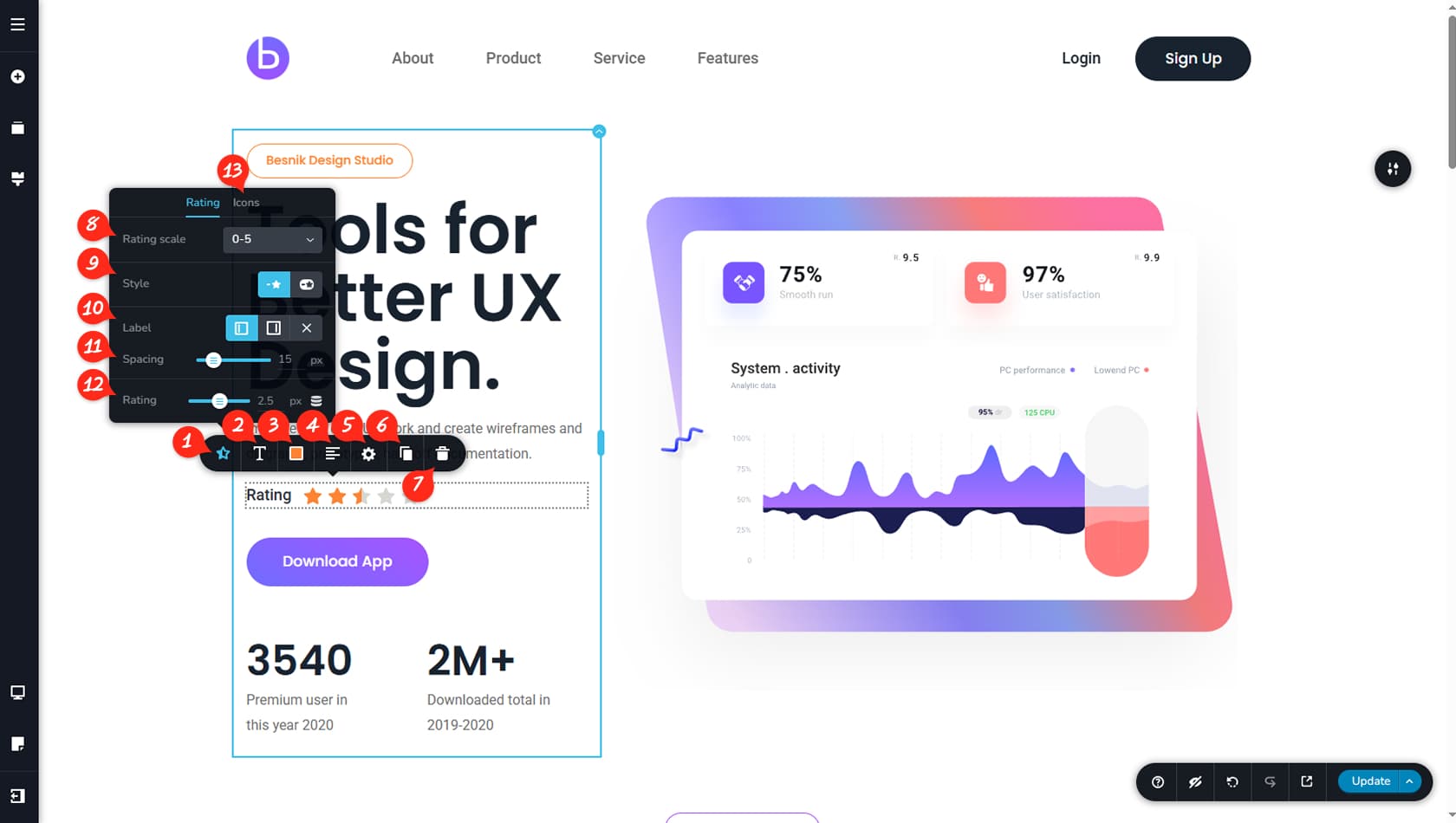
After dragging and dropping the widget, you can customize its options by selecting the first icon on the left in the toolbar.
Label Typography
Here you can adjust the typography settings for the label.
Rating Colors
This section allows you to set the colors for the label, rating icons, and background, including hover color options.
Alignment
This control sets the alignment of the Rating widget.
Rating Styling
Here you can open the Styling panel to manage margins, paddings, animations, and more.
When referring to the Styling Panel of the widget, please see the Widgets Styling article for more details and an in-depth guide. Note that most widgets share similar styling options, with slight variations depending on the specific widget.
Duplicate Rating
This option duplicates the Rating widget.
Delete Rating
This option deletes the Rating widget.
0-5 / 0-10 Rating
This setting lets you choose between a 0–5 or 0–10 icon scale for your rating.
Rating Layout
Here you can select between two available layout styles for the Rating widget.
Label Position
This option controls the label position, allowing it to appear on the left, right, or be hidden.
Label Spacing
Here you can adjust the spacing between the label and the icons.
Rating Value
This setting defines the rating value, based on the scale selected earlier.
Rating Icons Options
Within the Icons tab, you can choose the icon style, adjust its size, and control the spacing between icons.