Accordion
The Accordion widget is a practical way to organize large amounts of content into expandable sections, helping keep pages clean and easy to navigate. By allowing users to reveal information only when needed, it reduces visual clutter while improving readability and interaction. Commonly used for FAQs, feature breakdowns, or step-by-step information, each accordion item includes a fully editable content area, giving you the flexibility to add text, images, buttons, or any other elements within a structured and space-efficient layout.
Accordion Options
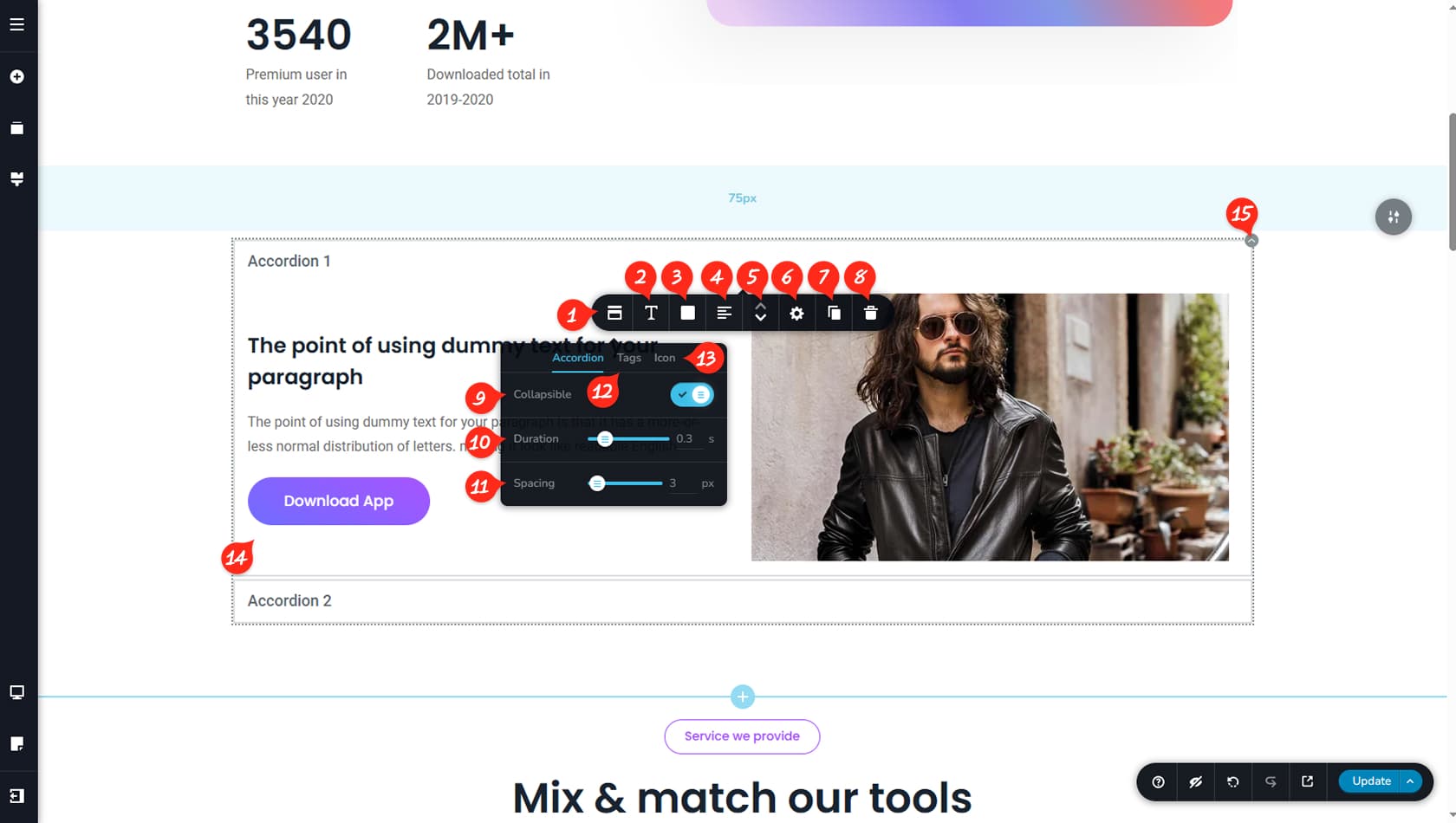
Accordion Options
After dragging and dropping the widget, open the left-most icon to access the Accordion settings, where you can customize it in detail.
Accordion Title Typography
Here you can adjust the typography of the Accordion title.
Accordion Color Settings
This section allows you to modify the Accordion colors, including text, background, border, and shadow, with separate options for hover and active states.
Accordion Alignment
This control sets the alignment of the Accordion title.
Accordion Reorder
You can reorder Accordion items using the arrow icons.
Accordion Styling
This option opens the Styling Panel.
The Styling Panel includes specific options for the Accordion widget, allowing you to adjust the title padding and content padding independently.
Duplicate Accordion Element
This option allows you to duplicate an Accordion element.
Delete Accordion Element
This option deletes the current Accordion element.
Collapsible Accordion
This setting makes the Accordion collapsible or non-collapsible. By default, one section remains open, but enabling this option allows all sections to be closed until activated.
Animation Duration
This option controls the animation duration when an Accordion section opens.
Accordion Spacing
This setting adjusts the spacing between Accordion elements.
Accordion Tags
Here you can assign tags to Accordion items. Make sure to separate multiple tags with commas.
Accordion Icon
This option adds an icon to the Accordion title. Unlike standard icons, only specific arrow styles are available, and they always appear on the right side of the title. You can also adjust the icon’s size.
Content Space
The Accordion content area supports full editing capabilities, allowing you to add columns, rows, images, text, buttons, or any other widgets, just like in the main editor. The Accordion title text can be edited directly as you would with a regular Text widget.
Widget Settings
The overall widget settings allow you to enable tags and access the Styling Panel just like any other widget. You can also duplicate or delete the entire Accordion widget, not just individual items.
When referring to the Styling Panel of the widget, please see the Widgets Styling article for more details and an in-depth guide. Note that most widgets share similar styling options, with slight variations depending on the specific widget.