Slider
The Slider feature allows you to transform a standard block into an interactive slideshow that can display multiple pieces of content within the same space. It’s useful for showcasing highlights, testimonials, featured content, or step-by-step information without overcrowding the page. By cycling through different slides, you keep layouts clean while increasing engagement and giving visitors more content to explore in a compact, visually dynamic format.
Slider Options
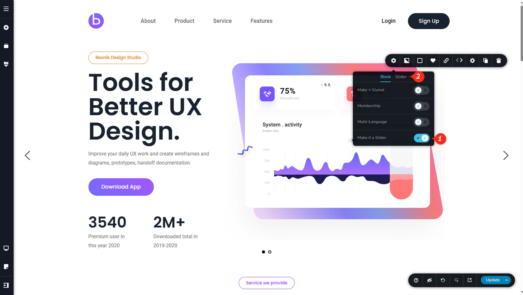
Convert a Block Into a Slider
To convert a block into a Slider, open the block toolbar, select the left-most icon, and enable the Make it a Slider option. Once activated, a Slider tab will appear at the top, providing additional customization settings.
Slider Options
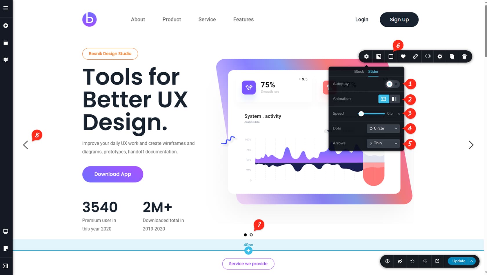
Click the Slider tab to further configure the slider.
Autoplay
Within the Slider options, you can enable Autoplay to have the slides advance automatically.
Scroll / Fade
Here you can choose between Scroll or Fade navigation for the slider.
Transition Speed
This setting controls the slide transition speed.
Dots Icon
From here you can select a different Dots style or choose None to hide them completely.
Arrows Icon
Here you can select a different Arrows style or choose None to hide them.
Dots / Arrows Colors
You will also find additional color controls for both Dots and Arrows, including their hover states.
Dots
Dots provide visual navigation and indicate the number of slides in the slider.
Arrows
Arrows allow manual navigation between slides.