Responsive Design
Responsive design is essential for ensuring a consistent and usable experience across mobile and tablet devices, where screen sizes and interaction patterns differ significantly from desktop. Adapting layouts for smaller screens improves readability, accessibility, and overall user engagement, while preventing content from feeling cramped or difficult to navigate.
Setting up responsive design is highly recommended, as a large portion of users browse their favorite websites and read news content on mobile devices. Our editor simplifies this process by allowing easy, view-specific adjustments for mobile and tablet, enabling you to fine-tune layouts without affecting the desktop version.
Switch To Your Preferred View
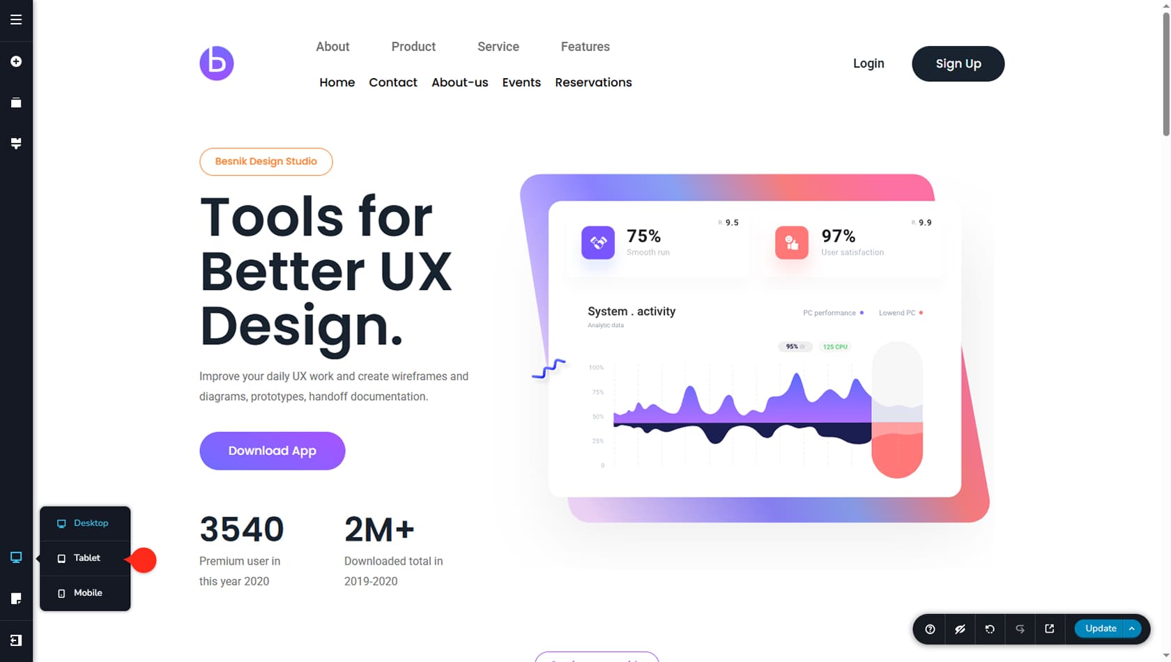
To switch the editor to a different resolution, use the responsive options icon on the left side of the interface. From there, select Desktop, Tablet, or Mobile. Once selected, the editor will adjust its width to match the chosen view.
Editor Changes on Responsive Design
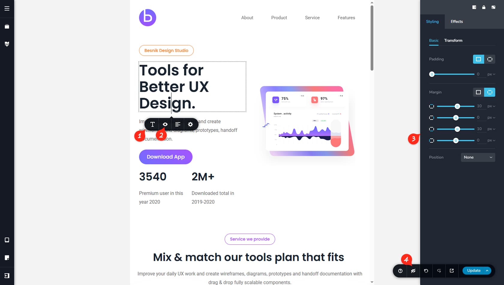
Each widget and editor element includes a focused set of responsive options tailored to its specific behavior. We recommend experimenting with these settings when configuring your design for responsive views.
Changes made in this view will not affect other resolutions and will override any settings applied on the desktop view.
Individual Toolbar Settings on Responsive
For example, you’ll notice that the Text widget no longer includes options such as color settings, link configuration, duplication, or deletion. Any options defined on the desktop view will also apply to smaller resolutions.
Hide Widget
Instead, a new option becomes available in the interface, allowing you to hide a widget specifically for the selected view.
Paddings & Margins on Responsive
Padding and margin settings will override values from other resolutions and apply only to the widget on the currently selected view. You’ll also see that additional settings are unavailable in responsive views, such as Blending, Corners, Z-Index, or Custom CSS.
Un-Hide All Elements
If a widget is hidden using its individual toolbar, you must toggle the eye icon in the bottom-right toolbar of the editor to edit it again or make it visible. This option will make all hidden elements visible in the editor again but the elements are still considered hidden in front-end.
Editing the actual content of your widgets will affect all resolutions across the board. For Example, if you add a word to a Text widget, this word will appear on all responsive views.