Image
Images play a vital role in enhancing the visual appeal and storytelling of a website, helping communicate ideas quickly and create a stronger emotional connection with users. Properly sized and optimized images improve layout balance, loading performance, and responsiveness across different devices. Having control over properties such as width, height, scaling, and positioning allows you to maintain visual consistency while ensuring that images adapt seamlessly to your design and support the overall user experience.
Image Settings
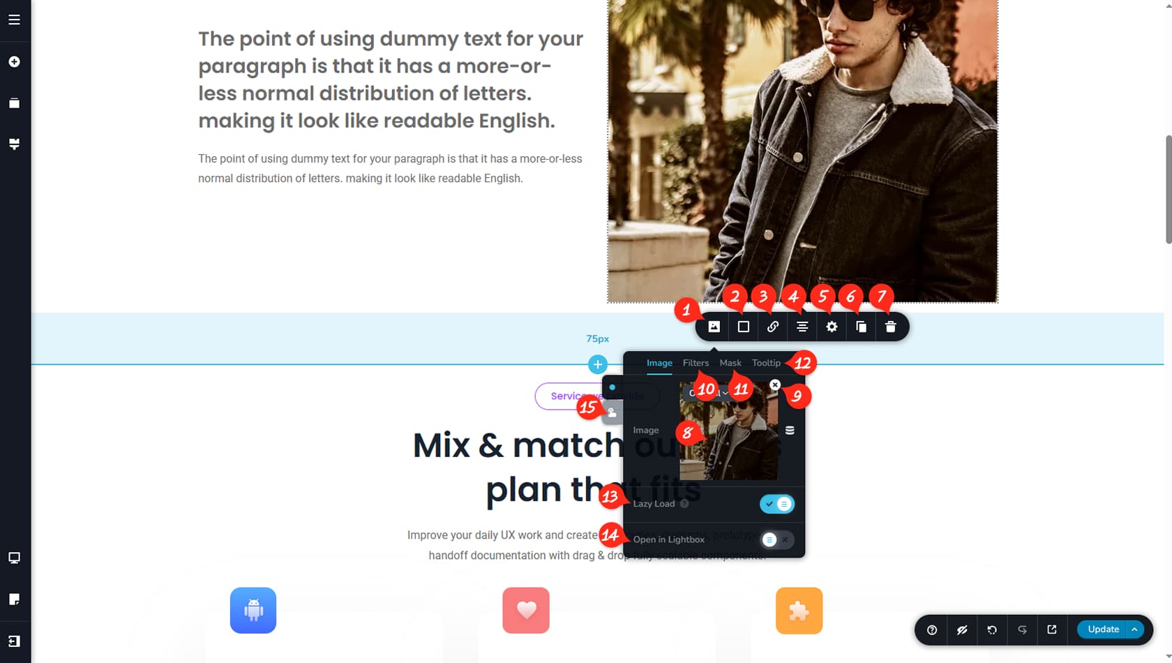
Image Options
When you click an image, the Image Toolbar will appear, giving you access to customization options and size controls. The first icon on the left opens the Image Options Panel.
Image Color Overlay
Here you can apply a color overlay to the image, including gradient, border, shadow, and hover settings.
Image Link
This control allows you to assign a link to the image.
Image Alignment
This setting lets you choose the image alignment: left, center, or right.
Settings Panel
This opens the Settings Panel, where you can manage size, as well as access the Styling and Animations panels.
When referring to the Styling Panel of the widget, please see the Widgets Styling article for more details and an in-depth guide. Note that most widgets share similar styling options, with slight variations depending on the specific widget.
Duplicate Image
You can duplicate the image here, and the duplicated widget will appear below the current one.
Delete Image
This control deletes the image.
Choose Image
Inside the Image Options, click this field to add an image from your Media Library. More details about adding images are provided below.
Remove Image
This option removes the current image from the widget while keeping all other settings unchanged.
Image Filters
These controls adjust image filters such as contrast, brightness, hue, and saturation.
Image Mask
Here you can apply a mask shape to the image and customize it separately.
Image Tooltip
This option enables a tooltip to appear when the image is clicked.
Lazy Load
This toggle activates Lazy Load, improving performance by loading the image only when it enters the viewport.
Open in New Tab
This option ensures the image opens in a new tab when clicked.
How to Add an Image
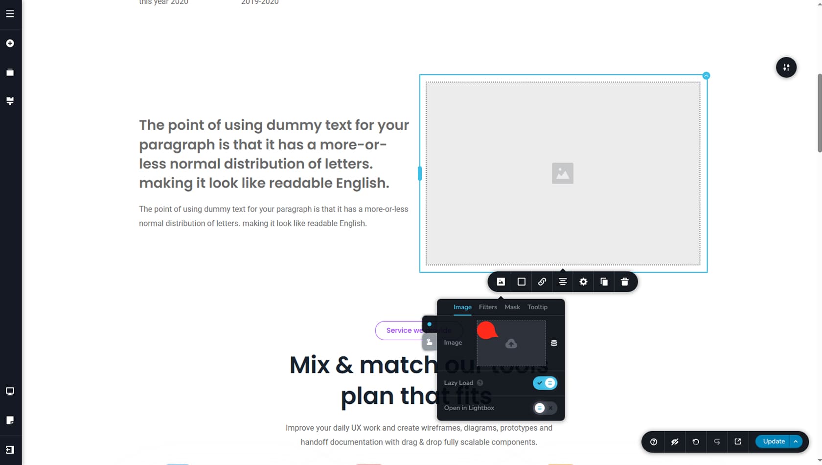
Click the area above to add an image to the widget. This will open the Media Library, where you can select an image of your choice.
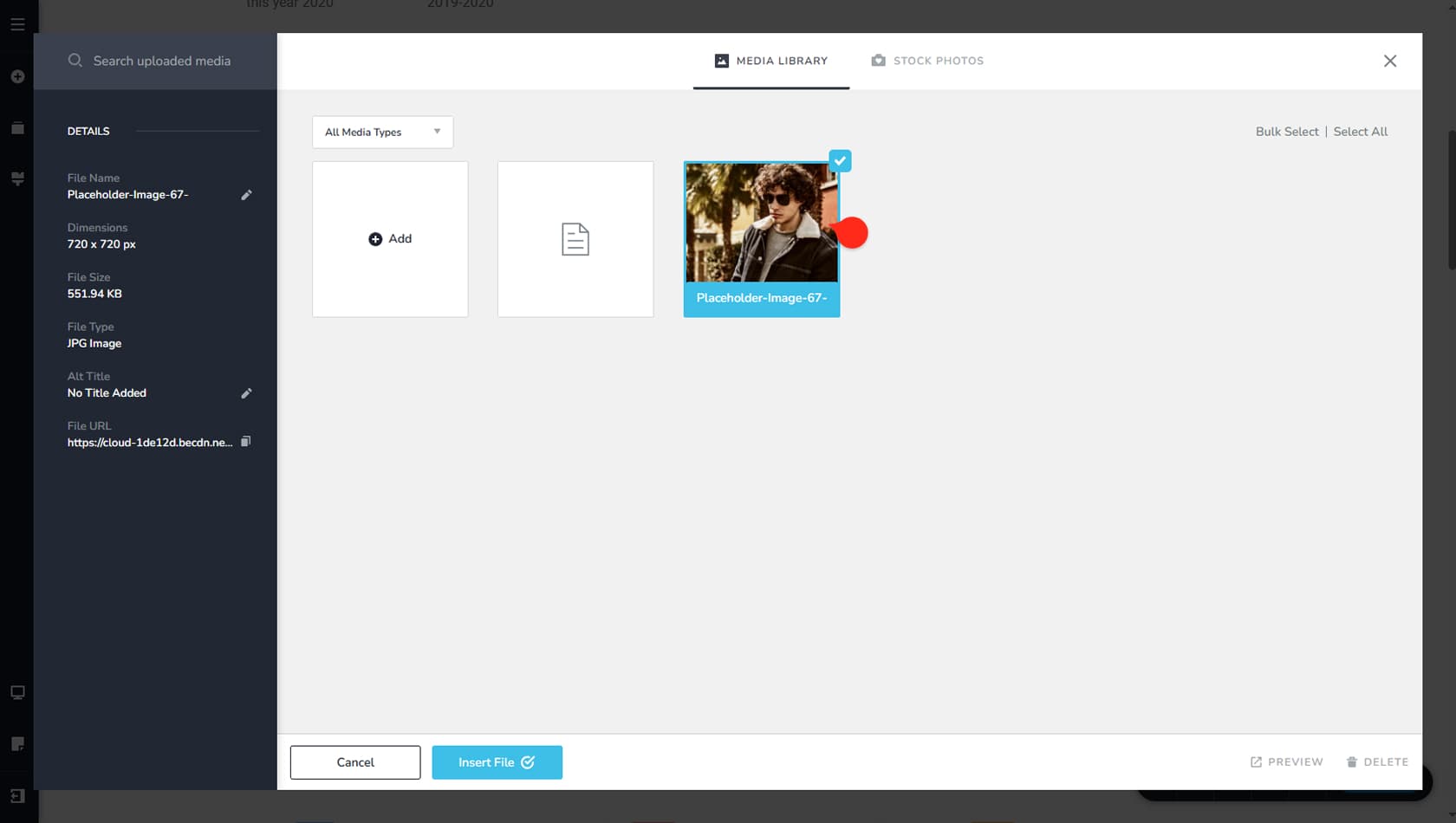
In the Media Library, select the image you want and insert it. You can also add a name below the image thumbnail or view its details on the left side.
Original & Custom Ratios
Custom Ratio
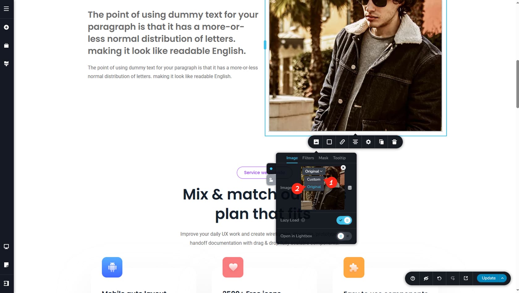
Once an image is selected for your widget, you can switch it to Custom to gain more detailed control over its size.
Original Ratio
This option resets the image to its original aspect ratio, helping preserve its native resolution and improve visual quality.
Custom Image Size
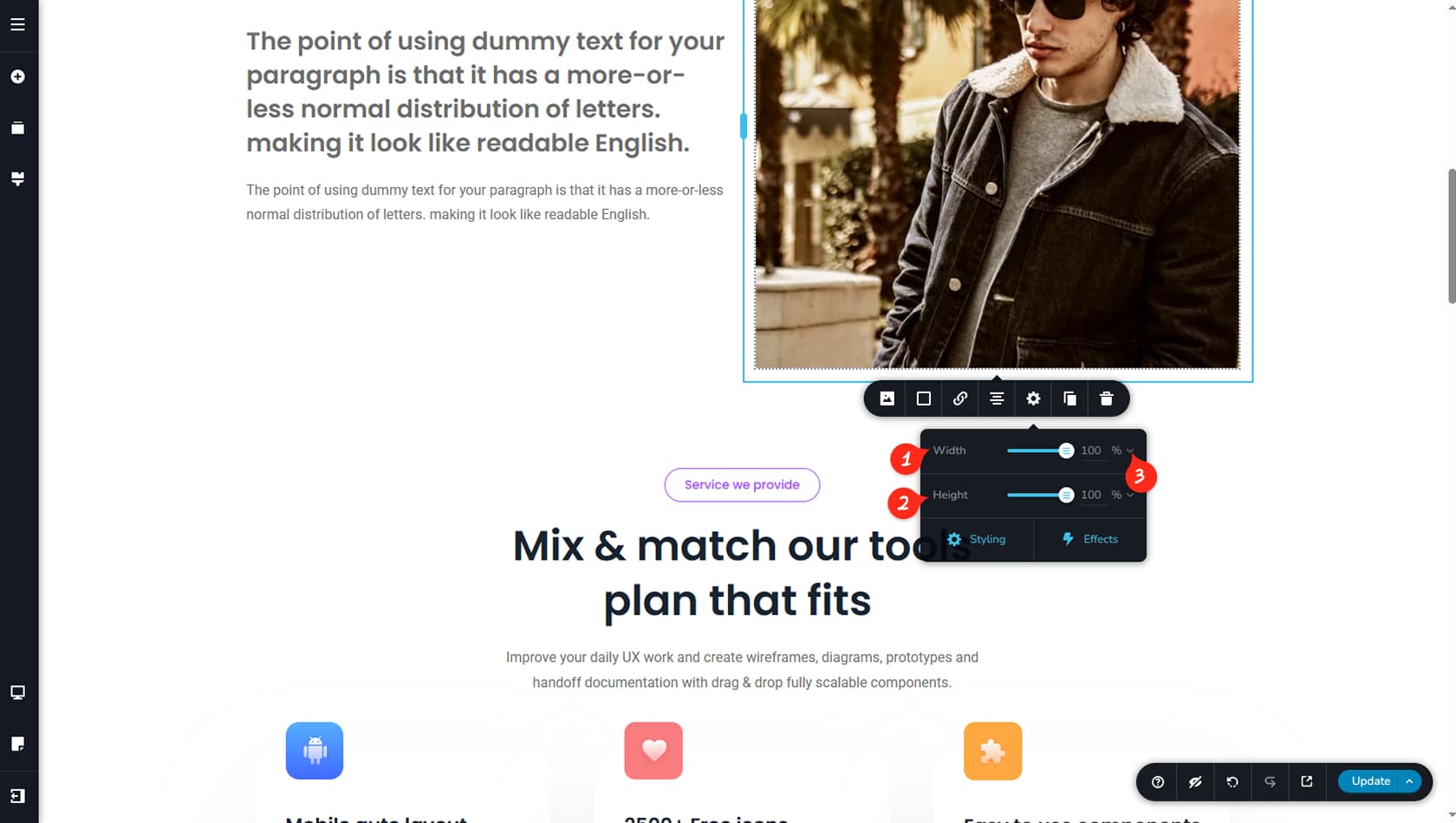
After setting the image to Custom, you gain more flexibility in defining its width and height.
If an image in any widget is custom, you can also adjust the focus point on that image by moving the small blue icon inside the image field.