Countdown
The Countdown widget is a time-based element designed to create urgency and highlight important upcoming moments. By counting down to a specific date or deadline, it helps draw attention to events, product launches, promotions, or announcements, encouraging visitors to stay engaged and take action. Its visual movement adds energy to a layout while providing clear, real-time information that keeps users aware of time-sensitive content.
Countdown Options
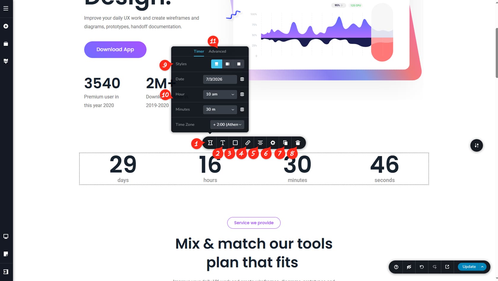
Widget Options
After dragging and dropping the Countdown widget, click it to open the toolbar and access its options. The icon on the left opens the dedicated widget settings panel.
Countdown Typography
This section controls the countdown’s typography, allowing you to style the numbers and titles separately for stronger visual contrast.
Countdown Colors
Here you can customize the colors of the countdown, including titles, numbers, background, border, and shadows.
Countdown Link
This control allows you to assign a link to the countdown widget.
Countdown Alignment
This setting manages the widget’s alignment.
Styling Panel
This option opens the Settings Panel, where you can adjust width and access the Styling and Effects panels to control paddings, margins, animations, and more.
When referring to the Styling Panel of the widget, please see the Widgets Styling article for more details and an in-depth guide. Note that most widgets share similar styling options, with slight variations depending on the specific widget.
Duplicate Countdown
This control duplicates the countdown.
Delete Countdown
This option deletes the Countdown widget.
Countdown Styles
Here you can choose between three countdown styles: numbers with titles underneath, numbers with titles side by side, or numbers only without titles.
Timer
The remaining options configure the timer itself, allowing you to set the date, hour, minutes, and timezone.
Toggle Timer Elements
Advanced settings let you toggle the display of days, hours, minutes, or seconds.