Carousel
The Carousel widget is a dynamic layout element that allows you to present content inside rotating panels, making it ideal for showcasing features, testimonials, images, or structured sections in a compact space. Each panel functions like a mini layout where you can add columns, text, images, buttons, or any other widgets, giving you full creative freedom. With customizable navigation arrows and dots, the carousel enhances interaction while keeping large amounts of content organized and visually engaging.
Carousel Settings
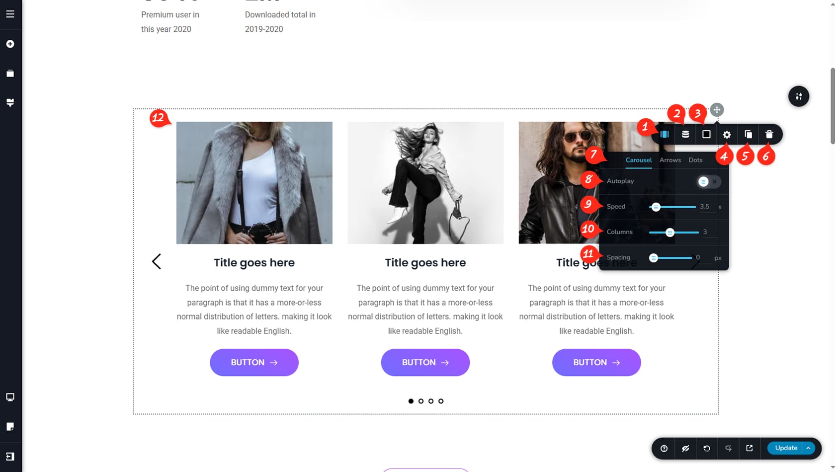
Carousel Options
After dragging and dropping the Carousel widget, a default layout with three columns will appear. Click the grey icon in the top-right corner to open the toolbar and access the Carousel panel.
Dynamic Content
Here you can configure the carousel columns to pull their content from the CMS instead of building them manually. This feature is known as Dynamic Content. For more details, see Dynamic elements.
Carousel Colors
This section allows you to set the carousel’s background colors, as well as customize the colors of the arrows and dots when these navigation options are enabled.
Carousel Styling
This opens the Styling panel, where you can adjust paddings, margins, and other visual settings.
When referring to the Styling Panel of the widget, please see the Widgets Styling article for more details and an in-depth guide. Note that most widgets share similar styling options, with slight variations depending on the specific widget.
Duplicate Carousel
This control duplicates the entire Carousel widget.
Delete Carousel
This control deletes the Carousel widget.
Carousel / Arrows / Dots
The tabs let you switch between Carousel settings, Arrow navigation options, and Dot navigation options.
Autoplay
Enabling Autoplay will make the carousel slide automatically through the columns. You can also define a stop time or enable a pause control.
Slide Duration
This setting determines the duration of the slide animation.
Number of Displayed Columns
Here you can choose how many columns are displayed within the carousel.
Column Spacing
This option adjusts the spacing between columns.
Editing the Content of the Carousel
Each column can be edited independently, allowing you to build any layout inside by dragging and dropping widgets. Inner columns are also supported, and each column can have its own colors, styling, and layout customization.
Carousel Navigation
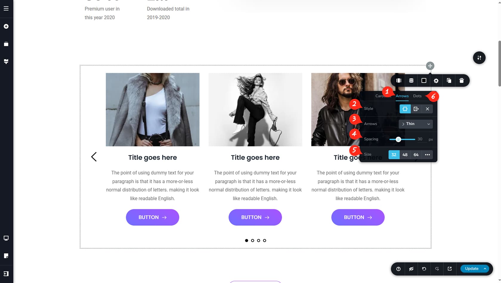
Arrows Options
After switching to the Arrows tab, the Arrow panel will open, providing advanced navigation customization options.
Arrows Layouts
Here you can set the arrow layout so they appear on opposite sides of the carousel or grouped on a single side.
Arrows Icon
This setting allows you to select the arrow style.
Arrows Spacing
Here you can adjust the spacing between the arrows and the carousel columns.
Arrows Size
This option controls the size of the arrows.
Dots Style
You can also customize the dot navigation style from the Dots tab located next to the Arrows tab.