Menu
The Menu widget makes it easy to display and manage navigation directly within your layout, helping visitors move through your website in a clear and structured way. By connecting to previously created menus, it ensures consistency across pages while allowing full control over typography, spacing, and layout style. With flexible design options, the widget helps you create navigation that not only functions smoothly but also blends naturally with the visual identity of your project.
For more details regarding how to set up a menu in the CMS, see details in the Menus & Navigation article.
Menu Options
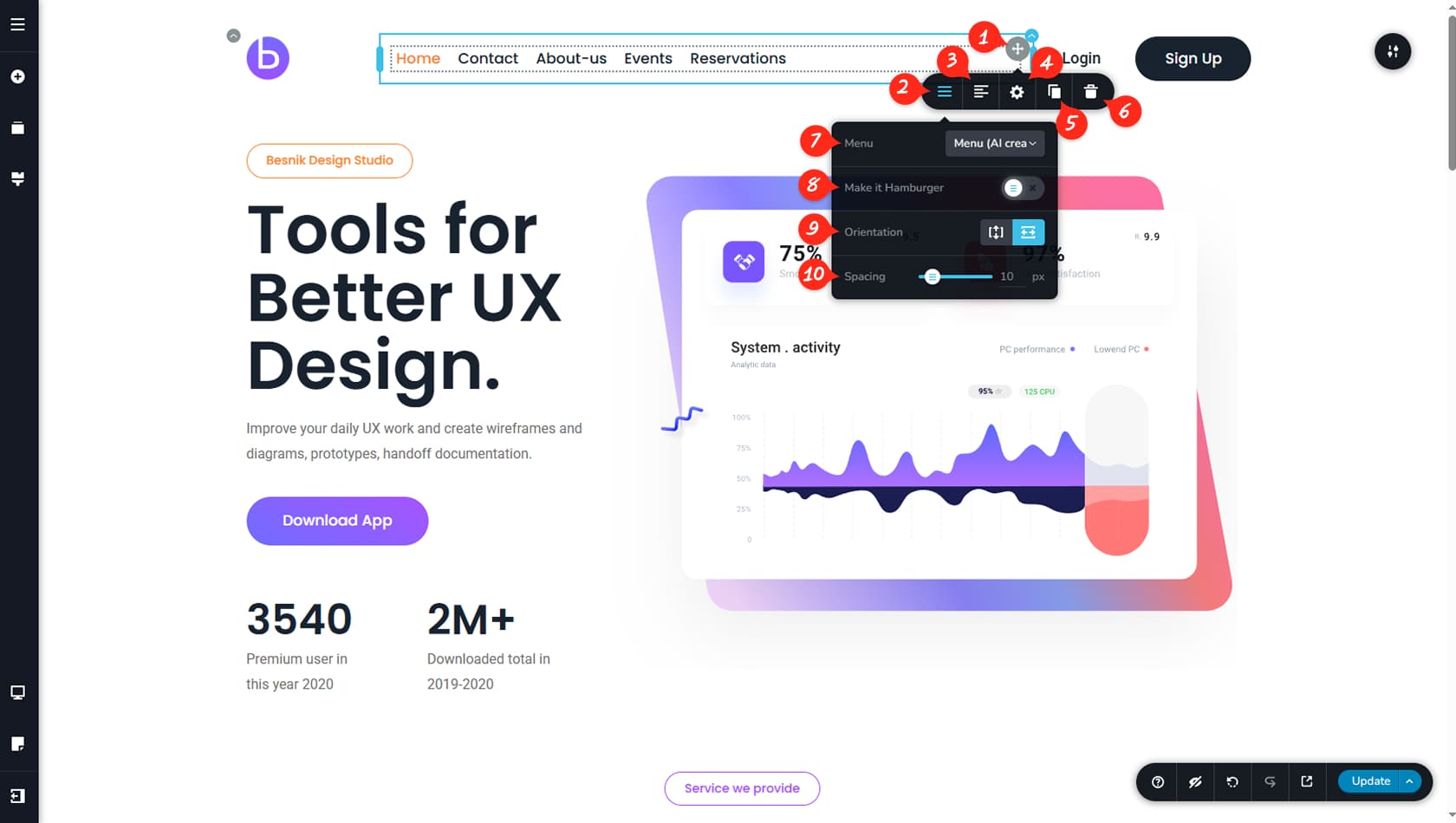
Editing the Widget
After dragging and dropping the Menu widget, you will see options to customize both the entire widget and individual menu items. The following settings focus on configuring the menu as a whole.
Menu Options
Open the Menu Options by clicking the first icon on the left side of the toolbar.
Menu Items Alignment
This setting controls the alignment of the menu items within the widget.
Styling Panel
Here you can open the Styling Panel to adjust the menu’s padding and margins.
When referring to the Styling Panel of the widget, please see the Widgets Styling article for more details and an in-depth guide. Note that most widgets share similar styling options, with slight variations depending on the specific widget.
Duplicate Menu
This control duplicates the Menu widget.
Delete Menu
This control deletes the Menu widget.
Choose Menu
This option allows you to select a menu that was previously created in the CMS.
Set Hamburger Menu
Here you can switch the menu to a hamburger layout, which opens the selected menu inside a side panel.
Menu Alignment
This setting changes the menu layout between horizontal and vertical alignment.
Menu Items Spacing
This option defines the spacing between menu items.
Menu Item Settings
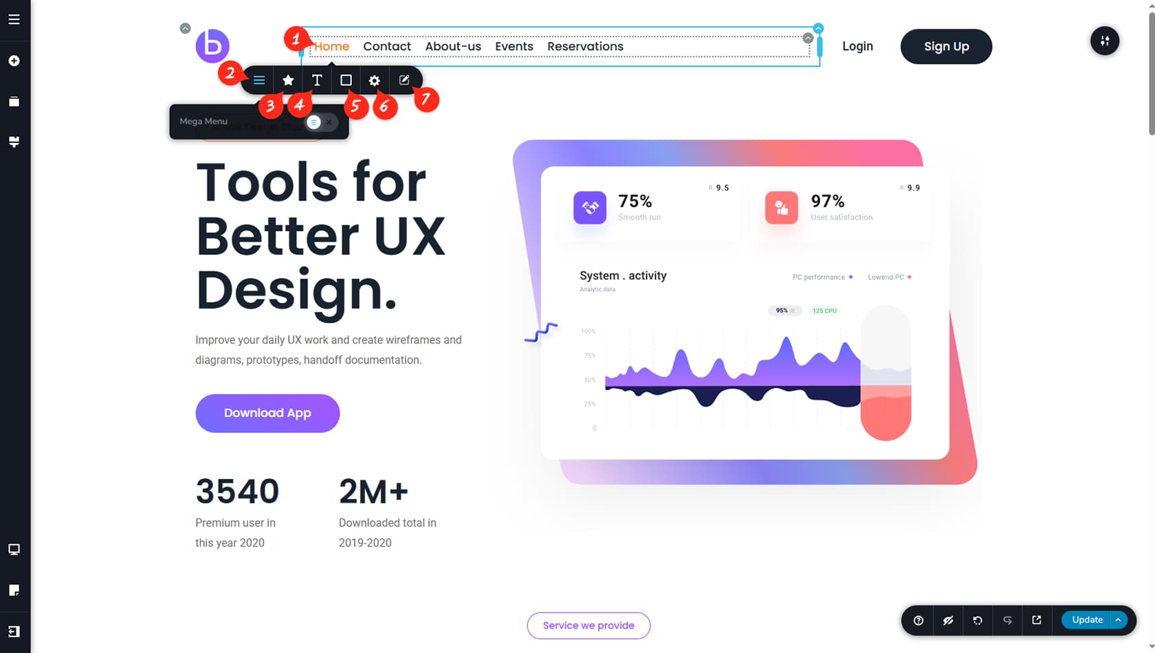
Customize Menu Item
By selecting a menu item, you can customize the elements inside the widget.
Megamenu Switch
This setting allows you to convert the selected menu item into a Mega Menu.
Menu Icon
Here you can add an icon to the chosen menu item, adjust its size, control the spacing from the text, and position it to the left or right.
Menu Typography
This option lets you modify the typography of the menu items.
Menu items placed within a dropdown can be customized independently and will not adopt the initial typographies.
Menu Item Colors
This setting allows you to customize the text, background, and border colors of the menu items.
Styling Panel
The Styling Panel lets you adjust the padding and corner radius of the menu items.
Edit Menu
This option opens the menu for editing in the CMS.
Hamburger Menu
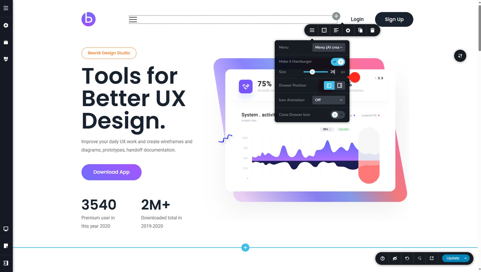
After switching the menu to a hamburger layout, additional customization options become available. You can adjust the hamburger icon size, set the position of the menu drawer, choose an animation for the icon, and add a custom icon to close the menu drawer.
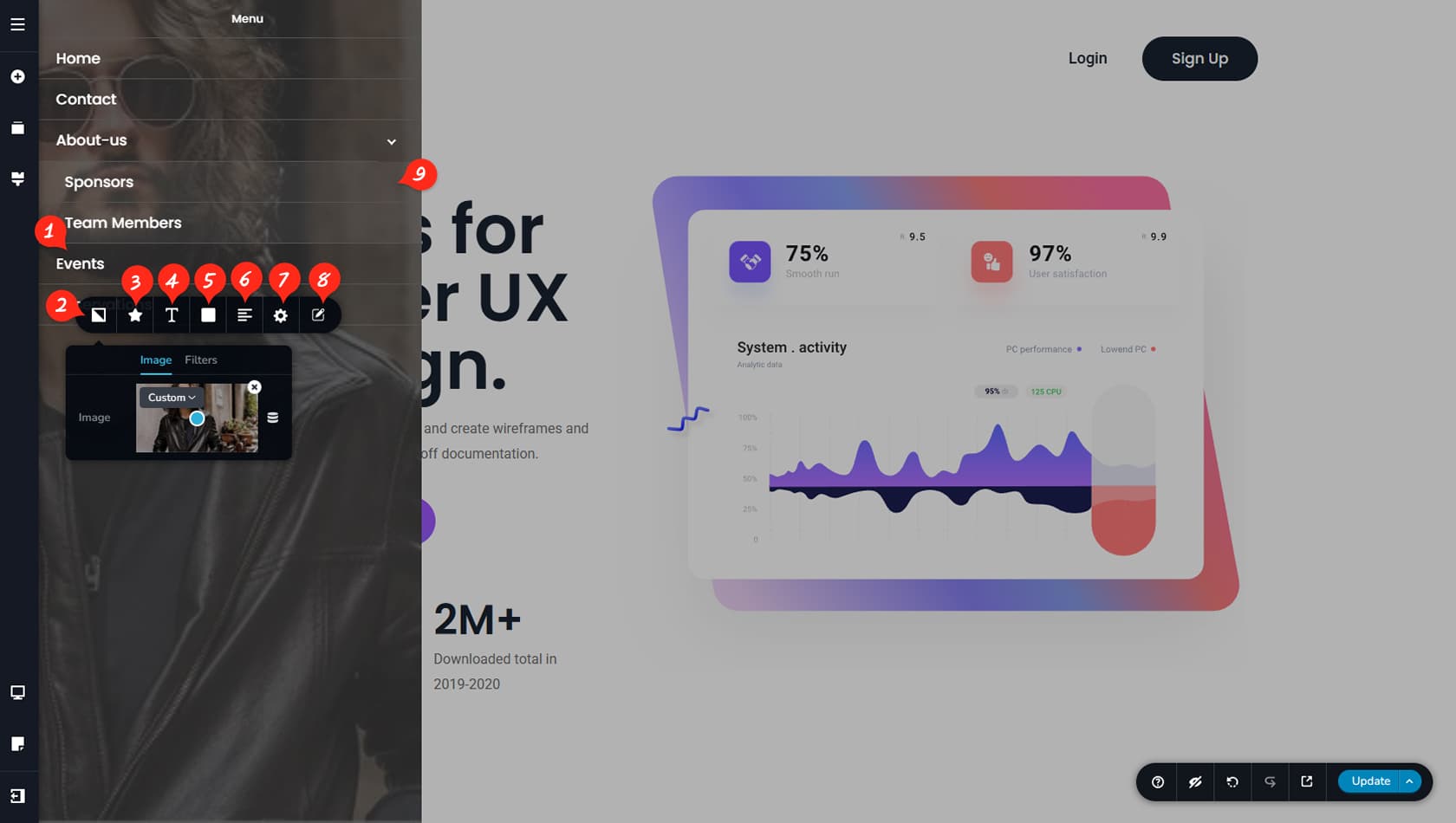
Clicking the hamburger icon will open the menu drawer, displaying your selected menu in a vertical layout.
You can edit the default “Menu” label shown in drawer menus and replace it with any text you prefer, or remove it entirely.
Menu Items Customization
Selecting a menu item will open the toolbar, giving you additional customization options.
Drawer Background
Here you can set a background image for the drawer and apply filters if needed.
Menu Item Icon
This setting allows you to add an icon, adjust its size, control its position relative to the menu item text, and modify the spacing between them.
Menu Items Typography
Here you can edit the item’s typography.
Menu Items Colors
This section lets you customize the colors of the menu item text, background, and border, including hover and active states.
Menu Items Alignment
This option controls the alignment of menu items inside the drawer.
Menu Items Padding
Here you can apply padding to the menu items within the drawer.
Edit the Menu
You can also exit the editor and manage the menu directly in the CMS.
Menu Dropdown Items
Dropdown items will appear when clicking a parent menu item and can be customized separately just like any other menu item.
Menu Dropdown
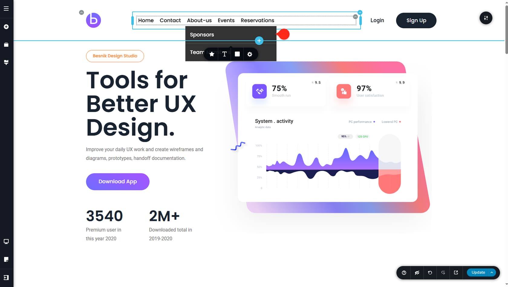
If multiple items are placed under a parent menu item in the CMS, they will appear as dropdown entries in the Menu widget when the parent item is selected. These dropdown items include independent settings for icons, typography, and colors, along with Styling Panel options such as corner radius.
Megamenu
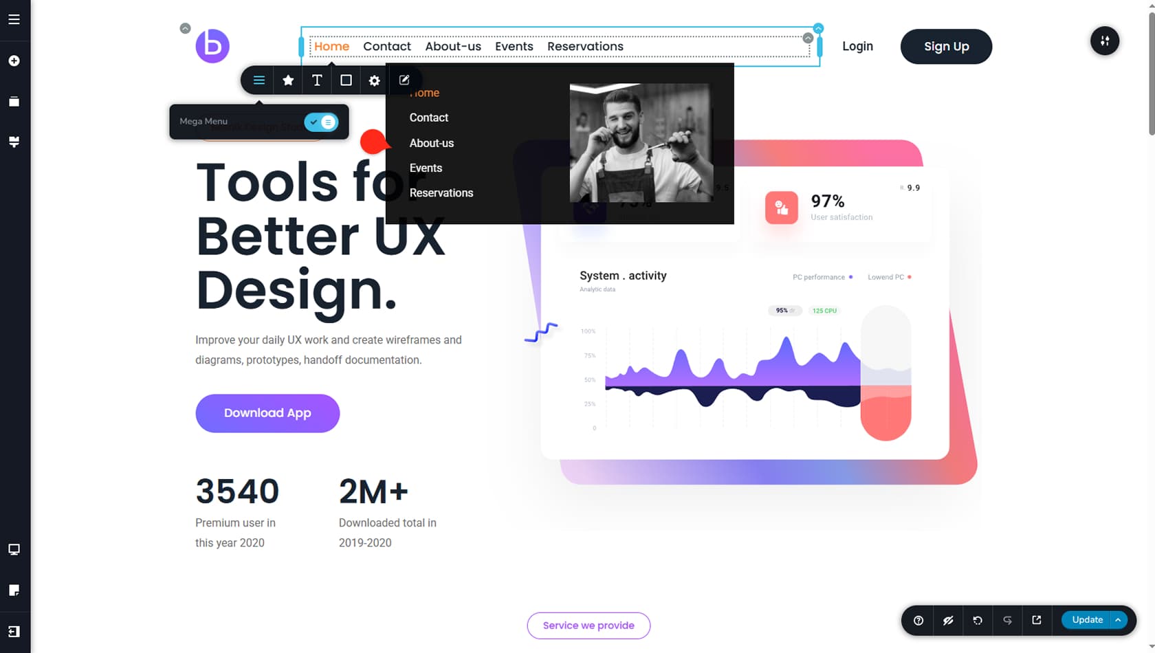
A mega menu expands standard navigation by providing a larger, fully customizable content area directly within the menu itself. Instead of simple dropdown links, it allows you to organize complex structures using columns, images, text, or buttons, making it easier to present large amounts of information in a clear and accessible way.