Working with Widgets
Widgets are the individual content pieces that come together inside a block. They play the same role within a block that blocks play within a page, essential building units that let you shape layouts and add real content. With the right combination of widgets, you can build nearly any section you can imagine.
To start using widgets, first add a block by importing a prebuilt one or creating a blank one. For a full walkthrough on getting started with blocks, see the Working with Blocks article.
Adding a Widget
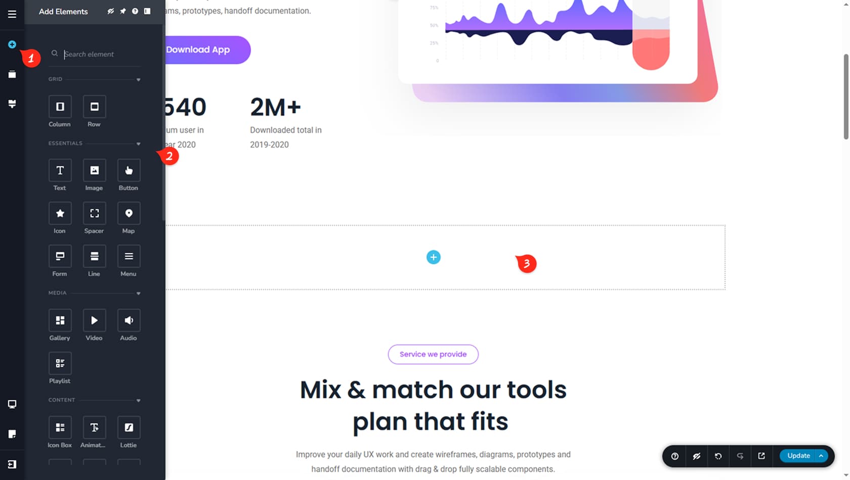
Open The Widgets Panel
Start by opening the Widgets panel on the left by clicking the plus icon. The panel will expand and display all available widgets, with more than 40 options to choose from.
Widget Panel Options
At the top of the panel, you can use the icons to hide widgets you do not plan to use, pin your favorites for quicker access, open help from this guide, or change where the panel sits. You can also use the search field to quickly find a specific widget.
Drag & Drop
When you are ready to add one, drag the widget from the panel and drop it into the block where you want it to appear.
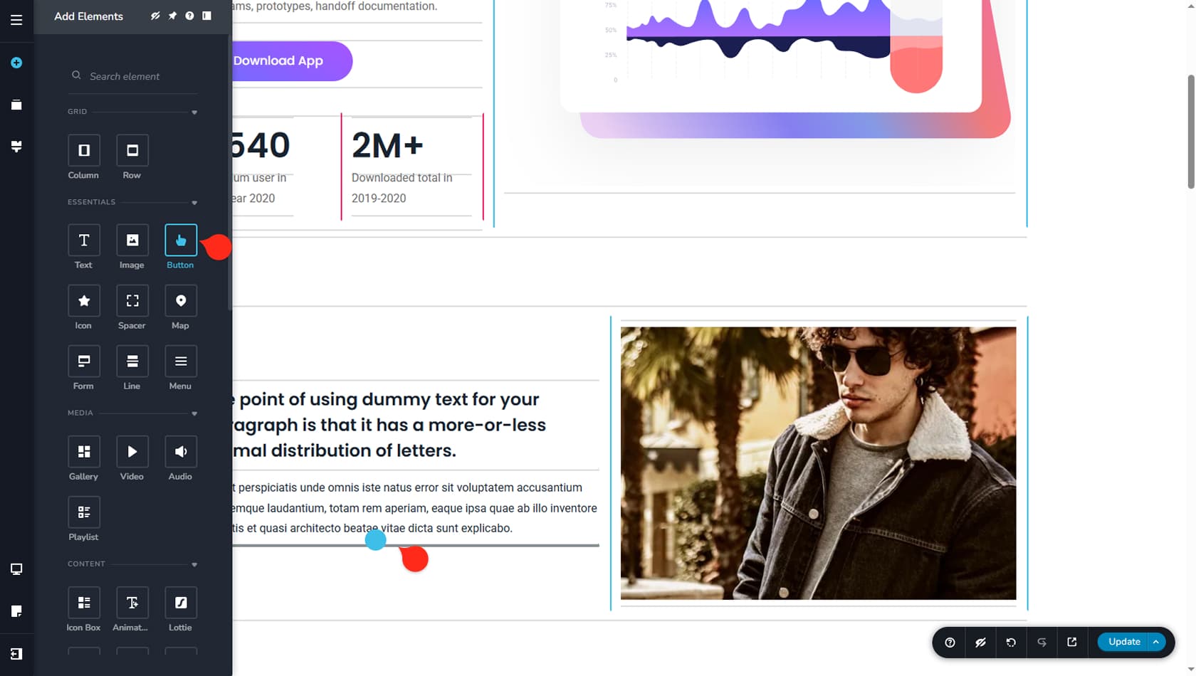
Here, you can see that two columns are already in place, along with a heading, a short description, and an image, and the next step is adding a button. When you drag in the Button widget, guide lines appear across the editor. Grey horizontal guide lines indicate placement within an existing column, while blue and red guides show where a new column would be created to make space for the widget.
Drag
Drag the widget from the panel and the placement guide lines will appear automatically.
Drop
Drop it where you want it to go. If you are placing it correctly, you will see the target line highlight before the widget is inserted to that location.
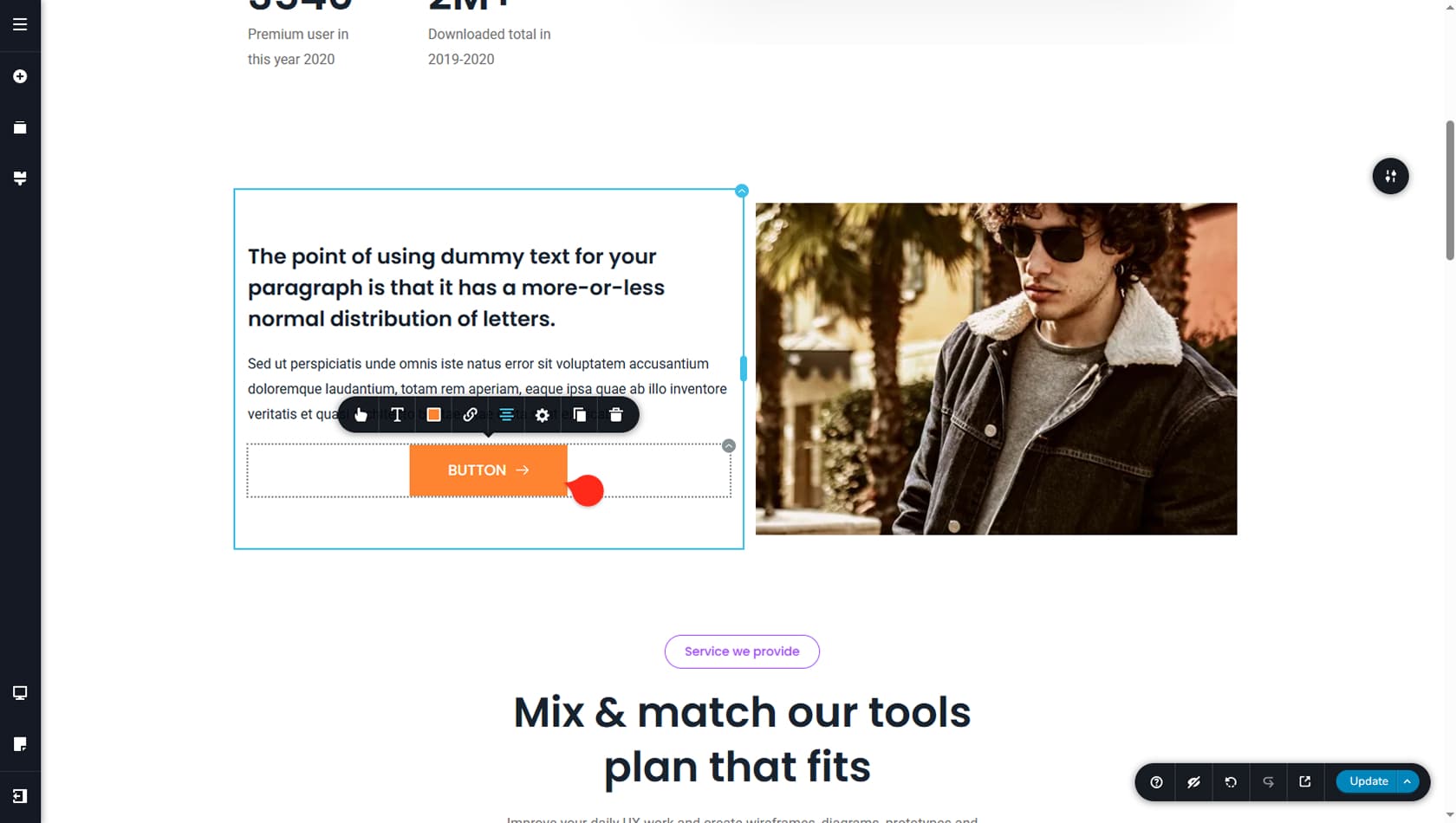
A new Button widget is now in place, but the styling and alignment may not match what you are aiming for, so let’s take a quick look at how widget styling works.
Customizing a Widget
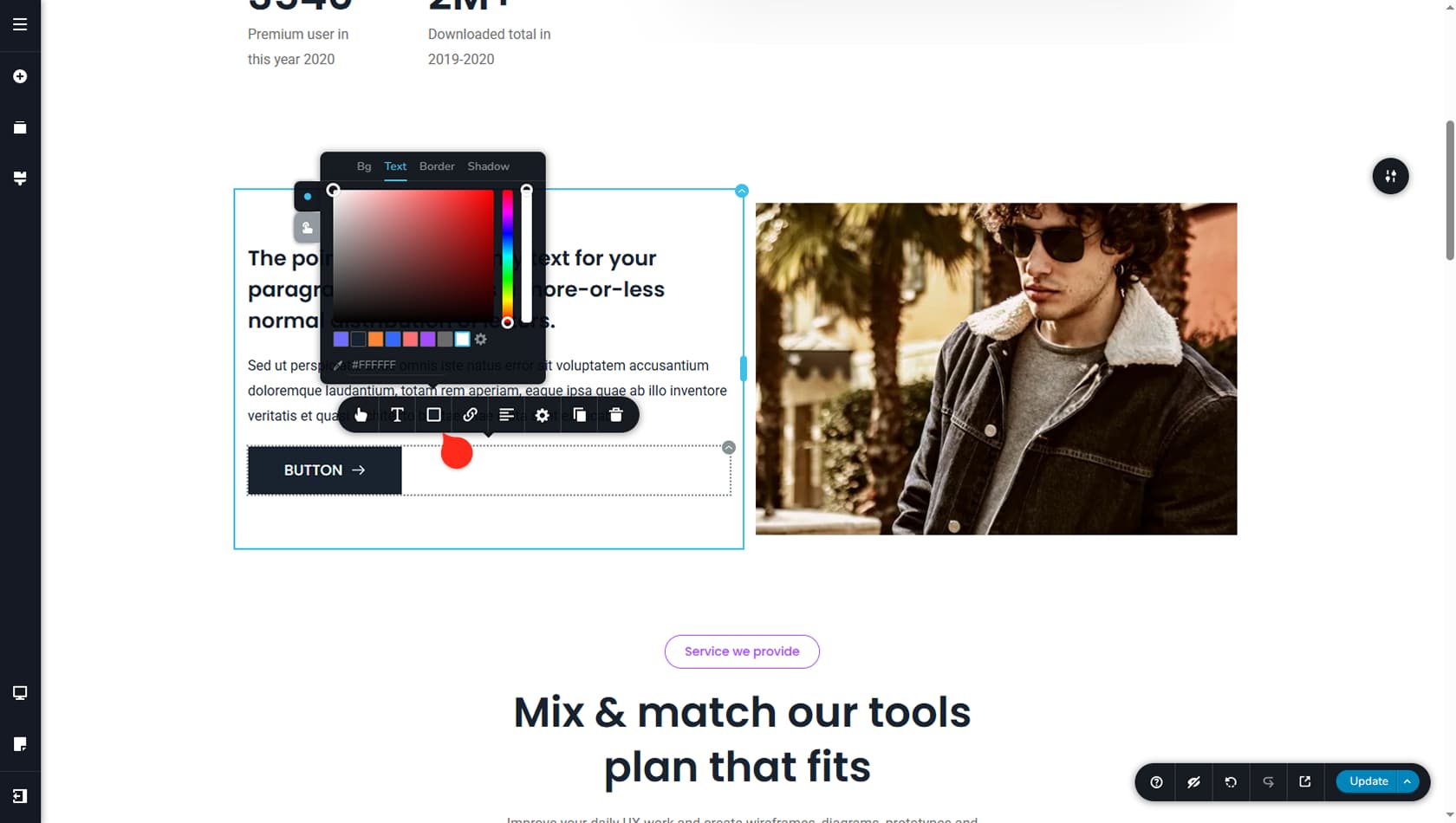
Each widget comes with its own set of customization options, and many of them are specific to that widget type. To access these settings, click a widget in the content area and adjust the option you want to change. For example, with a button you can quickly change its alignment, update the background color, or remove the border, and there are plenty of additional controls to explore. This documentation includes a dedicated page for every widget, with a full breakdown of its features and styling options.
Remember: If you do not update the page, no changes are saved so feel free to experiment with widgets options to your heart’s content before committing to the changes.