Rows & Columns
Rows and Columns form the structural foundation of your project’s layout, providing the framework that keeps content organized, balanced, and visually consistent across the page. Rows act as horizontal containers that define sections of your design, while columns sit inside them to control spacing, alignment, and content distribution. You can place up to six columns side by side, allowing for flexible grid-based layouts, and adding widgets inside a column will automatically expand its height to accommodate the content. For more advanced compositions, columns can also be nested within other columns, giving you the freedom to build more dynamic structures and create complex, visually engaging designs while maintaining full control over layout behavior.
Adding Columns or Rows
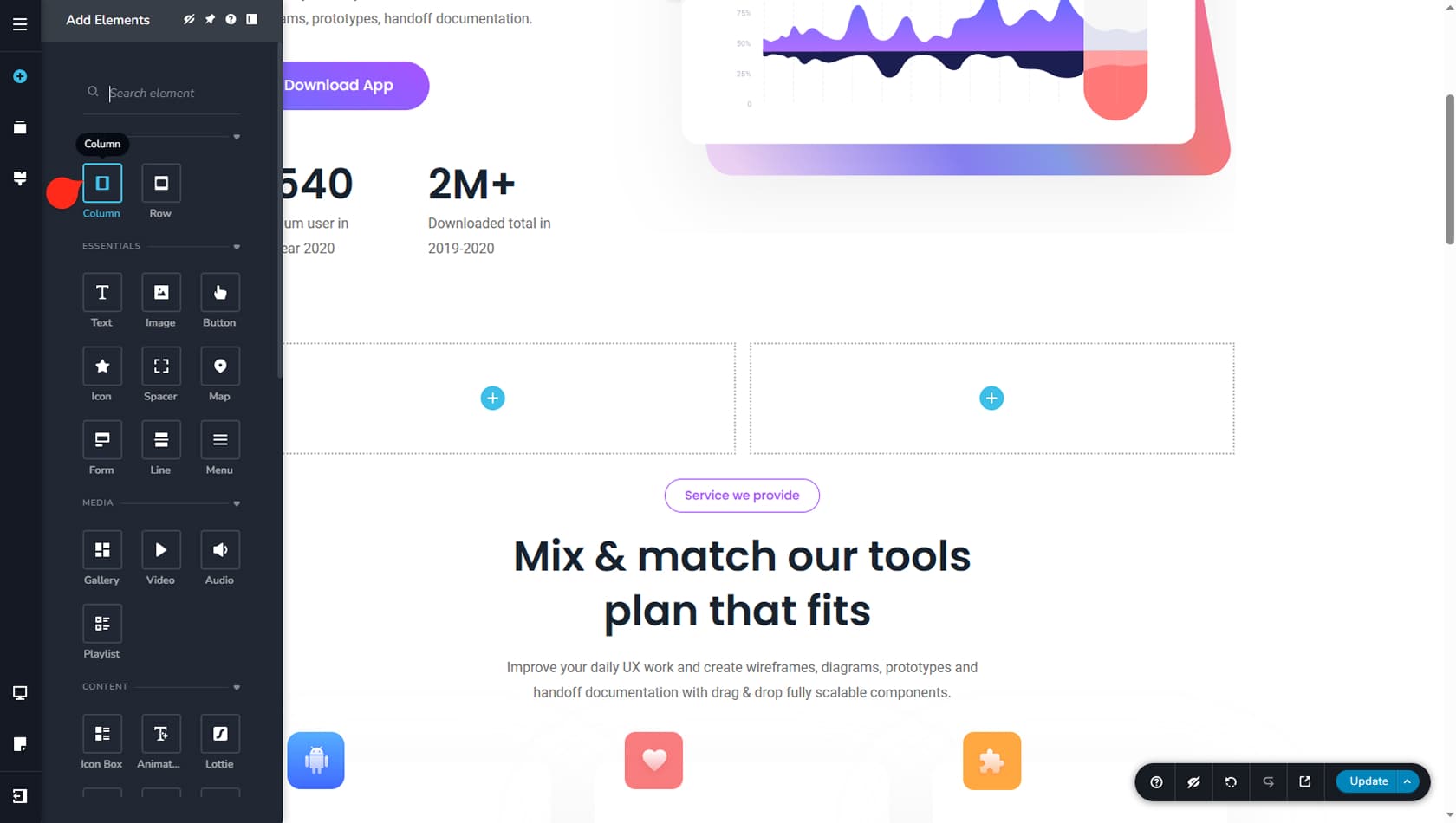
To add a new row or column, open the Widgets panel on the left side of the interface by clicking the plus icon, then drag and drop either a Row or Column into the editor area. Blue outlines will appear in the editor to indicate the boundaries of a column and highlight its editable area. You can then drag and drop any other widget inside the column.
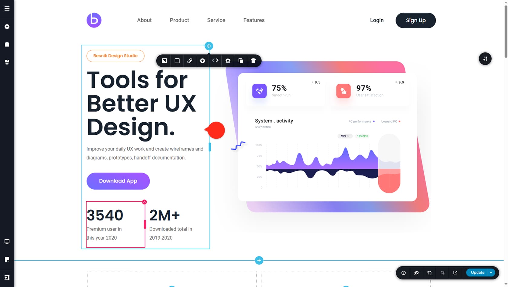
Here is an example of a column containing content. Notice how the content defines the column’s height, and that placing elements side by side requires the use of inner columns.
Inner columns are outlined in red instead of blue, making it easier to distinguish between the two.
How to Edit a Column
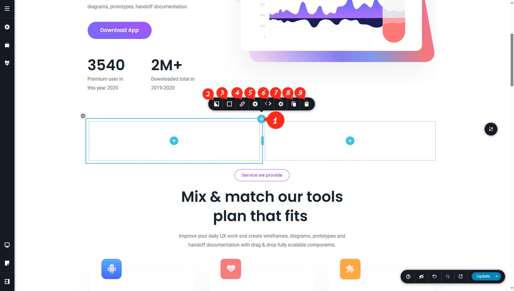
Blue Icon
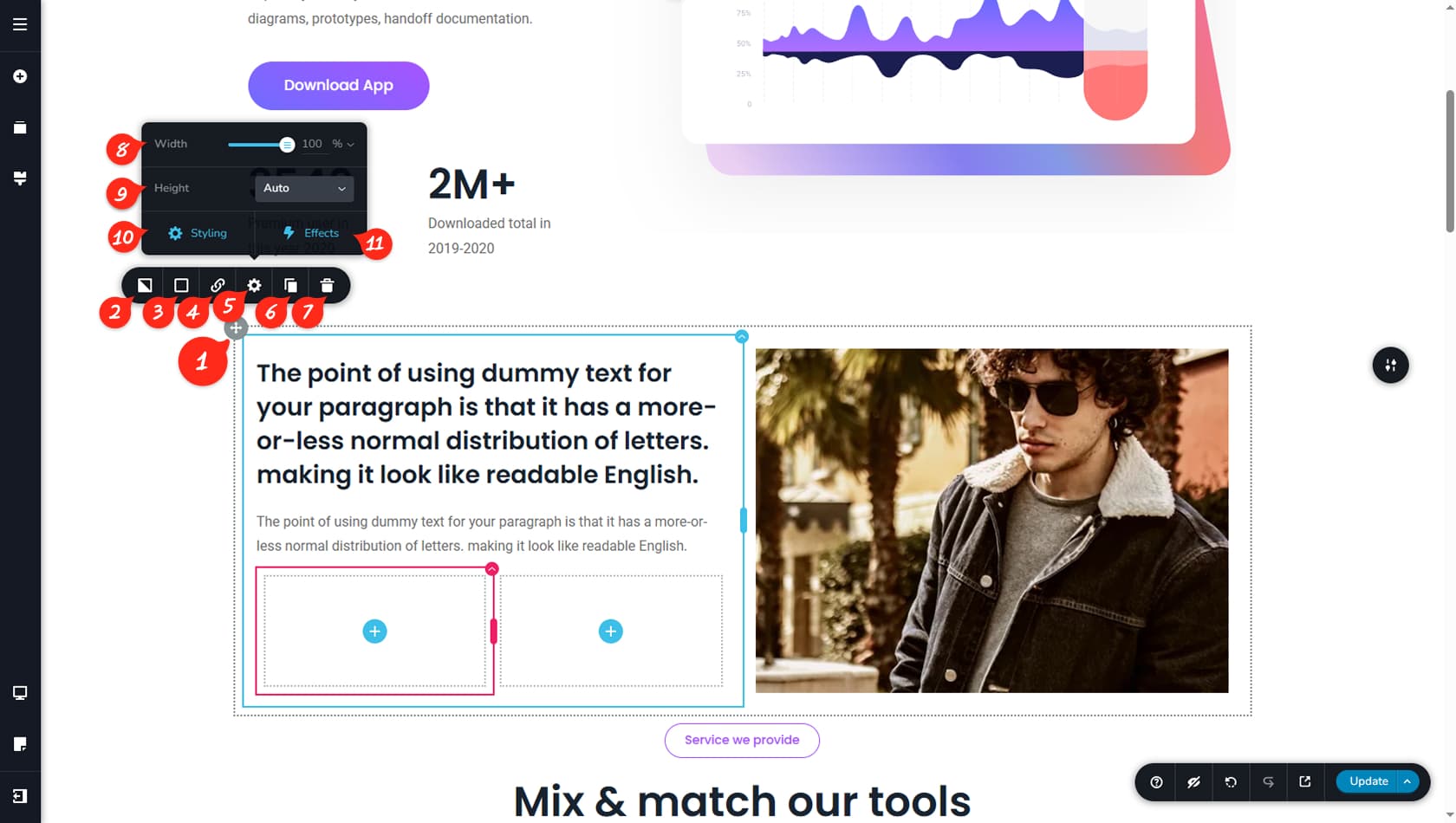
To open the edit toolbar for a column, click the small blue icon in the top-right corner. The toolbar will then expand.
Background Image
This option allows you to set a background image and customize it using filters or masks.
Background Color
This option allows you to control the column’s background color and opacity.
Assign a Link
This option allows you to assign a link to the column. For more details on setting links, refer to the Links article.
Add New Column
From here, you can add a new column to the right of the selected one.
Swap Columns
From here, you can swap the position of this column with either the one on the left or the one on the right.
Settings Panel
From here, you can open both the Settings Panel and the Styling Panel.
When referring to the Styling Panel of the widget, please see the Widgets Styling article for more details and an in-depth guide. Note that most widgets share similar styling options, with slight variations depending on the specific widget.
Duplicate Column
From here, you can duplicate the column along with all of its content. The duplicate will appear to the right of the selected column.
We strongly recommend using the duplicate feature to save time when creating similar side-by-side columns.
Delete Column
From here, you can delete the selected Column.
Column Settings
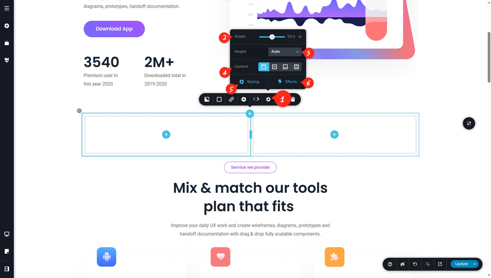
Open Settings
From here, you can open the Settings Panel, where multiple options are available to control this widget. Each widget includes its own unique settings within the Settings Panel.st equal 100%.
Column’s Height
Here, you can configure the column’s height by choosing between Auto, Custom Height, or Maximum Height. Auto height adjusts based on the total height of the content, Custom Height sets a fixed value, and Maximum Height enables scrolling once the content exceeds the defined limit.
Vertical Content Alignment
Here, you can control the vertical alignment of the content by setting it to Top, Center, Bottom, or Justified.
Styling Panel
Here, you can open the Styling Panel on the right side of the interface. Within Styling, you can modify the column’s paddings, margins, corners, blending mode, Z-Index, or Custom CSS.
Column Animations
Here, you can manage the column’s animations. For more details, refer to the Animations article.
Editing A Row
Think of rows as single horizontal containers designed specifically to hold columns within them. Two rows cannot be placed side by side, and all other widgets must be added inside the columns contained in the row.
Row Options
To begin editing a row’s options, look for the grey outline that indicates the row, with its option button located in the top-left corner instead of the right. Click this button to open the toolbar options.
Background Image
This option allows you to edit the row’s background image, including filters or masks.
Background Color
This option allows you to adjust the row’s background colors, borders, shadows, and opacity.
Assign a Link
This option allows you to assign a link to the entire row.
Row’s Settings Panel
This option opens the Settings Panel for rows.
Duplicate Row
This option duplicates the selected row, placing the copy directly underneath it.
Just like with columns, we strongly recommend using the duplicate option to save time instead of creating a new row from scratch when the content is similar
Delete Row
This option deletes the selected Row.
Row Width
This option in the Settings Panel controls the row’s width, allowing you to limit the total width of the columns contained within it.
Row Height
This option sets the row’s height to either Automatic, determined by the content’s height, or Custom, using a fixed value.
Styling Panel
This option opens the Styling Panel on the right, where you can adjust the row’s paddings, margins, corners, blending, Z-Index, or Custom CSS.
Animations
This option opens the Animations list for the row.