Table
The Table widget makes it simple to organize structured information into clear, easy-to-read layouts, helping present comparisons, pricing plans, schedules, or detailed data without requiring complex setup. With editable headers, sidebars, and fully customizable cells, it allows you to build organized content quickly while maintaining visual consistency across your project. By simplifying the process of creating and styling tables, the widget improves clarity, saves time, and helps visitors understand information at a glance.
Table Options
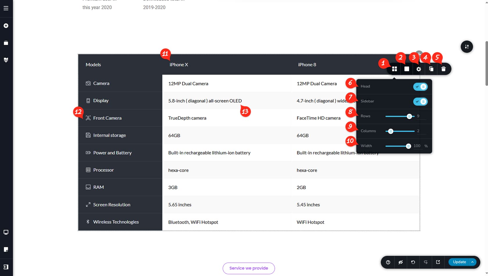
Table Options
After dragging and dropping the Table widget, click it to open the toolbar, then select the left-most icon to access the table options.
Table Colors
Here you can customize the colors of the table’s background, border, and shadow, including active states. The normal and active background settings define alternating shades used for the content cells.
You can customize the header and sidebar colors independently by selecting each one and adjusting their background color settings.
Widget Styling
This option opens the Styling panel, where you can adjust paddings, margins, animations, and more.
When referring to the Styling Panel of the widget, please see the Widgets Styling article for more details and an in-depth guide. Note that most widgets share similar styling options, with slight variations depending on the specific widget.
Duplicate Table
This control duplicates the entire Table widget.
Delete Table
This control deletes the entire Table widget.
Table Header
Here you can toggle the table header on or off. The header is a dedicated row used to display the titles of the columns below.
Table Sidebar
This setting enables or disables the sidebar, which acts as a dedicated column used to display the titles of the rows.
Number of Rows
Here you can define the number of rows in your table, excluding the header.
Number of Columns
This option lets you set the number of columns, excluding the sidebar.
Table Width
Here you can control the overall width of the table using percentage values.
Customize Header
The header includes its own settings, allowing you to add icons, adjust typography, change background and text colors, set border colors, define text alignment, and choose between automatic or custom cell widths. To edit header text, simply click and modify it like any other text element.
Customize Sidebar
The sidebar settings are similar to the header. You can add items, adjust typography, customize background and text colors, set border colors, control alignment, define the sidebar width, and open its Styling panel to manage padding. Rows can also be reordered using the arrow controls. To edit sidebar text, click and modify it directly.
Cells Editor Area
Each individual cell behaves like a mini column where you can build freely by dragging and dropping widgets, including additional columns if needed. By default, cells contain Text widgets. For more details on customizing text, refer to the Text article.