Progress
The Progress widget is a clean and effective way to visually present percentages, skills, or completion levels within your layout. By animating a bar from 0% to a defined value, it quickly communicates progress or performance at a glance while keeping the design simple and structured. With flexible styling options such as colors and label placement, it helps highlight key information without overwhelming the overall layout.
Progress Options
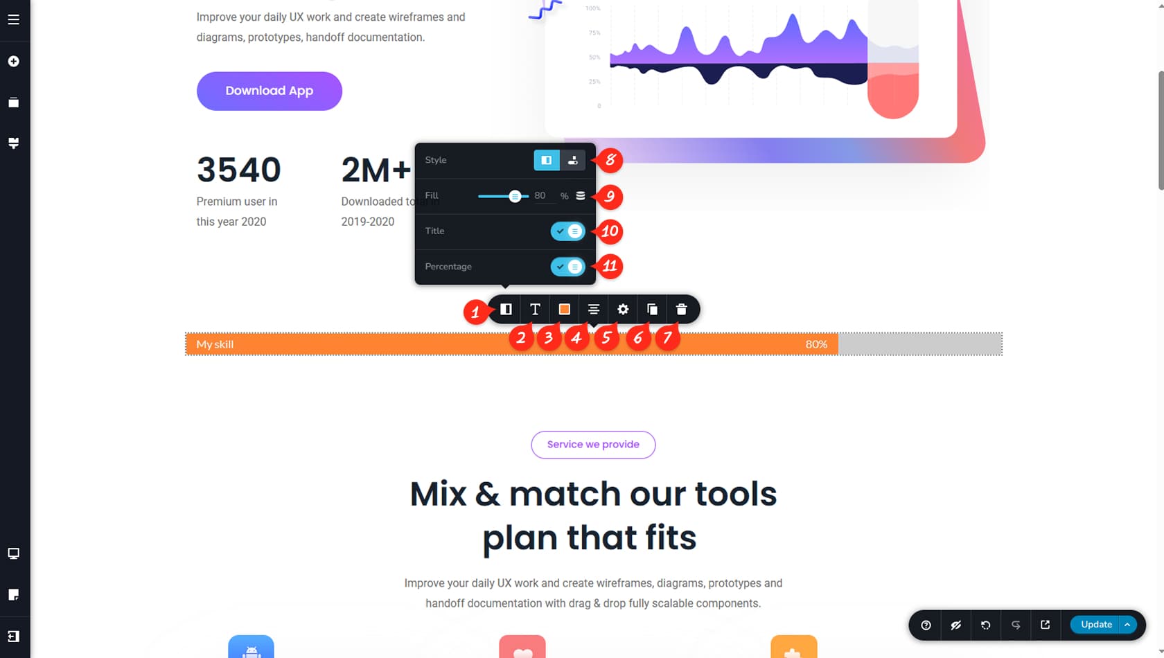
Progress Panel
Here you can open the customization panel for the Progress widget.
Progress Typography
This setting controls the typography for both the title and the percentage values.
Progress Colors
Here you can adjust the colors of the title, percentage, bar, background, and shadow, including separate hover color options.
Progress Alignment
This control sets the alignment of the Progress widget.
Progress Height/Width
Here you can define the width and height of the progress bar, as well as access the Styling and Effects panels.
When referring to the Styling Panel of the widget, please see the Widgets Styling article for more details and an in-depth guide. Note that most widgets share similar styling options, with slight variations depending on the specific widget.
Duplicate Progress Widget
This option duplicates the Progress widget.
Delete Progress Widget
This option deletes the Progress widget.
Progress Bar Style
Here you can choose whether the progress title appears inside or outside the skill bar.
Progress Percentage
This setting defines the percentage value displayed by the skill bar.
Toggle Title Visibility
Here you can toggle the visibility of the title.
Toggle Percentage Visibility
Here you can toggle the visibility of the percentage value.