Tabs
The Tabs widget is a powerful organizational tool that allows you to present multiple sections of content within a single, space-efficient layout. By grouping information under selectable titles, it helps reduce visual clutter while making navigation more intuitive and interactive. Each tab functions like its own editable workspace, giving you full freedom to add columns, text, images, buttons, or any other elements, making it ideal for FAQs, feature breakdowns, pricing details, or structured presentations that benefit from clear separation without creating additional pages.
Tabs Options
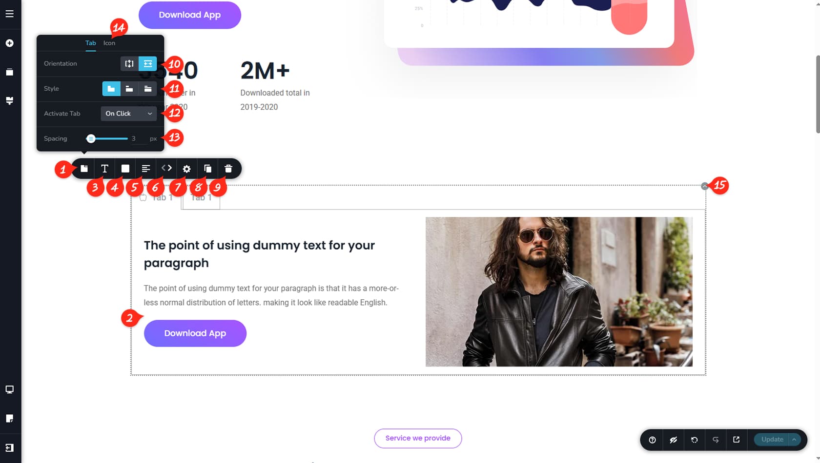
Tabs Options
After dragging and dropping the Tabs widget into your editor, you can customize it using the toolbar. Select the left-most icon to open the Tabs Panel, where various visual options for your tabs are available.
Tab Contents
Each tab includes its own unique content area. You can edit it freely, add widgets, and use all standard builder features inside it. In the example shown, the content includes two columns, a title, a description, a button, and an image. Switching between tabs will display the content assigned to the selected tab. You can also rename a tab by clicking its title and editing the text directly. Finally, we look into more details for changing the content area below.
Tab Title Typography
This setting controls the typography of the tab titles.
Tab Title Colors
Here you can customize the colors of the background, borders, shadows of the tab titles. Separate color options are available for Hover and Active states.
Tab Title Alignment
This control changes the alignment of the tab titles.
Reorder Tabs
You can reorder tabs using the small arrows on the left or right. This option appears only when multiple tabs exist.
Tabs Styling
This opens a simple Styling panel where you can adjust padding and corner radius for the Tab titles.
When referring to the Styling Panel of the widget, please see the Widgets Styling article for more details and an in-depth guide. Note that most widgets share similar styling options, with slight variations depending on the specific widget.
Duplicate Tab
This control duplicates the selected tab along with its content.
Delete Tab
This option deletes the selected tab and its content.
Vertical / Horizontal Tabs
Here you can switch between vertical and horizontal tab layouts. With vertical tabs, the content appears to the right; with horizontal tabs, it appears underneath.
Tabs Visual Styles
This setting changes the tab style between three designs: connected tabs, separated tabs, or text-only tabs divided by a line from the content.
Click / Hover Activation
Tabs can normally be opened by clicking them, but this option allows switching tabs on hover instead.
Tab Title Spacing
Here you can define the spacing between tab buttons, adjustable from 0 to 100 pixels.
Tab Title Icon
Within the Icon tab, you can add an icon to the tab button and position it above, below, left, or right of the tab text, as well as adjust spacing between the icon and text.
Content Toolbar
These options control the tab content area, allowing you to modify background color, borders, shadows, and access the Styling and Effects panels, or duplicate or delete the entire widget.