Working with Blocks
Blocks, also known as sections, are the foundation of building a page. Each block represents a distinct part of your website, such as a header, hero area, team section, or contact section.
In this article, you’ll learn how blocks work, how they fit into the overall builder structure, and what features and options are available when working with them.
Ways to start building blocks
Creating a block from scratch
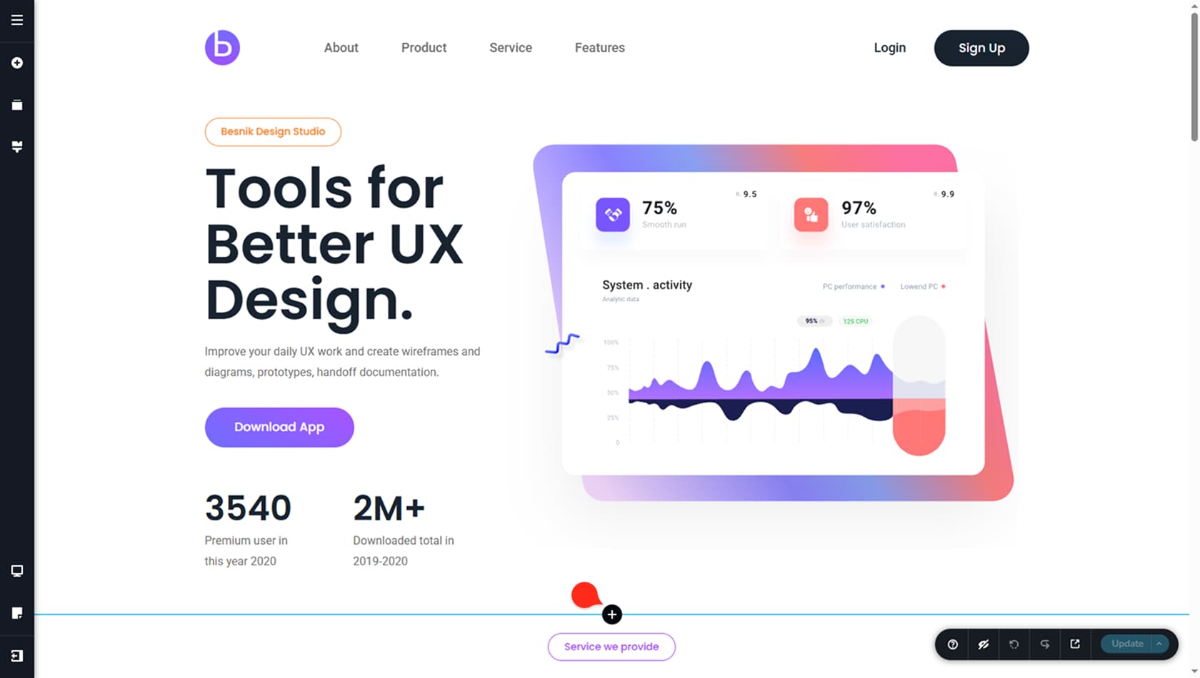
To create a block from scratch, start by adding a new block using the plus icon. You will see it between existing blocks, or in the center of the page if no blocks have been added yet. Clicking the icon opens up the premade blocks popup.
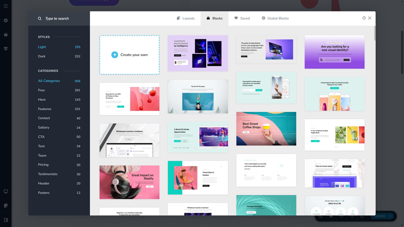
Selecting the option to create your own will insert a new, empty block that you can design how you like, with full control over layout and content.
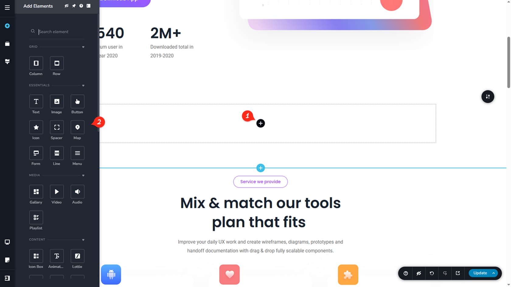
Once the blank block is in place, open the Widgets panel on the left and drag and drop widgets into the block to build your design. Each widget has its own dedicated guide in this documentation, so you can quickly learn what it does and how to customize it to match the section you have in mind.
Import an existing block
Another way is to insert a prebuilt block. Choose one directly from the premade block popup, or refine your results using categories, keyword search, and the light or dark style filters. After you select a block, it is placed on your page and automatically inherits your global colors and typography.
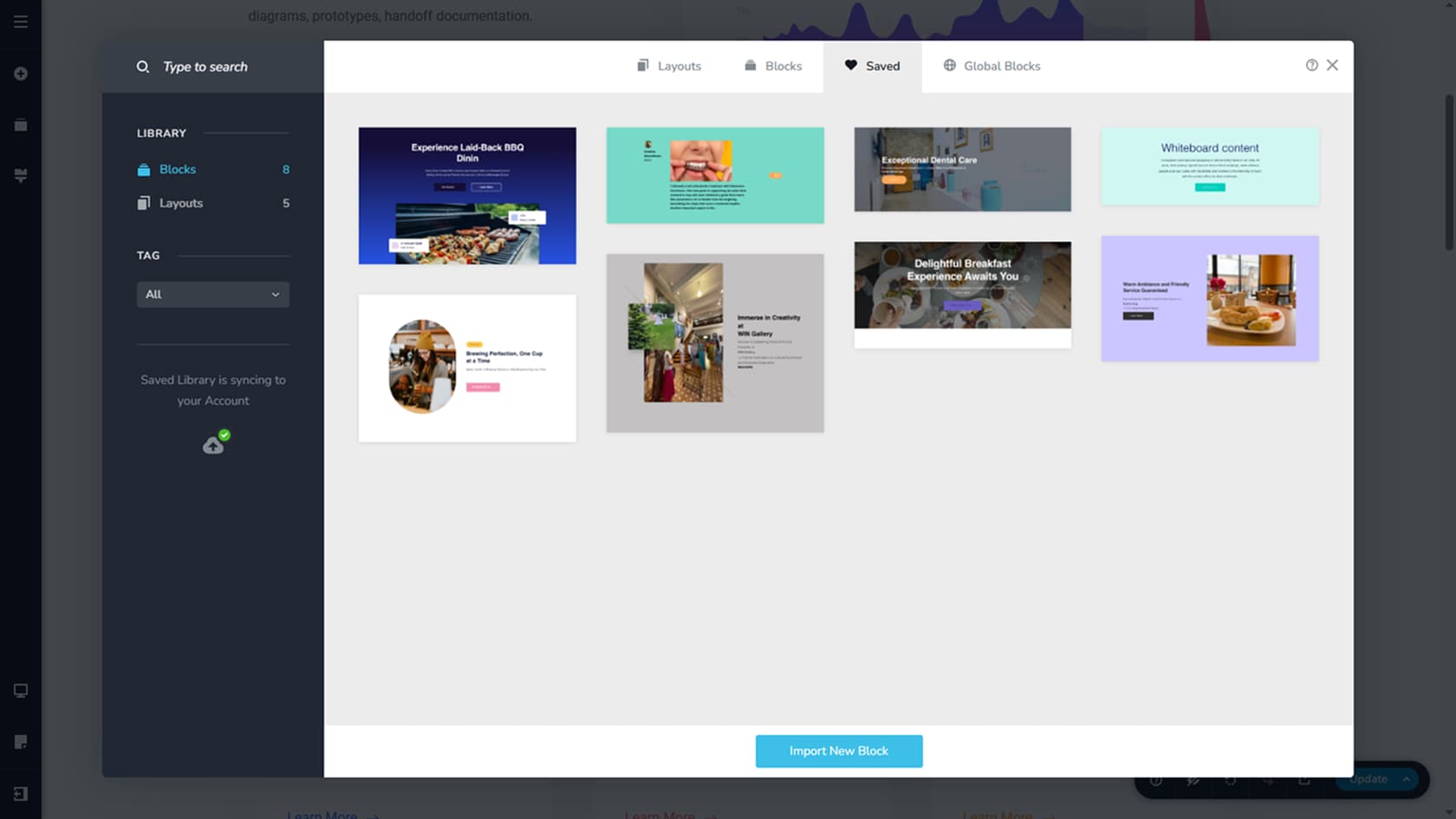
You can also add a block you previously saved. Open the Saved tab at the top, then select Blocks in the left panel. Once you click one, it is inserted into the page and adapts to your global styles. For more details, see the Saved Blocks & Layouts article.
Start with premade blocks to create your page faster. Adding premade blocks creates the structure of your page and you only need to replace images and text, rather than creating everything from scratch.
The Block Options Toolbar
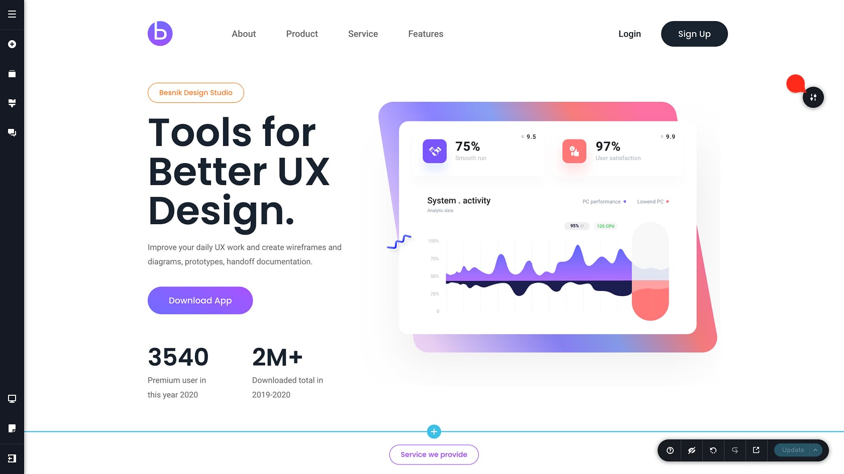
When you hover over your page, the block under your cursor will show a round handle/bubble in the top-right corner. Click it to open the block settings toolbar, also known as the options toolbar.
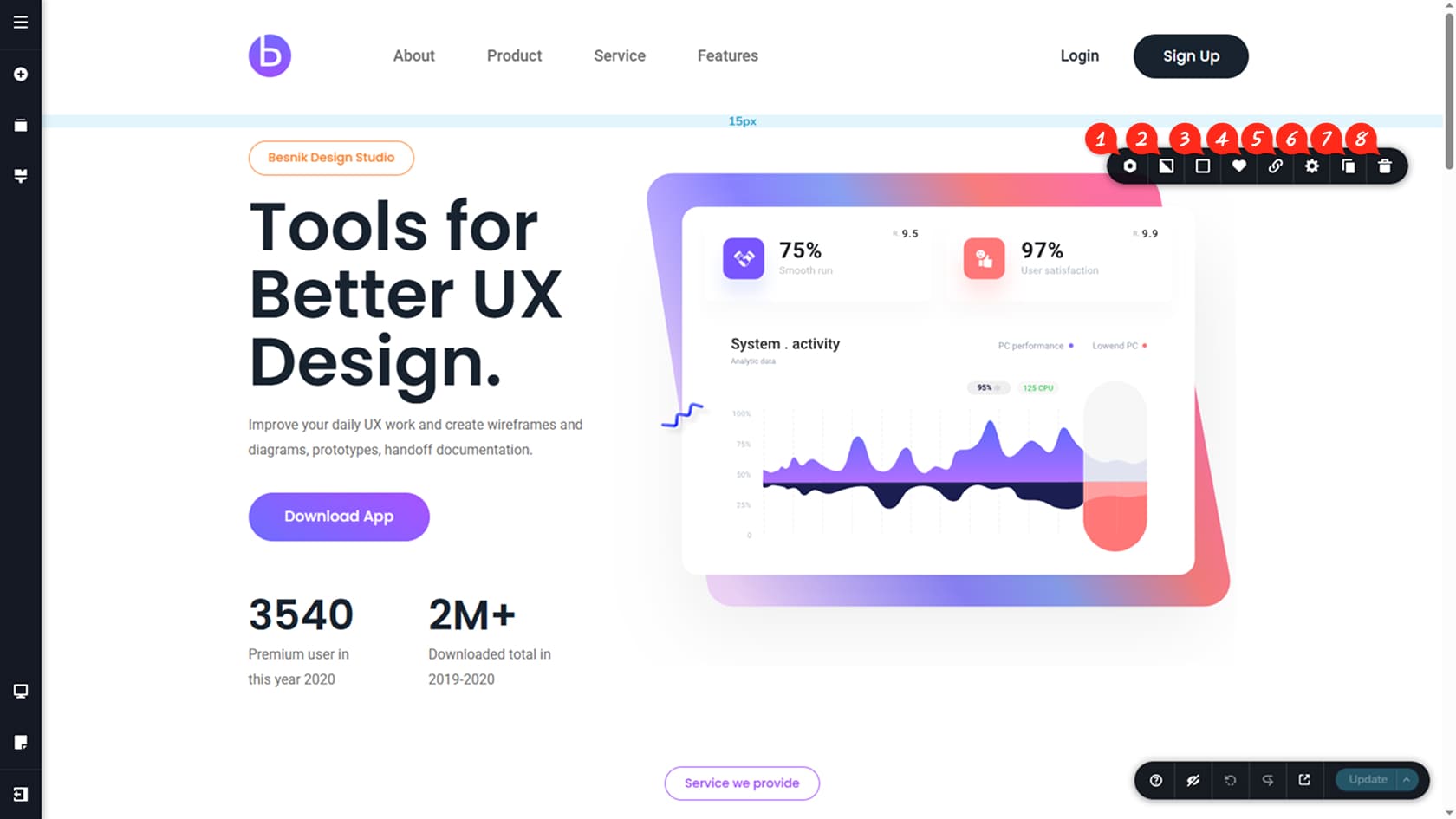
The block toolbar is the main control center for editing a block. It gives you quick access to everything you need, including sizing, background settings, animations, and decorative options like top and bottom shapes.
Block Settings
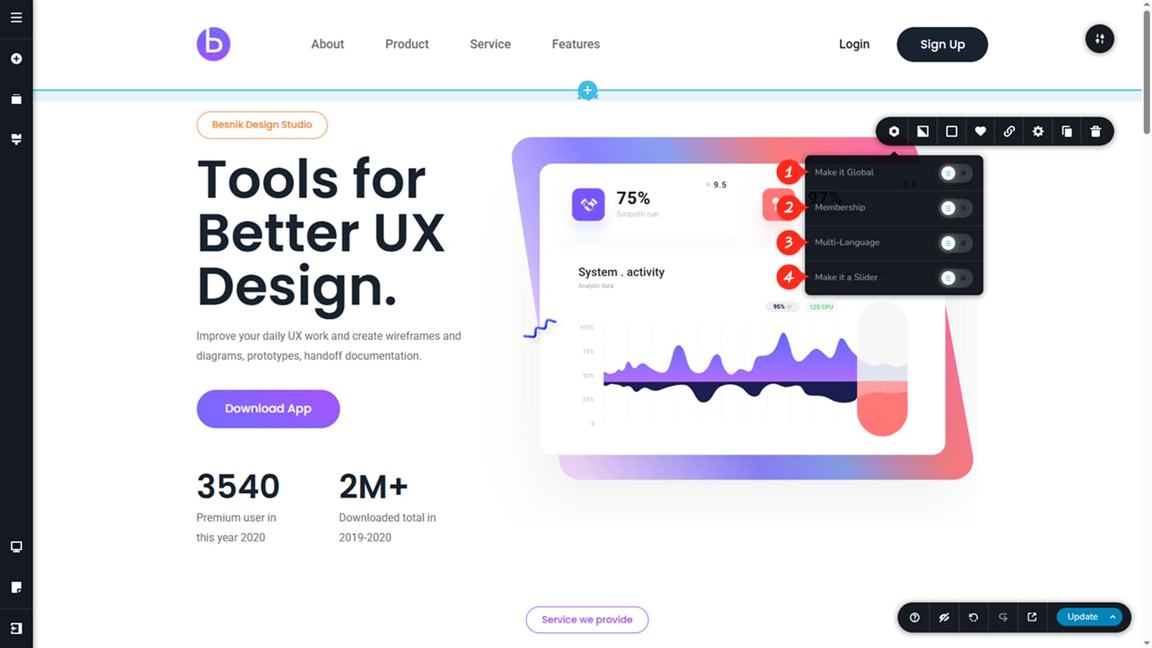
Make it global
This setting converts a block into a global block, so it can be shown across all pages or only on selected pages in your project. When you edit a global block, the updates are applied everywhere it is used. Learn more in the Global Blocks article.
Membership
You can also restrict a block’s visibility to specific user groups. Once enabled, you can choose exactly who can see it.
Multi-language
You can also restrict a block’s visibility to a specific language. Once enabled, you can choose exactly on what language the block is visible.
Make it a slider
This option turns the block into a slider, so the same block area can display multiple slides, each with its own content. More details are available in the Slider article.
Background Options
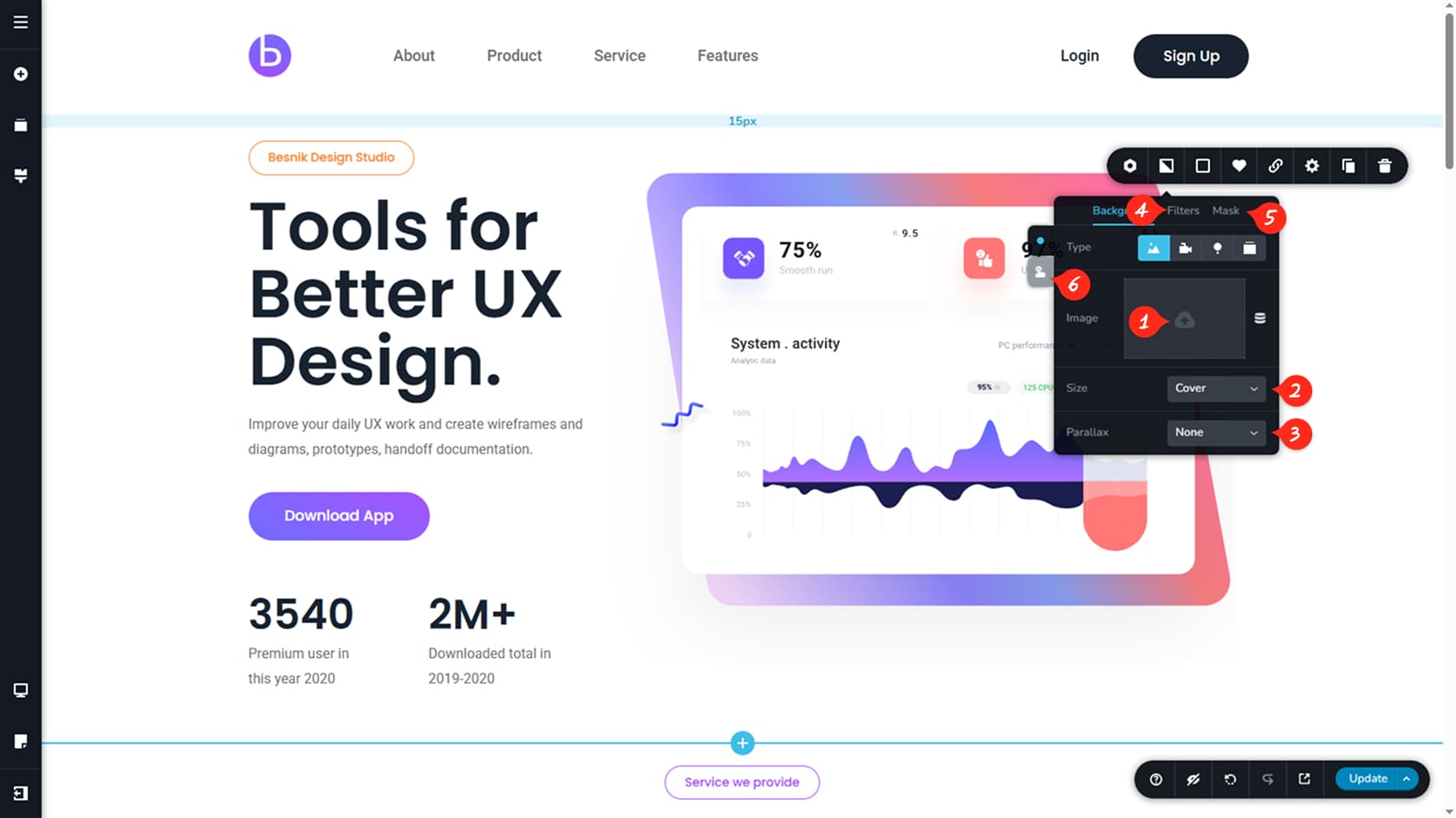
Image
This option lets you choose an image to use as the block’s background.
Size
You can control how the background image fits inside the block by selecting modes like cover, auto, or contain. The easiest way to find the right look is to switch between them and pick the one that fits your design best. You can also adjust the setting separately on tablet and mobile without affecting the desktop version.
Parallax
You can enable a parallax effect so the background scrolls at a different speed than the page, creating a subtle depth effect.
Filters
This option opens basic image filters, giving you quick control over settings like brightness, contrast, and saturation.
Mask
This option applies an image mask on top of the background. You can adjust the mask size and position to get the exact framing you want.
Color Options
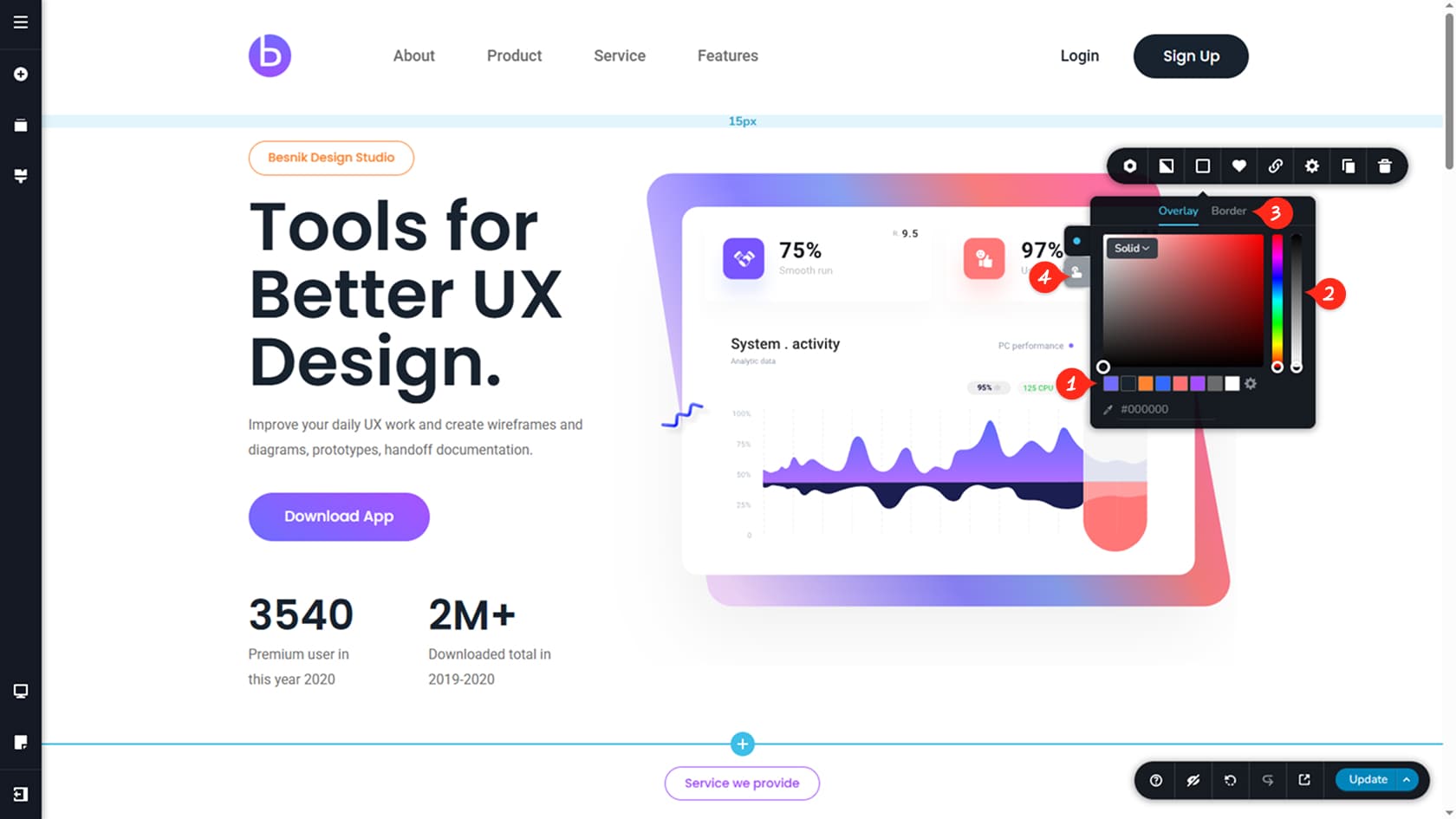
Global color palette
Here you can choose a background color for the block, either from your global colors or by picking a custom color from the palette.
Always select from the global colors at the bottom. This will enable easy global color changes later on from the global styling options.
Opacity adjustment
You can also adjust the color opacity.
If the block uses a background image, the image will sit behind the color, so lowering opacity creates a transparent overlay effect.
Border options
This section lets you add a border to the block and control its width, color, and style, including switching from solid to dotted.
Hover state colors
You can also define a hover state, so the block’s color changes when a visitor hovers over it.
Save Block
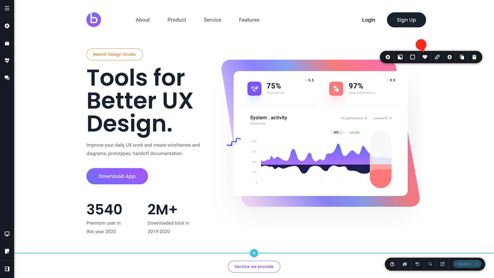
This option saves the current block (structure and content), so you can reuse it later anywhere in this project.
Keep in mind that saving a block creates a snapshot. If you edit the block afterward, those changes will not reflect the saved version. To refresh it, save the block again and remove the older saved version from the list.
Access your saved blocks in the premade blocks popup under the Saved tab.
Blocks can link to:
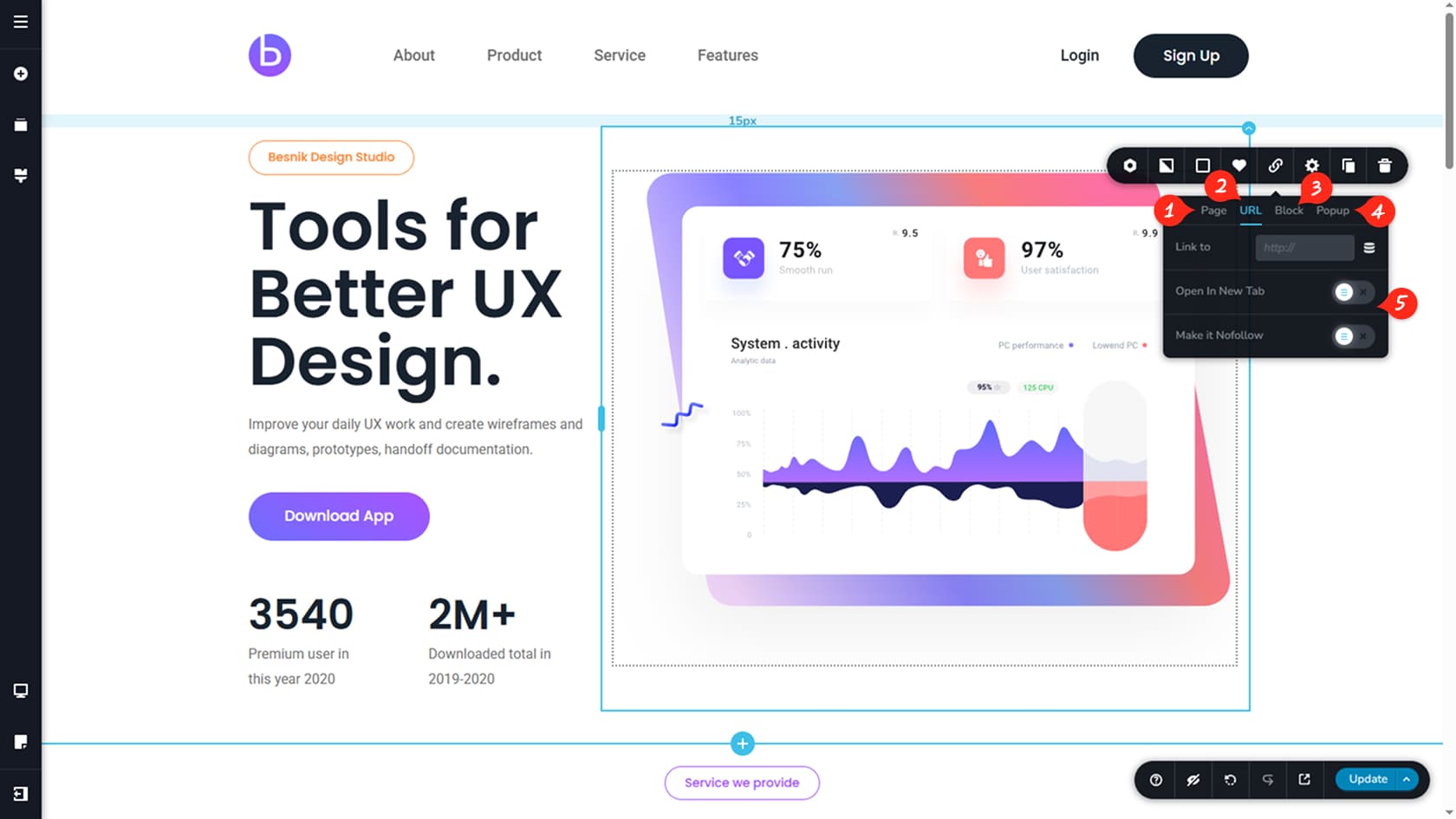
Page
You can link the block to an internal page within your project.
URL
You can paste any external URL, or set a dynamic destination, such as a specific post or the site homepage.
Another block on the page
You can link the block to an anchor on the same page, when the block is clicked it scrolls visitors to the selected block.
Popup
Clicking the block will open a popup. More details are covered in the Popup Builder article.
Link options
You can choose to open the link in a new tab and optionally mark it as nofollow. Nofollow links tell search engines not to pass ranking signals to the destination page.
Other block settings
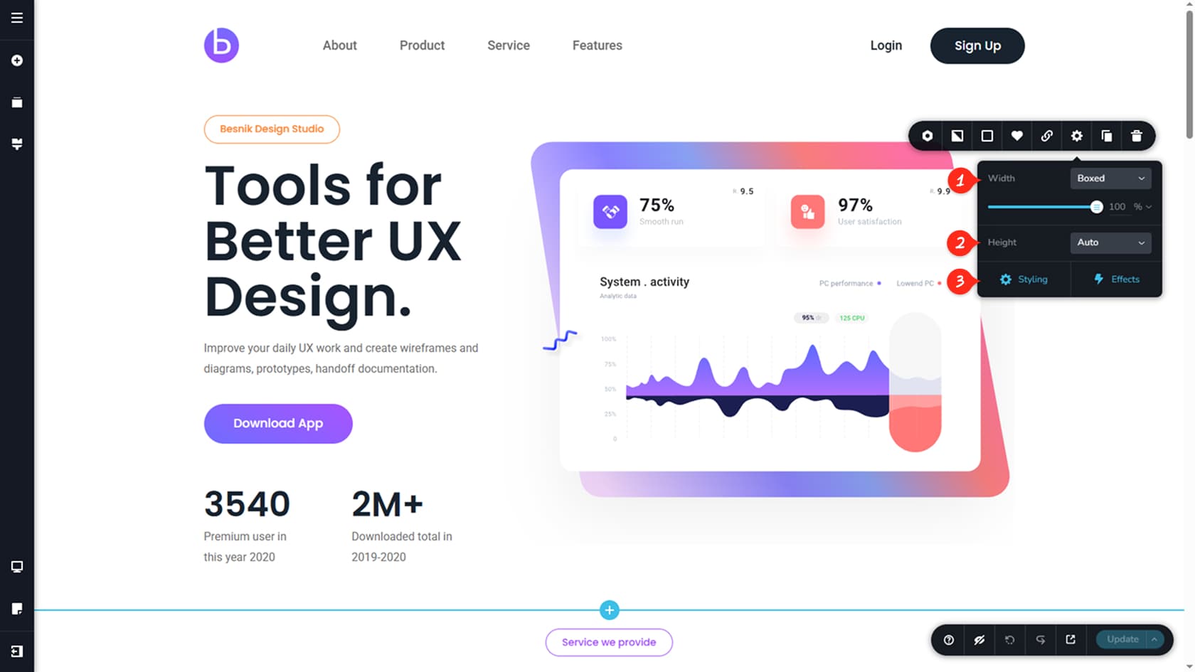
Width
Here you can adjust the block width. Choose between Boxed for a controlled, percentage-based width, or Full Width to span the entire screen. By default, Boxed at 100% uses a 1170 px container.
Height
From here, you can set the block height. Options include Auto, which adapts to the block’s content, Custom, which uses a fixed pixel value, and Full Height, which matches the viewport height.
Styling & Effects
Here you can access additional styling and effects options. This will open a right sidebar with more advanced options such as padding, margins, CSS, effects & animations, top and bottom shapes for blocks and more. For a deeper dive, see the Widget Styling & Animations articles.
Duplicate Block
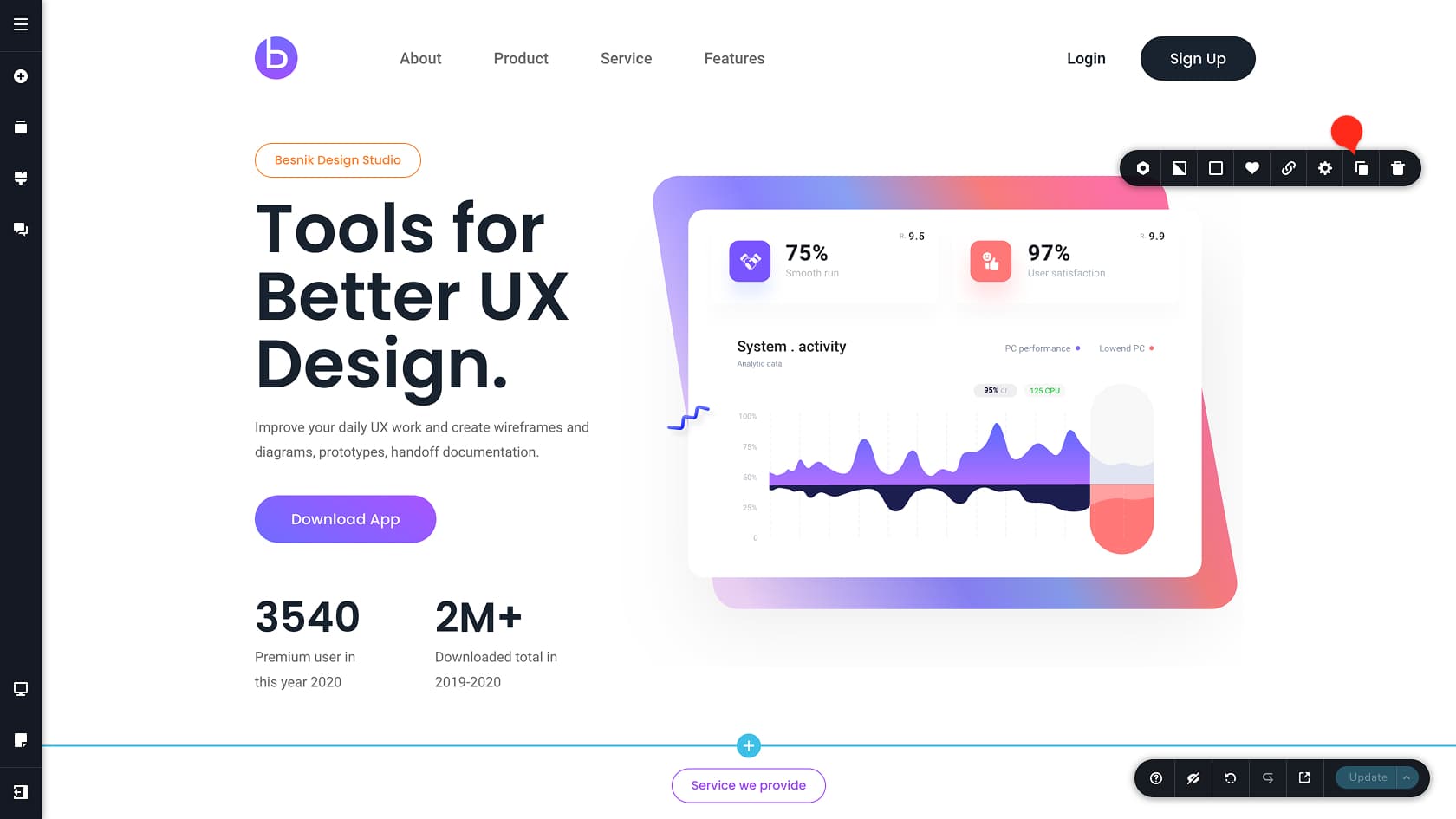
Duplicates the selected block and places an identical copy directly below it.
This is a fast way to reuse a block and make variations instead of starting from scratch.
Delete Block
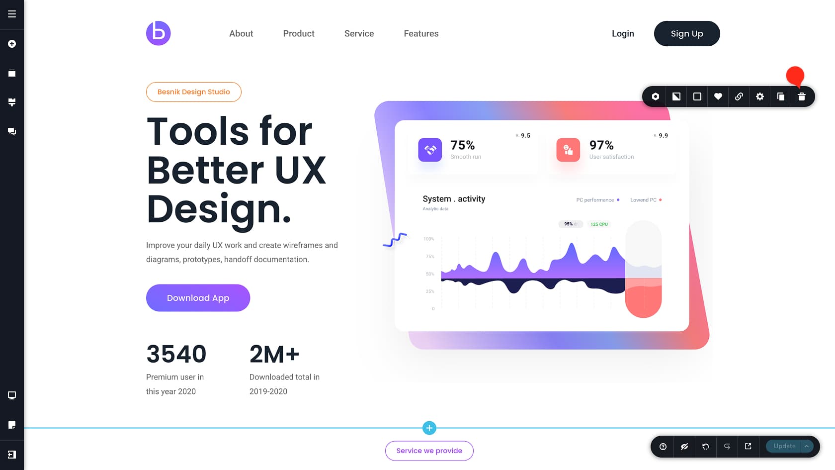
Removes the selected block from the page.
You can bring it back with Undo (CTRL+Z on Windows or CMD+Z on Mac)