Post Navigation
The Posts Navigation widget provides a simple and effective way to move between related content by displaying links to the previous and next assets within a structured layout. By guiding visitors through content in a natural sequence, it improves navigation flow, encourages continued browsing, and helps keep users engaged without needing to return to listing pages. Its clear visual structure makes transitioning between posts or assets quick and intuitive.
This widget is only available within assets such as blog posts or custom asset pages.
Post Navigation Options
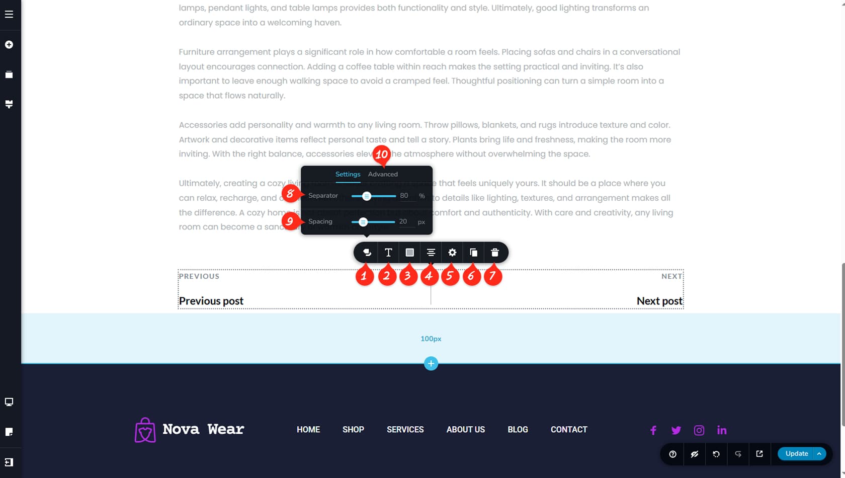
Navigation Options
After dragging and dropping the widget, click anywhere within its area to open the toolbar. Select the first icon on the left to access its unique settings.
Widget Typography
Here you can adjust the typography of the asset titles and their labels.
Widget Colors
This section allows you to customize the colors of the labels, titles, and the separator.
Widget Alignment
This option controls the alignment of the widget.
Widget Width
Here you can define the widget width and open the Styling and Effects panels to modify paddings, margins, animations, and more.
When referring to the Styling Panel of the widget, please see the Widgets Styling article for more details and an in-depth guide. Note that most widgets share similar styling options, with slight variations depending on the specific widget.
Duplicate Widget
This control duplicates the widget.
Delete Widget
This control deletes the widget.
Widget Separator
Here you can set the separator height using percentage values relative to the widget’s container.
Label / Title Spacing
This option adjusts the spacing between the label and the title.
Display Toggles
The Advanced tab includes toggles for the label, title, and separator, allowing you to show or hide them as needed.