Icon Box
The Icon Box widget combines multiple essential elements into a single, ready-to-use layout, making it ideal for highlighting features, services, or key information without building a structure from scratch. By grouping an icon, text content, and an optional button into a balanced two-column design, it helps maintain visual consistency while speeding up the creation process. This structured combination improves clarity, draws attention to important messages, and allows quick customization of icons, titles, descriptions, and calls to action, making it a practical solution for creating organized and engaging content blocks.
The Icon Box offers a flexible layout that visually behaves like a two-column structure without relying on traditional column widgets, allowing more creative freedom beyond standard layout rules.
Three In One
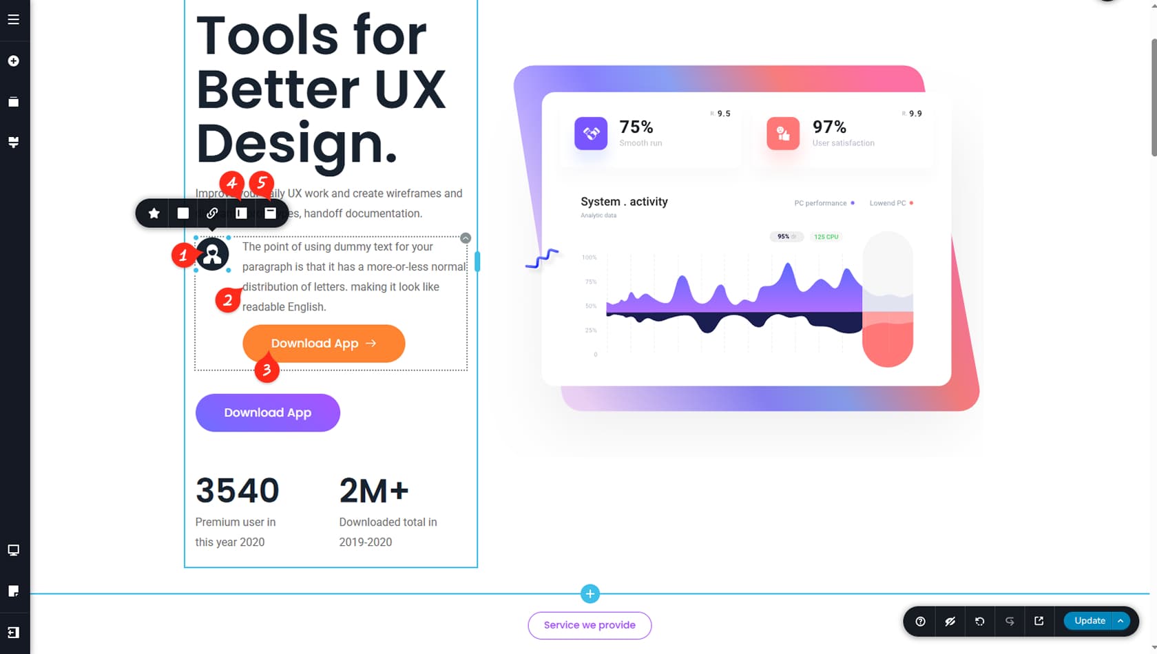
The Icon Box is a three-in-one solution that lets you manage an icon alongside a text and button element placed side by side.
The Icon
The icon section includes the same settings as a standard Icon widget. More details about icon options can be found in the Icon article. In addition, the icon area includes several extra settings described below.
The Text
The text section uses the same settings as a regular Text widget. More details about text options are available in the Text article.
You can split this text section into a header and a paragraph or more if needed.
The Button
The button is an optional element within the Icon Box widget. You can customize it just like a standard button (see the Button article for more details) or remove it if it is not needed.
Switch Sides Alignment
This control allows you to switch the position of the icon and the text with button sections.
Icon Vertical Alignment
This setting lets you vertically align the icon to the top, center, or bottom relative to the text and button area.