Counter
The Counter widget is a dynamic visual element designed to highlight achievements, milestones, or key statistics in an engaging way. By animating numbers from a starting value to a final result, it naturally draws attention and adds a sense of movement to your layout, making important data more impactful and memorable. Commonly used for metrics such as client counts, completed projects, or performance highlights, the Counter helps communicate credibility and progress while allowing full customization to match the style and tone of your project.
Counter Options
Options Panel
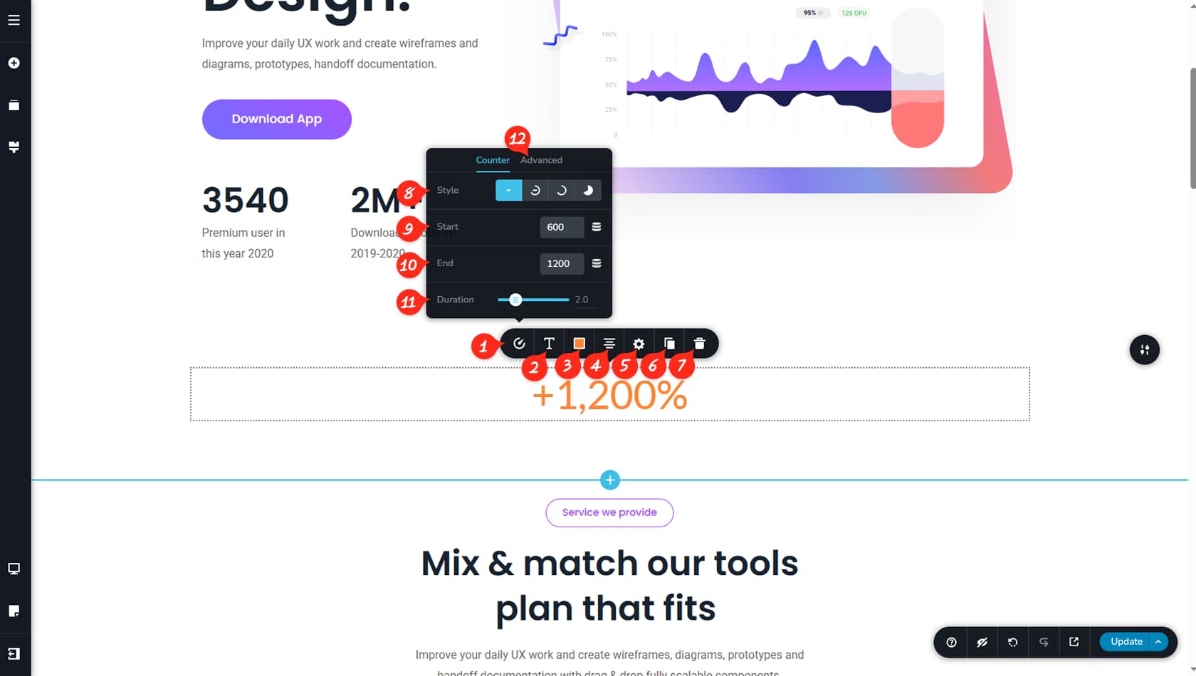
After dragging and dropping the Counter widget, click it to open the toolbar and access its customization options. The icon on the far left opens the Counter Panel.
Counter Typography
Here you can adjust the typography of the counter.
Counter Colors
This section allows you to modify the colors of the counter, including its prefix, suffix, and shadow, along with hover color settings.
Counter Alignment
This control sets the alignment of the Counter widget.
Counter Styling
This opens the Styling Panel, where you can manage paddings, margins, or animations.
When referring to the Styling Panel of the widget, please see the Widgets Styling article for more details and an in-depth guide. Note that most widgets share similar styling options, with slight variations depending on the specific widget.
Duplicate Counter
You can duplicate the widget using this option.
Delete Counter
This control deletes the widget.
Counter Style
Within the panel options, you can change the counter style, choosing between a circular layout with the value inside, a circular-only style, or a chart-style circle.
Starting Value
Here you can define the starting value of the counter.
End Value
This setting determines the final value where the counter animation ends.
Counter Duration
This option controls the duration of the counter animation.
Counter Advanced Options
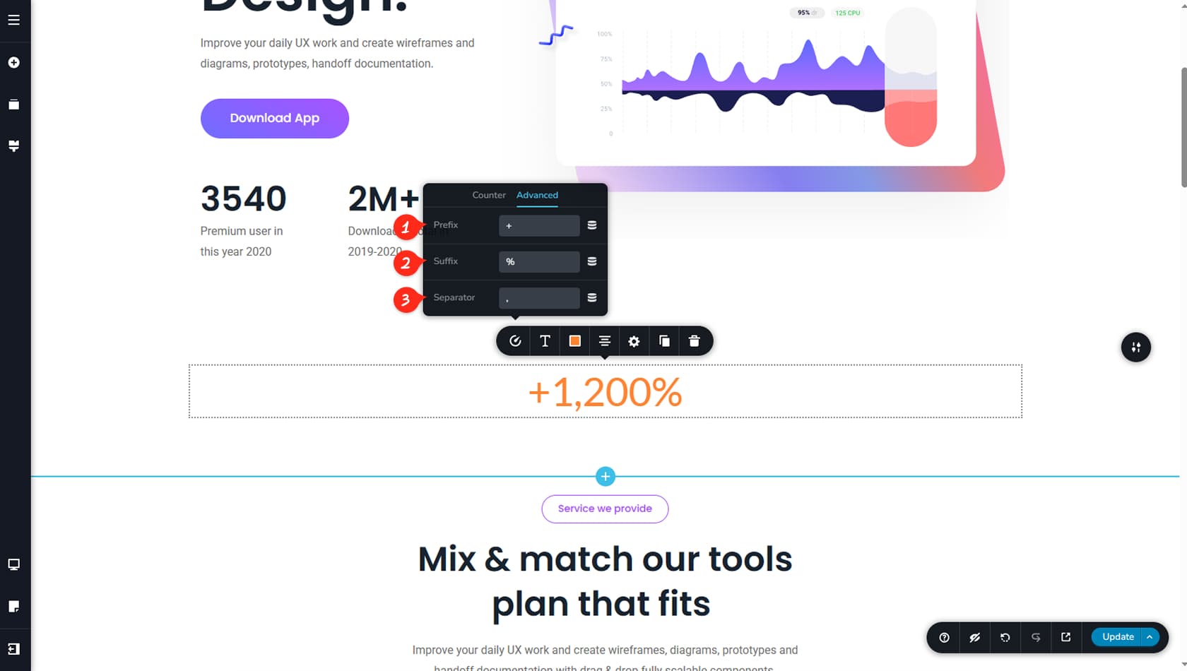
Under Advanced options, you can add a prefix or suffix and apply a simple separator to the value.
Advanced Options
Prefix
This setting allows you to add a prefix to the counter, which will appear before the numeric value.
Suffix
This setting allows you to add a suffix to the counter, which will appear after the numeric value.
The prefix and suffix fields can contain any text, not just single symbols; full words or phrases can also be used.
Separator
Finally, the separator is displayed between every three digits of the counter value, and it can be removed entirely if desired.