Icon
Icons play an important role in improving visual communication and guiding user interaction across a website. They help convey meaning quickly, support navigation, and enhance the overall design without relying entirely on text. The ability to choose from a large built-in icon library or upload custom icons, including GIFs, gives you greater creative freedom to match your branding, highlight key actions, and create more engaging, dynamic interfaces.
Icon Toolbar & Settings
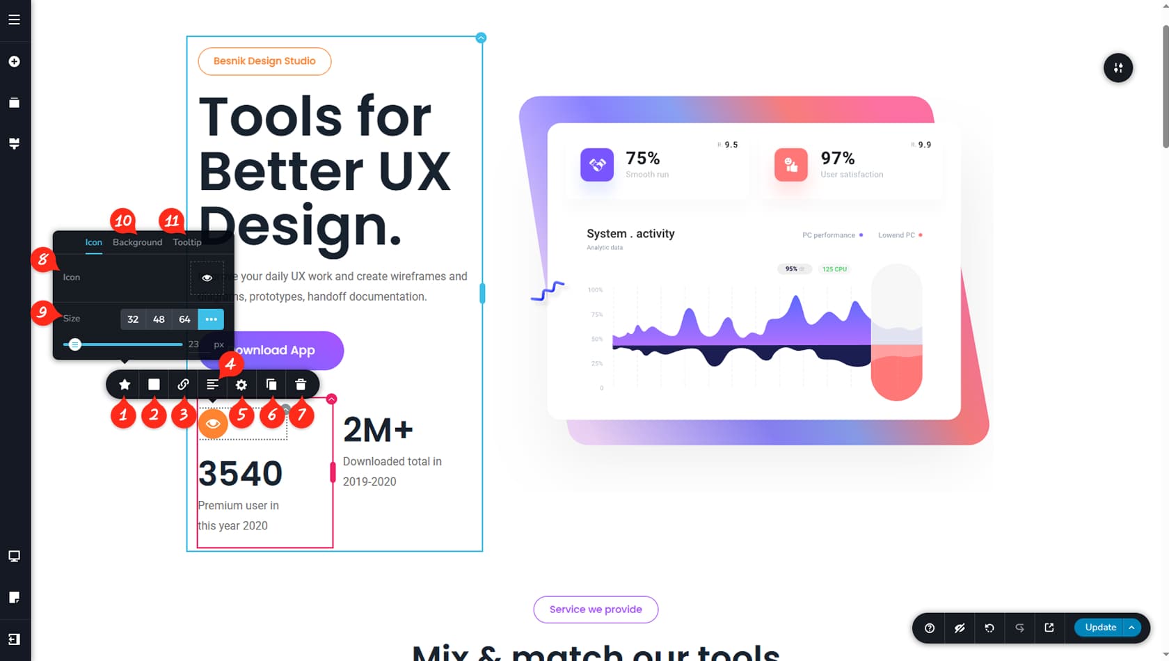
Icon Settings
This control opens the dedicated panel for editing icons.
Icon Colors
Here you can adjust the icon’s color, background, border, opacity, and hover settings.
Icon Link
You can assign a link to the icon using this option.
Icon Alignment
This setting controls the icon’s alignment, allowing you to choose between left, center, or right.
Icon Styling
This opens the Styling Panel, where you can manage Custom CSS and Animations.
When referring to the Styling Panel of the widget, please see the Widgets Styling article for more details and an in-depth guide. Note that most widgets share similar styling options, with slight variations depending on the specific widget.
Icon Duplicate
You can duplicate the icon using this option.
Duplicating an icon does not create a new widget; it adds another icon next to the existing one within the same widget. You can then adjust the spacing between them or change their order. Dragging and dropping an icon from outside the widget will create a new Icon widget.
Delete Icon
This control removes the selected icon from the widget. If multiple icons are present, only the chosen one will be deleted.
Icon Library
Here you can select an icon from the available libraries, including Font Awesome, or add a custom one. More details about adding icons are provided below.
Icon’s Size
This setting adjusts the icon’s size, and the three dots on the right allow you to define a custom value.
Icon Background
This setting manages the icon’s background. Additional details are explained below.
Icon Tooltip
This option enables a tooltip to appear when the icon is clicked.
Icon Library
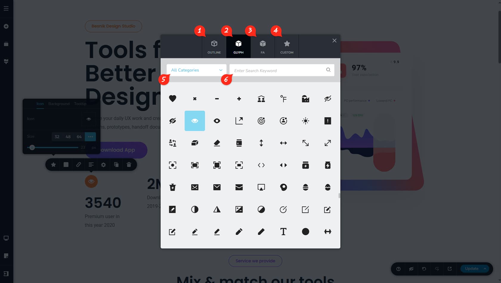
Whenever a widget includes the option to select an icon, this panel will appear. Here, you can quickly choose an icon or upload a new one.
Outline
Here you can select outline icons without a fill color.
Glyph
Here you can choose filled icons.
Font Awesome
Here you can browse icons from Font Awesome.
Custom Icon
Here you can import GIF icons from your device.
Filter by Category
Icons can be filtered by category for easier browsing.
Search Icon
You can also search for an icon directly using a keyword.
Icon Background
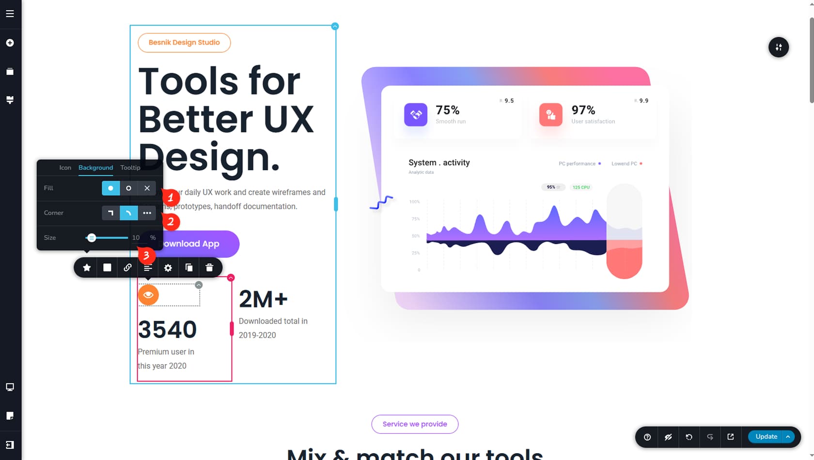
Icon Background Style
Within the Icon Background settings, you can choose between a filled background, an outline, or no background at all so only the icon remains visible.
Icon Background Corners
This setting controls the background corners, allowing you to make them round, square, or any custom shape in between.
Icon Background Size
Here you can adjust the spacing between the icon and the edges of its background or border.