Breadcrumbs
The Breadcrumbs widget provides a clear visual navigation path that helps visitors understand where they are within your website’s structure. By automatically displaying the hierarchy of pages, it improves usability, reduces confusion, and allows users to move back to higher-level sections quickly.
Breadcrumbs Options
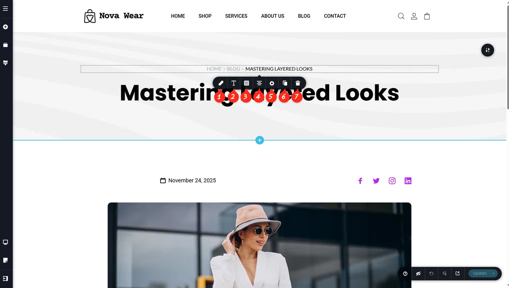
Breadcrumbs Spacing
The Breadcrumbs widget includes only a few simple options. After dragging and dropping it, click any item within the widget to open the toolbar. The first icon on the left controls the spacing between breadcrumb links.
Items Typography
Here you can adjust the typography of the breadcrumb items.
Breadcrumbs Colors
This section allows you to customize the colors of the links and separators, including hover and active states.
Breadcrumbs Alignment
This option sets the alignment of the breadcrumbs.
Breadcrumbs Styling
Here you can open the Styling panel to adjust padding, margins, animations, and more.
When referring to the Styling Panel of the widget, please see the Widgets Styling article for more details and an in-depth guide. Note that most widgets share similar styling options, with slight variations depending on the specific widget.
Duplicate Widget
This control duplicates the widget.
Delete Widget
This control deletes the widget.