Login/Register
The Login Form widget provides a complete access point for visitors to manage their accounts directly on your website, including logging in, registering, or recovering a forgotten password. By offering a structured and customizable interface with flexible field options, typography, and color settings, it helps maintain a consistent visual identity while improving user convenience and security. This widget simplifies account management, encourages user interaction, and creates a smoother, more professional authentication experience within your project.
Before using the login form, visitors must first create an account by registering under a previously configured user type in the CMS. Once registration is completed and the account is approved, they can return to the login form to access their profile, manage their information, or use any features available to their assigned user role; this also includes visibility over blocks or pages that are visible to that specific user role.
Login Widget Options
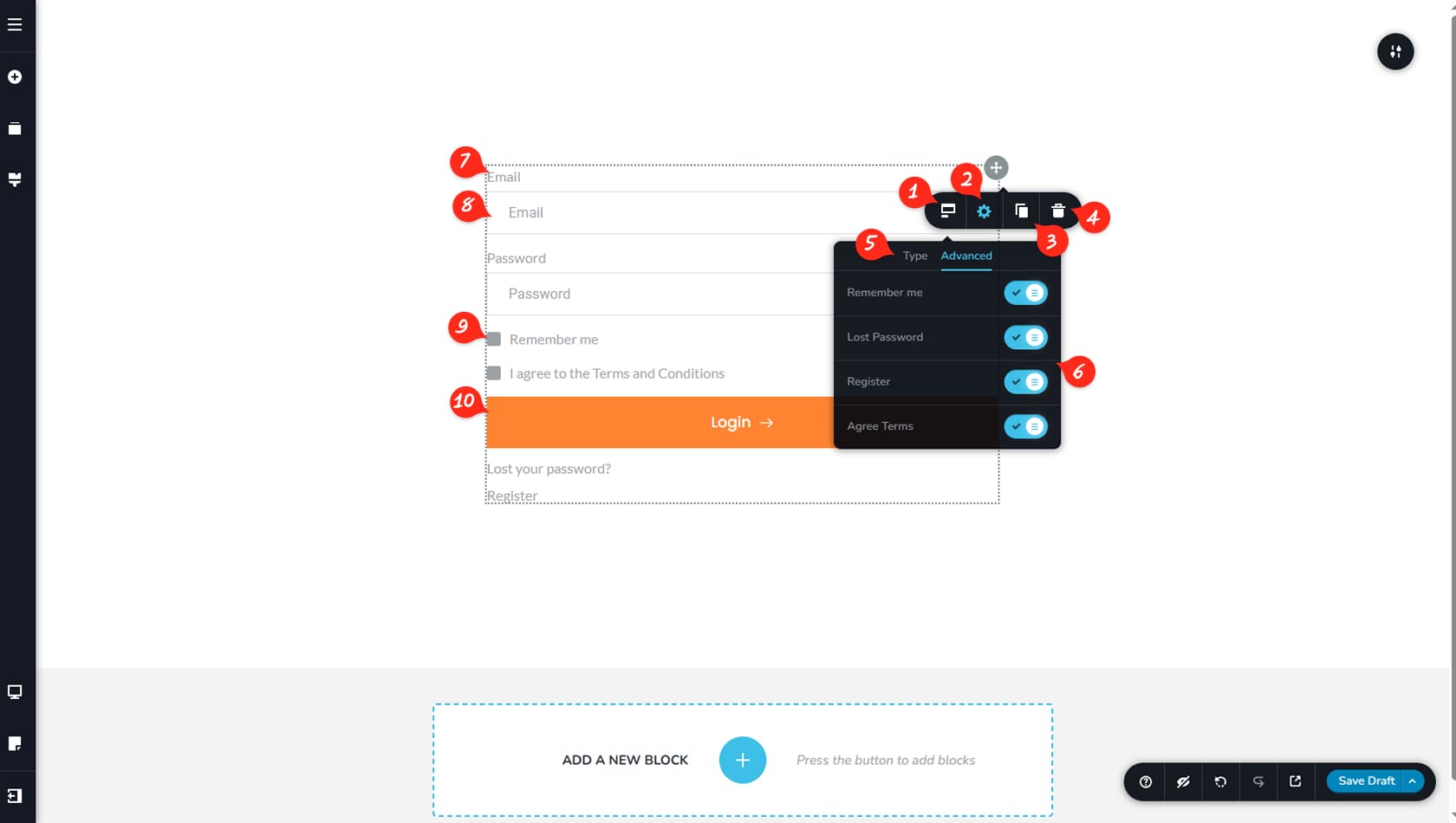
Login Form Options
After dragging and dropping the Login widget, you can access its options by selecting the left-most icon in the toolbar. This opens the Login form settings panel.
Widget Styling
This option opens the Styling and Effects panel, where you can adjust padding, margins, animations, and more.
When referring to the Styling Panel of the widget, please see the Widgets Styling article for more details and an in-depth guide. Note that most widgets share similar styling options, with slight variations depending on the specific widget.
Duplicate Widget
This control duplicates the widget.
Delete Widget
This control deletes the widget.
Login Widget Type & Advanced Options
Here you can switch between the Type tab and Advanced settings. The Type tab lets you choose between four form types: Login, Register, Forgot Password, or Authorized. Each type includes different roles, fields, and configuration options available in the Advanced tab.
Widget Advanced Tab
Within the Advanced tab, you can enable or disable specific options for the selected form type.
Widget Labels
When enabled, labels can be edited directly by clicking and modifying the text. Basic customization settings are also available, with more details provided later in this article.
Widget Form Fields
This section allows you to configure field settings such as labels, placeholders, and additional options. Detailed field settings are explained below.
Optional Fields
Optional fields and checkboxes can be customized by clicking them, allowing you to adjust typography, colors, hover colors, and alignment.
Login Button
Finally, you can customize the form button using the same settings available in the Button widget. For more information, refer to the “Button” article.
Login Fields Options
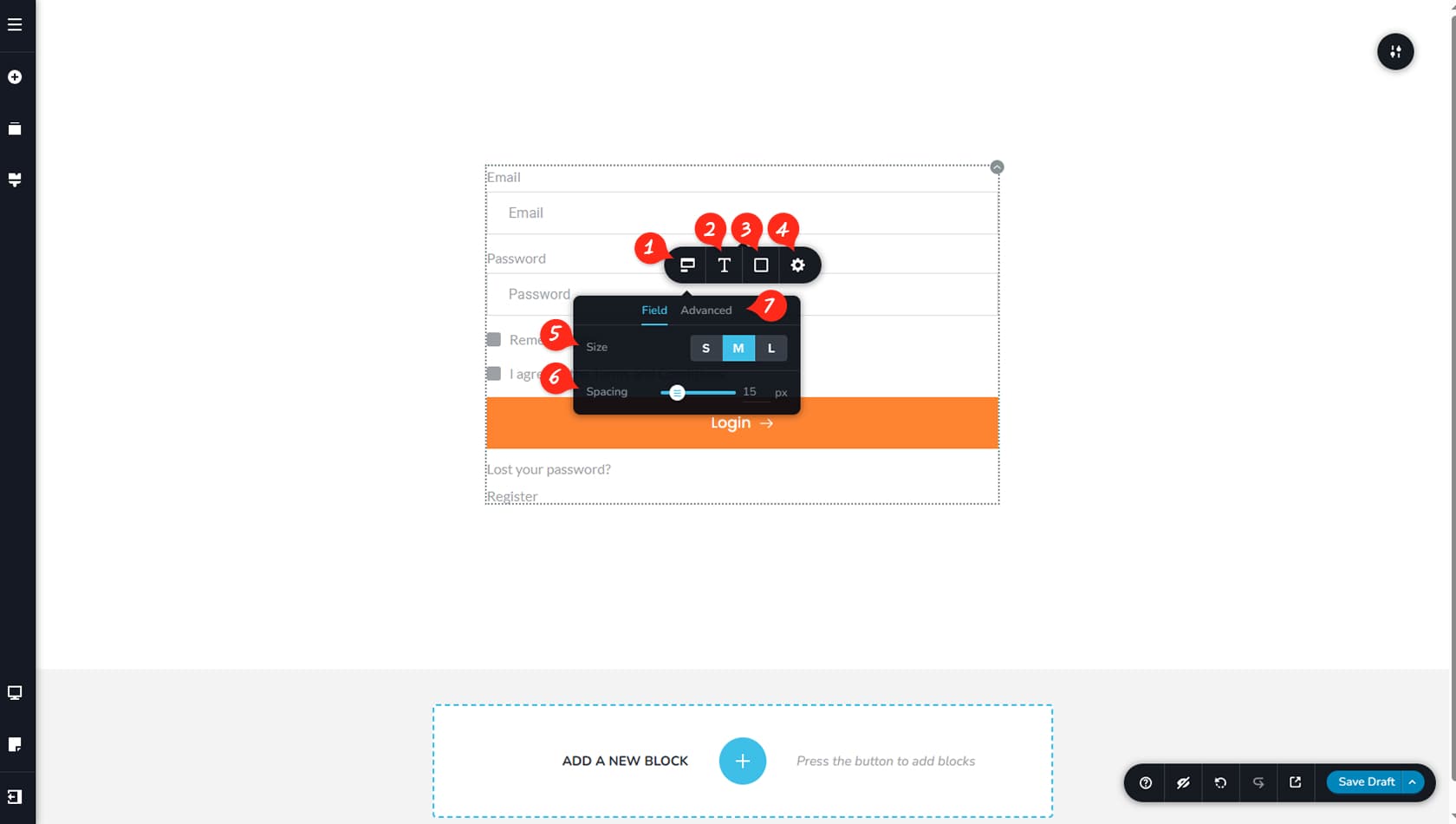
Form Field Options
Clicking on a form field will reveal additional field options. Select the left-most icon to open the Field tab.
Form Field Typography
Here you can adjust the typography of the field placeholders and user input text.
Form Field Colors
This section allows you to customize the colors of the field text, background, border, and shadow, including hover color options.
Form Field Width
Here you can define the field width using percentage values within the form and access the Styling panel to adjust corner radius.
Fields will automatically align side by side when their combined width is below 100%.
Form Field Size
This setting lets you choose between small, medium, or large field sizes, which affects height and padding.
Form Field Spacings
Here you can adjust the spacing between fields by modifying the spacing value in pixels.
Toggle Label / Placeholders
You can switch to the Advanced tab to toggle labels or placeholders on or off.
Login Label Options
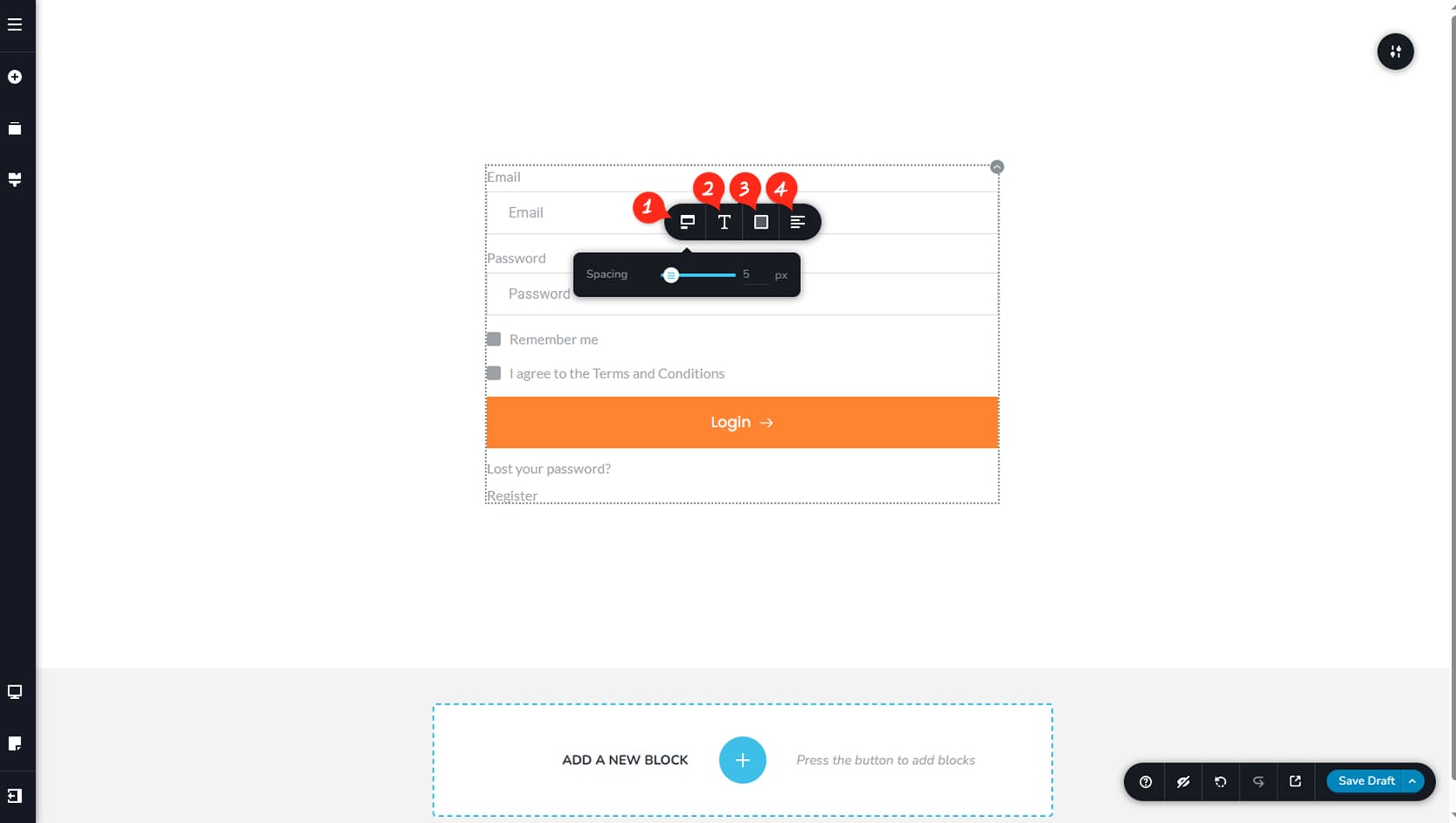
Label Options
When labels are enabled, you can click them to edit the text just like any other text element in the editor. Each label also includes its own toolbar for additional customization. The left-most icon opens options to adjust the spacing between the label and the form field.
Label Typography
Here you can customize the typography of the labels.
Label Colors
This section allows you to adjust the label colors.
Label Alignment
This option controls the alignment of the labels.
Form Alternatives
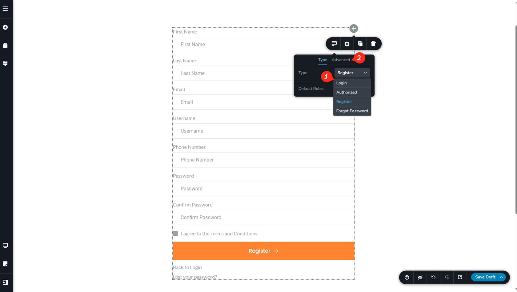
Form Purpose
In the Type tab of the widget toolbar, you can select the form type, switching between Login, Authorized, Register, or Forgot Password. Each type includes its own specific set of fields and configuration options.
For example, the Register form includes the following fields by default: “First Name”, “Last Name”, “Email”, “Username”, “Phone Number”, “Password”, “Confirm Password”, an agreement checkbox, and a Register button. All fields except the Email field and the Register button can be disabled from the Advanced tab.
Toggle Type Fields
The Advanced tab determines which optional fields and features are enabled within the selected form type.