Button
Buttons are essential interactive elements that guide users toward meaningful actions across your website. They help create clear navigation paths, encourage engagement, and support goals such as exploring content, submitting information, or completing conversions. Well-designed buttons improve usability by providing visual cues and consistent interaction patterns, making it easier for visitors to understand where to click and what to do next while maintaining a cohesive and intuitive user experience.
Button Options
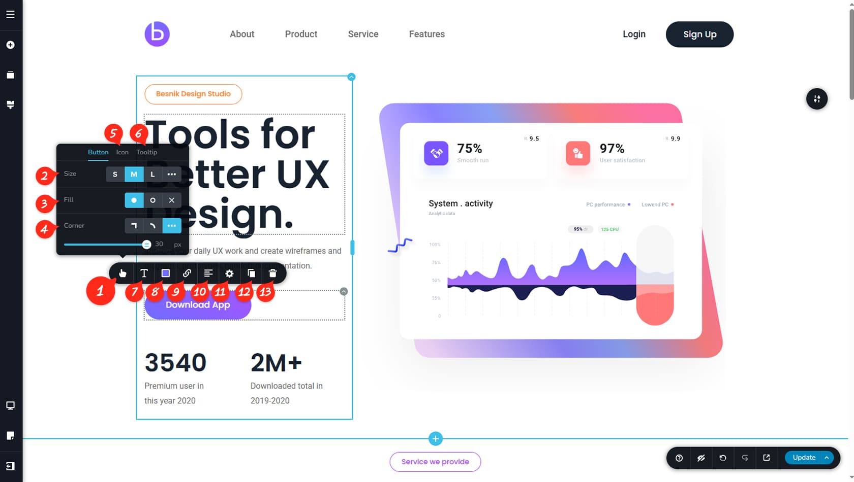
Button Options
The Button widget includes several important customization options. To begin, click the button in the editor and open the first icon on the left in the top toolbar. This will reveal multiple settings that define the button’s appearance and behavior.
Button Size
The first setting controls the button size. You can choose between Small, Medium, Large, or select Custom by clicking the three dots on the right, which opens a panel for fixed width and height values.
Button Fill
This option lets you switch the button style between Full, Border Only, or Text Only. Full enables background color, border, and text styling. Border Only removes the background while keeping borders and text visible. Text Only removes both background and border customization.
Button Corner
This option controls the button’s corner style, allowing you to choose between straight corners, rounded corners, or a custom border radius value.
Button Icon
This option allows you to add an icon inside the button. More details are provided later in this article.
Button Tooltip
This icon enables a tooltip to appear when the button is clicked.
Button Typography
This option controls the typography and font settings for the button text. For more details, refer to the Fonts article.
Button Colors
This option controls the button’s colors, including background, text, border, shadow, and opacity. You can also apply a gradient if desired.
We recommend setting up a hover color option, as it improves accessibility.
Button Link
From here, you can configure the button link.
Button Alignment
From here, you can set the button alignment to left, center, or right.
Styling Panel
From here, you can open the Styling Panel for the button, which includes limited options such as Custom CSS and Animations.
When referring to the Styling Panel of the widget, please see the Widgets Styling article for more details and an in-depth guide. Note that most widgets share similar styling options, with slight variations depending on the specific widget.
Duplicate Button
From here, you can duplicate your button.
Duplicating a button does not create a new widget; instead, it adds another button within the same widget. The buttons will appear side by side without requiring inner columns. You will also find a new option in the first Options panel that allows you to control the horizontal spacing between them.
Delete Button
From here, you can Delete the Button. If you have multiple buttons in the widget, it will only Delete the selected one.
Button Icon
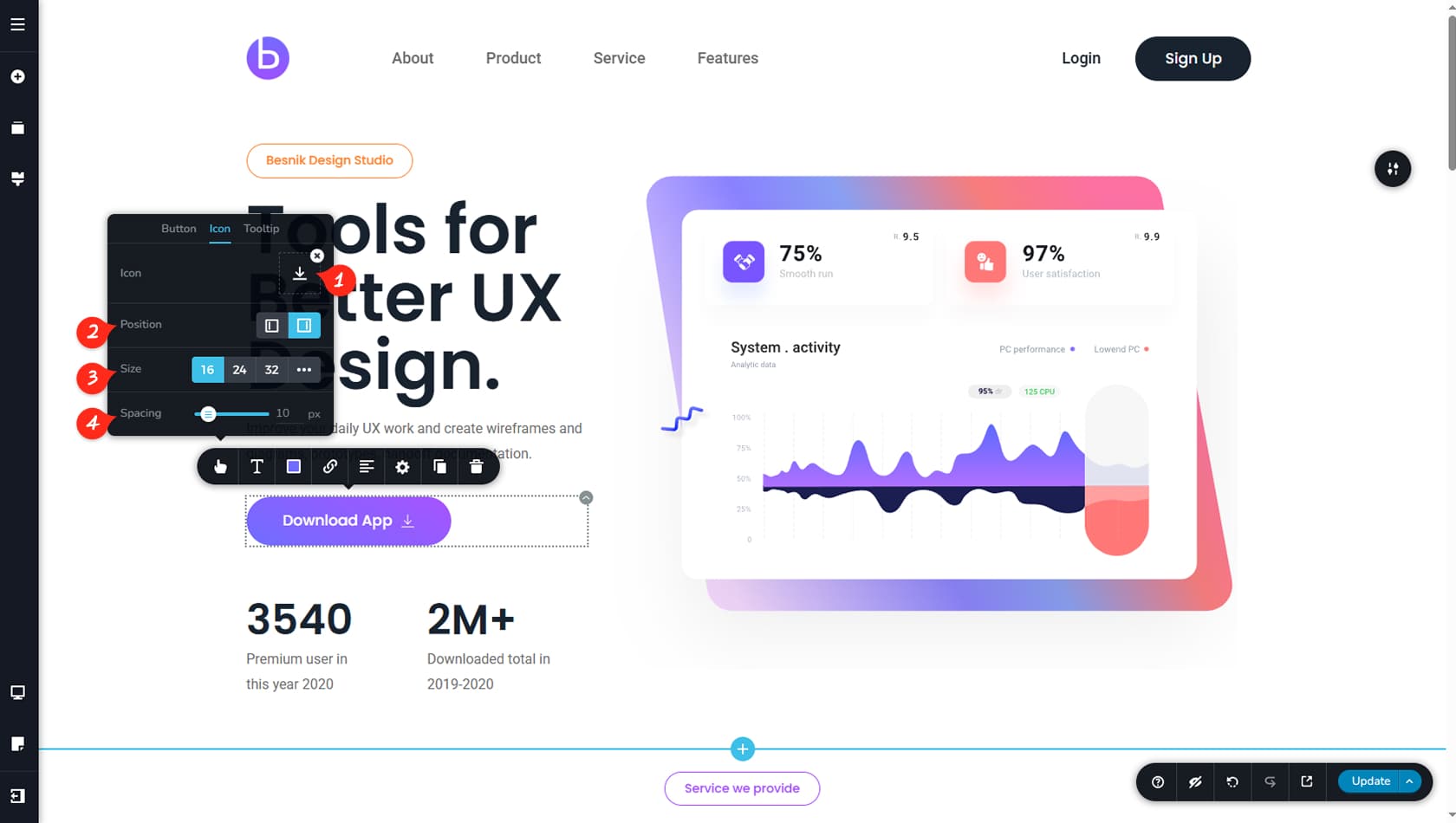
Choose Icon
You can add an icon to your button here. More details about using icons can be found in the This option controls the typography and font settings for the button text. For more details, refer to the Icon article.
Icon Position
You can choose whether the icon appears to the left or to the right of the button text.
Icon Size
This setting controls the size of the icon, and the three dots allow you to define a fixed value.
Icon Spacing
This setting adjusts the spacing between the icon and the button text.