Text
A customizable text element is essential for structuring content, communicating information clearly, and guiding users through a website’s layout. It allows you to create headings, descriptions, and rich text sections that establish hierarchy, improve readability, and support your overall design. Flexible text customization ensures consistency in typography, spacing, and styling across the project, while giving you the freedom to adapt content for different sections, audiences, and devices without disrupting the visual flow of the page.
To add a Text Widget, simply navigate to the Widgets Panel and drag and drop the Text Widget anywhere in your editor.
Editing the Text Widget
Edit a Text
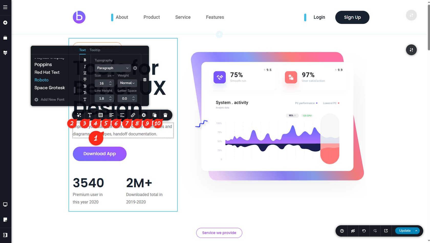
To edit your text content, click the placeholder text and replace it with your own. A toolbar will appear above the widget, providing a wide range of customization options.
AI Help
This option allows you to request assistance from the integrated AI, which can help translate, extend, shorten, or simplify your text.
Typography Settings
This option lets you apply a Global Typography Style created previously or configure custom font settings, including font family, size, and weight. For more details about fonts and typography, refer to the Fonts article and the Global Styling article.
Color Options
This option allows you to adjust the text color, background color, shadow, opacity, or apply a mask.
Text Alignment
This option allows you to change the text alignment to Left, Center, Right, or Justified.
Text List
This option allows you to convert your text into a list.
Links
This option allows you to add a link to the text. You can also select a specific portion of the content and apply a link only to that section. For more information, see the Links article.
Settings Panel
From here, you can open the Settings Panel. More details are provided below.
Duplicate Text
From here, you can duplicate your Text.
Delete Text
From here, you can delete the Text widget.
Text Settings Panel
Settings Panel
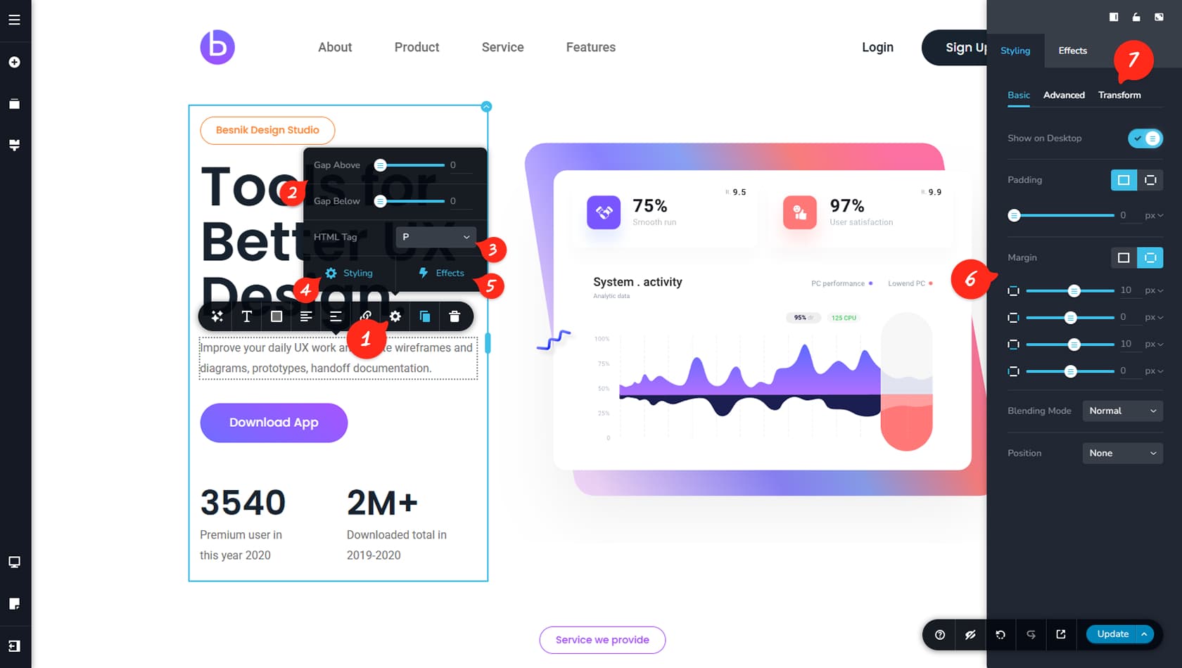
From here, you can open the Settings Panel to access additional options for the Text widget.
Gaps
This option allows you to add extra top and bottom spacing called “Gap,” which acts as separate padding for the widget and can be used as an alternative to the Spacer widget.
HTML Tag
From here, you can assign an HTML tag to your text.
Styling Panel Option
From here, you can open the Styling Panel on the right.
When referring to the Styling Panel of the widget, please see the Widgets Styling article for more details and an in-depth guide. Note that most widgets share similar styling options, with slight variations depending on the specific widget.
Animations
From here, you can configure animations for your text.
Styling Panel Customizations
The Styling Panel includes standard options such as paddings, margins, blending mode, position (None, Absolute, or Fixed), as well as Z-Index and Custom CSS.
Transform Text
A unique styling option allows you to transform the text by skewing, rotating, or flipping it.