Contact Form & Integrations
The Contact Form widget helps you collect messages, inquiries, and other information directly from your visitors without requiring external tools. It gives you full control over form fields, layout, typography, and colors so the form matches your site’s design. With built-in integrations and SMTP support, you can automatically send email notifications, route submissions to the right inbox, and streamline communication with your audience in a reliable and organized way.
Add The Form Widget
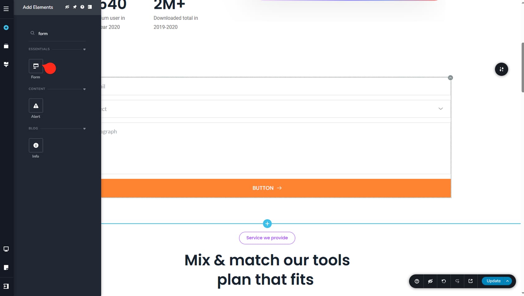
To begin editing your form, first add the Form widget to the builder. Go to the Add Elements button on the left side of the UI and search for Form.
Edit your Form Settings
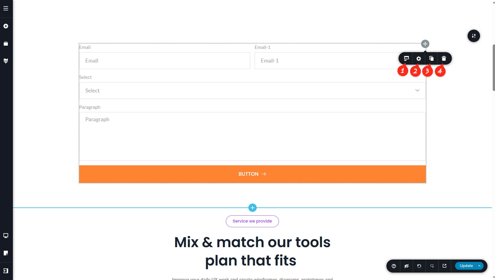
Set Multiform
You can access the widget settings from the grey icon in the top-right corner. The Form widget itself has limited options, but each form element includes its own toolbar with additional controls. The icon on the left lets you toggle the Multistep form, a newer form type that splits fields across multiple steps.
Styling Panel
You can also open the Styling panel from here to adjust the widget’s padding, margins, custom CSS, or animations.
Duplicate Form
From this toolbar, you can duplicate the form.
Delete Form
You can also delete the form from here.
Customizing Your Form Fields
Field Toolbar
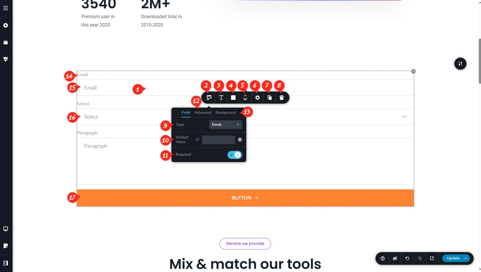
There are many options available for customizing your fields and form structure. To access them, simply click on a field. This opens a dedicated toolbar that controls the selected form field.
Field Options
From the leftmost icon in the toolbar, you can manage several field options.
Field Typography
From here, you can control the typography of all field placeholders and inputs.
Field Colors
You can also set the colors for the field background, text, borders, and shadows.
Reorder Fields
Use the small arrow icons to swap field positions.
Field Width
You can adjust spacing, width, and styling for your fields. More details about this are covered below in this article.
Duplicate Field
From this toolbar, you can duplicate the field.
Delete Field
You can also delete the field from here.
Field Type
Under Field Type, you can choose what type of field this is. Available options include: Text, Email, Number, Paragraph, Select, Radio, Checkbox, User Agreement, Date, URL, Time, FileUpload, Hidden, Tel, Password, and Calculated. Each type has different settings depending on the kind of input it accepts. For example, a Text field accepts general input, while a Date field opens a calendar for the user. Explore the field types to learn what each one can do.
Dynamic Field Value
You can also set a dynamic default value for your field. Click the dynamic icon next to the option and select your Asset Type and field to pull the value from.
Required
From here, you can toggle the Required option. When enabled, users must complete the field before submitting the form.
Labels & Placeholders
You can toggle Labels or Placeholders on or off.
Field Size
You can set the field size to Small, Medium, or Large.
Edit Label
To edit the label, click directly on it and type your new text. A label toolbar will appear, allowing you to adjust label spacing, typography, color, and alignment.
Edit Placeholder
To edit the placeholder, click it and type the text you want to display.
Edit Select Field
For fields like Select, a dropdown editor will appear, allowing you to modify each option just like editing a Text widget.
Submit Button
Finally, you can edit the submit button the same way you would edit any other Button widget.
Field Spacing
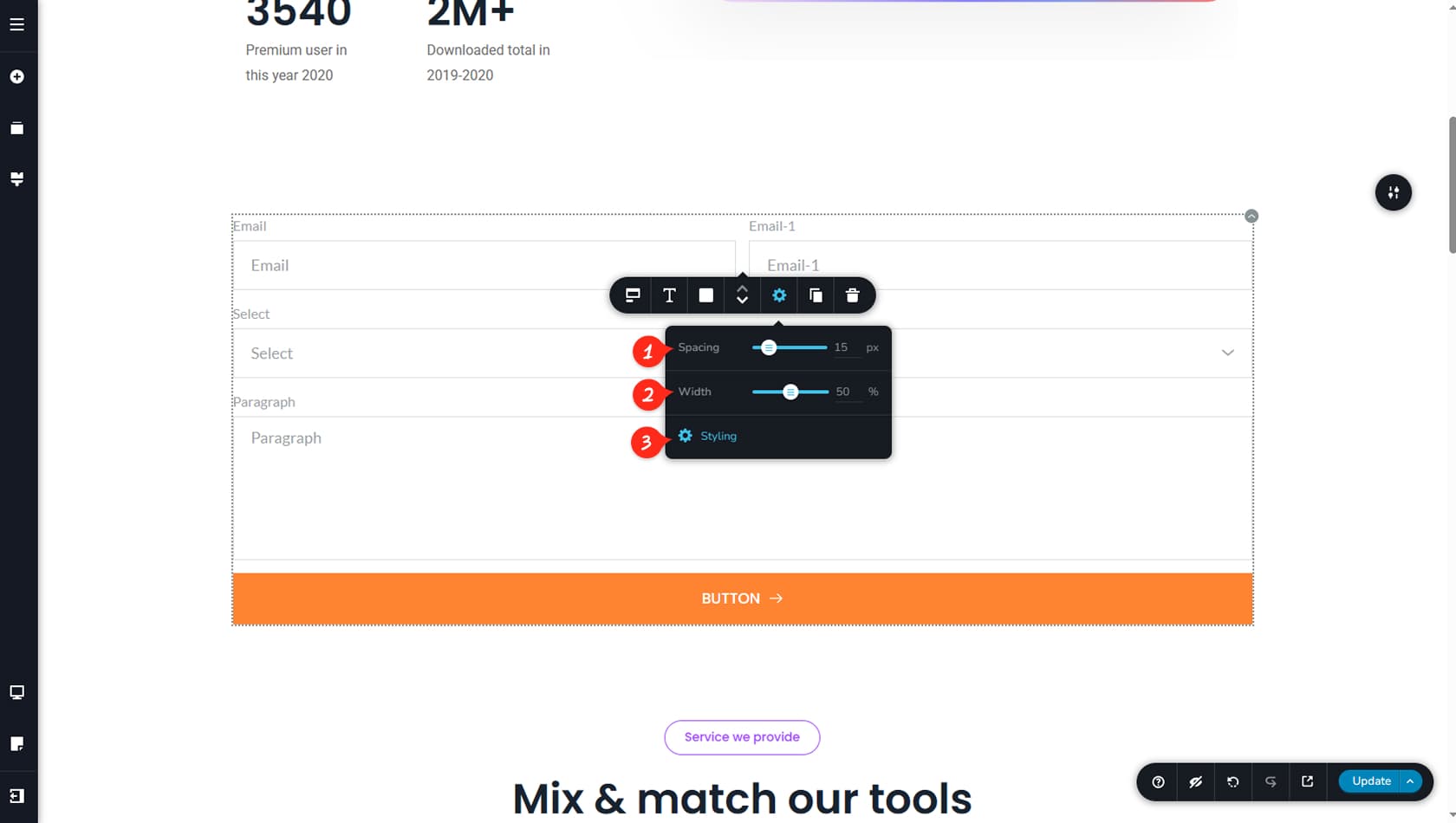
From here, you can adjust the spacing between fields.
Field Width & Side by Side Settings
From here, you can set the field width using percentages.
If you have two or more fields whose combined width is less than 100%, they will automatically align next to each other, similar to columns.
Field Custom CSS
You can add custom CSS to your field by clicking the Styling button here.
Multistep Form
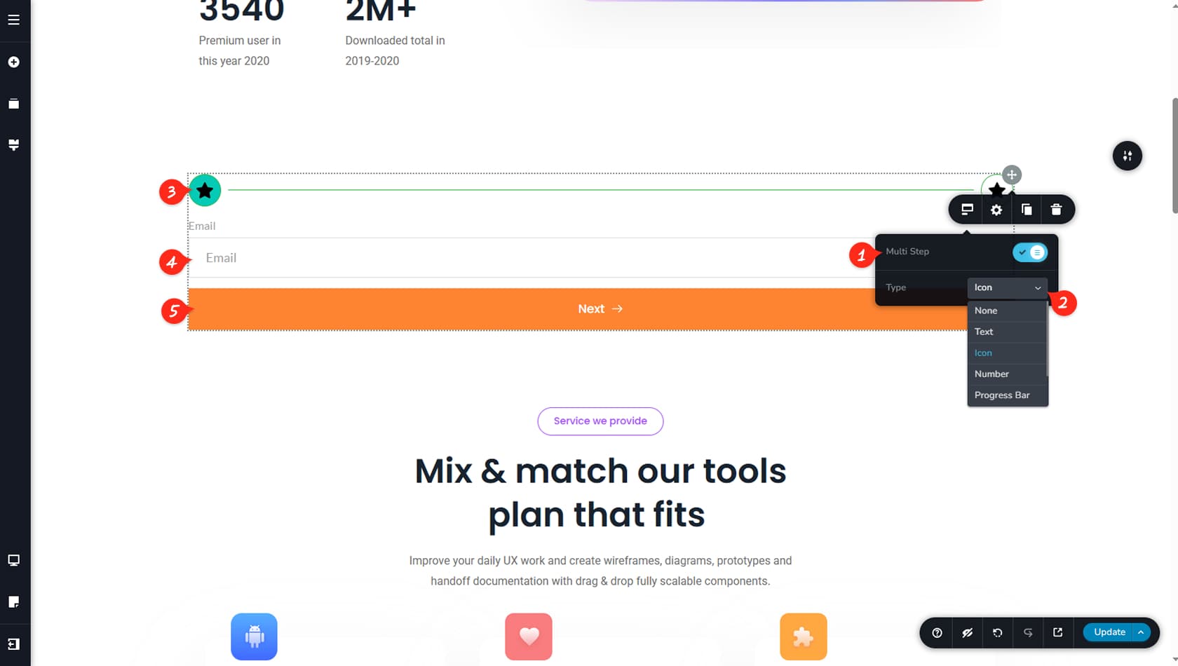
Multistep Toggle
You can enable Multistep from here.
Multistep Icon Type
From here, you can choose the multistep type: text, icons, icons & text, numbers & text, numbers, or a progress bar. Each option includes its own settings similar to those found in the respective widgets.
Customize Steps
From here, you can customize the multistep steps. By duplicating a step, you can add new steps to your multistep form.
Fields Customization
From here, you can edit the fields within your multistep form. These work exactly the same as in a standard form.
Multistep Button
From here, you can customize the form button used to switch between steps.
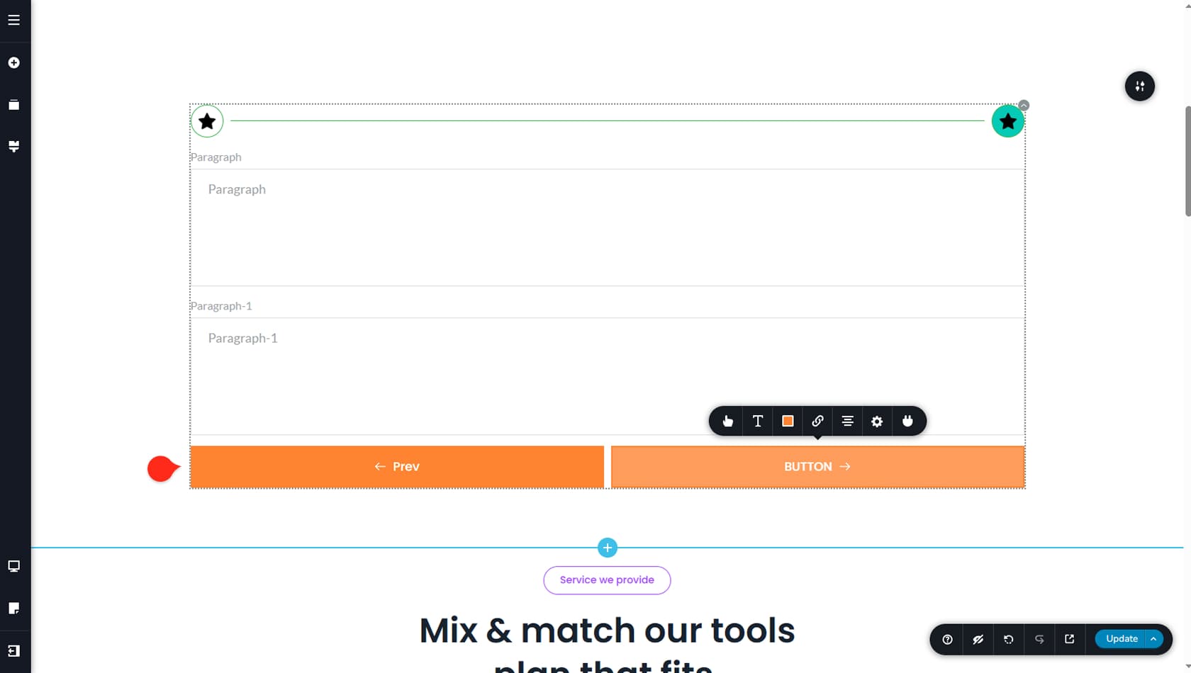
On the last page of the Multistep form, you will see two buttons instead of one. The first button is used for navigation, like the previous steps, while the second button is the one that submits the information through your integration.
Form Integration
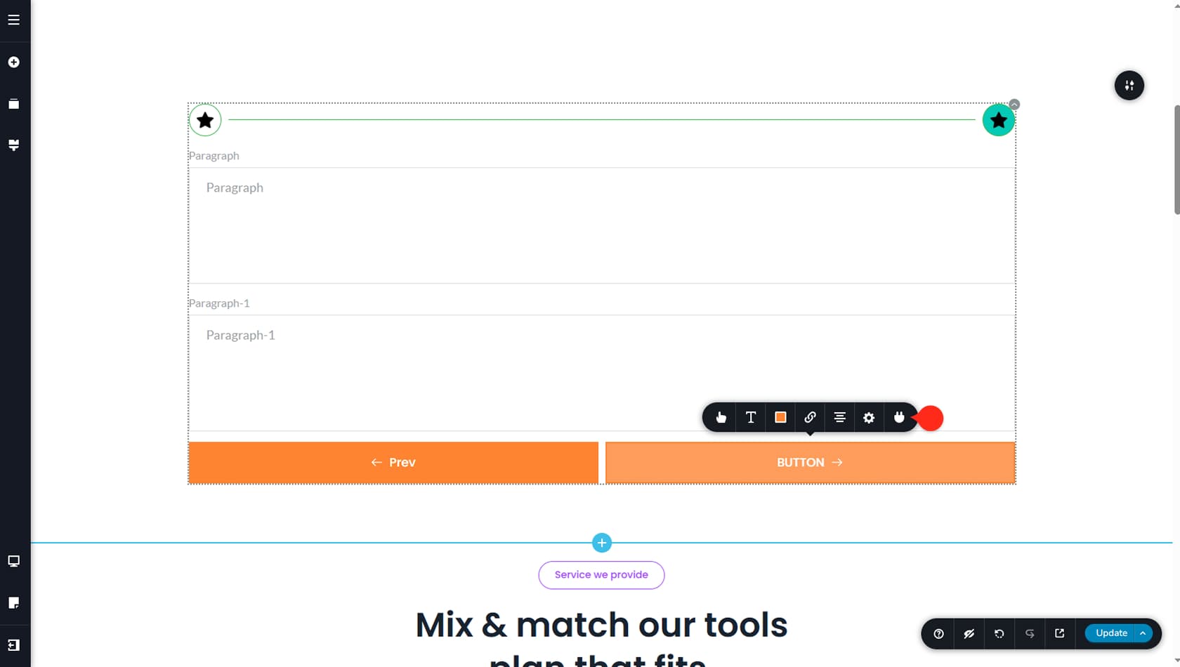
To integrate the form using the available options, click the rightmost icon in the toolbar. This will open the integration settings.
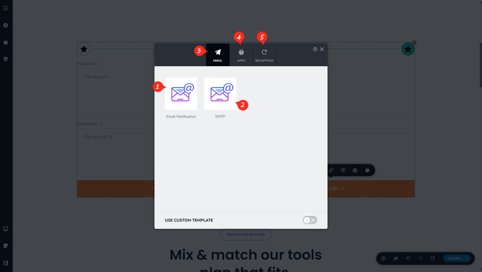
Email Notification
From here, you can configure Email Notification for your form.
Once an email is set up, you can disconnect it using the small Delete button that appears in the top-right corner of the email cards.
SMTP
From here you can set up SMTP for your form.
Email Notification and SMTP work together but serve different roles. Email Notification controls what happens after a form is submitted by sending the collected information to your chosen email address. SMTP handles how that message is delivered. While Email Notification triggers the email, SMTP ensures it is properly authenticated and reliably reaches the inbox instead of being blocked or marked as spam.
From here, you can choose to send form information via Email, App Integration, or set up reCAPTCHA.
Apps
Here you’ll find the App Integration options.
ReCaptcha
Here you can configure reCAPTCHA for your form.
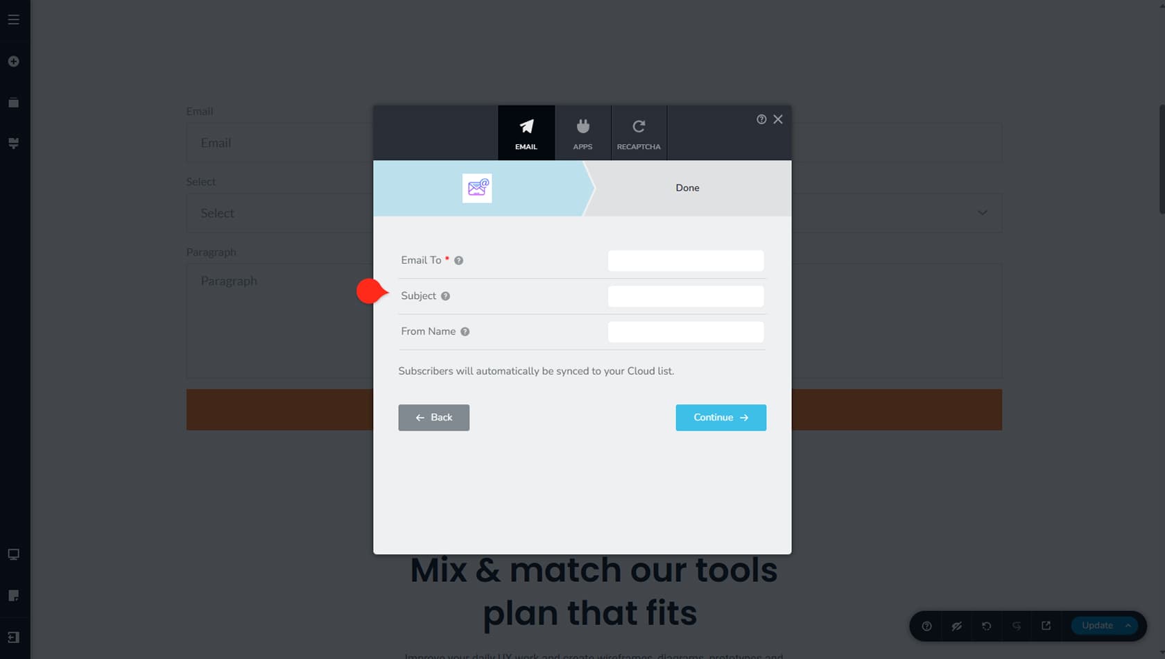
Email Notification is straightforward: enter the email address that should receive the form data, along with a subject and sender name. When finished, click Continue to complete the setup.
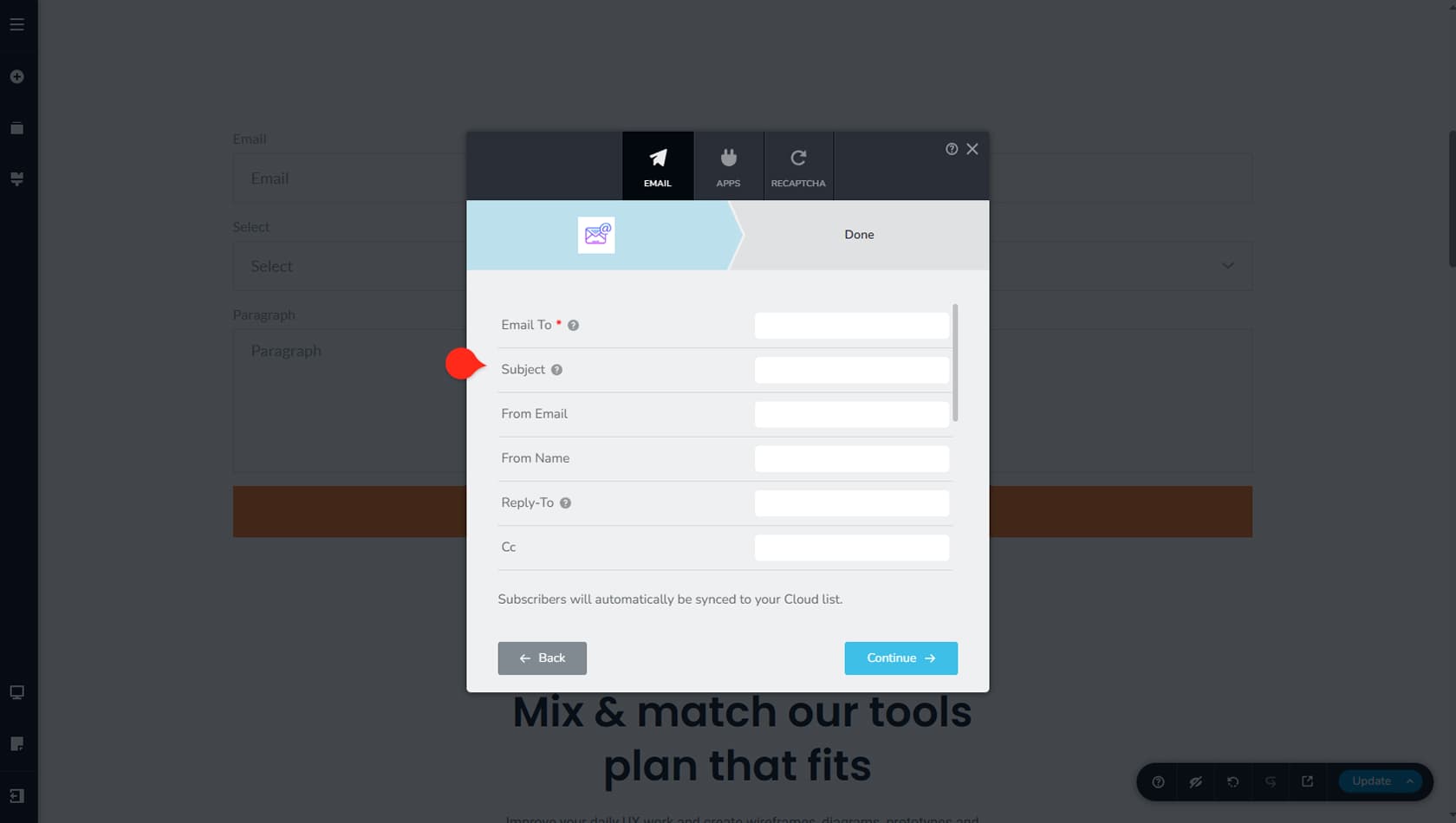
SMTP includes more fields and configuration options. In addition to Email To and Subject, you can set a From Email, From Name, Reply To, CC, BCC, and Meta Data. You’ll also need to provide the Host (required), Port (required), enable the Authentication toggle, and enter the Username (required) and Password (required), as well as choose the encryption type between SSL and TLS.
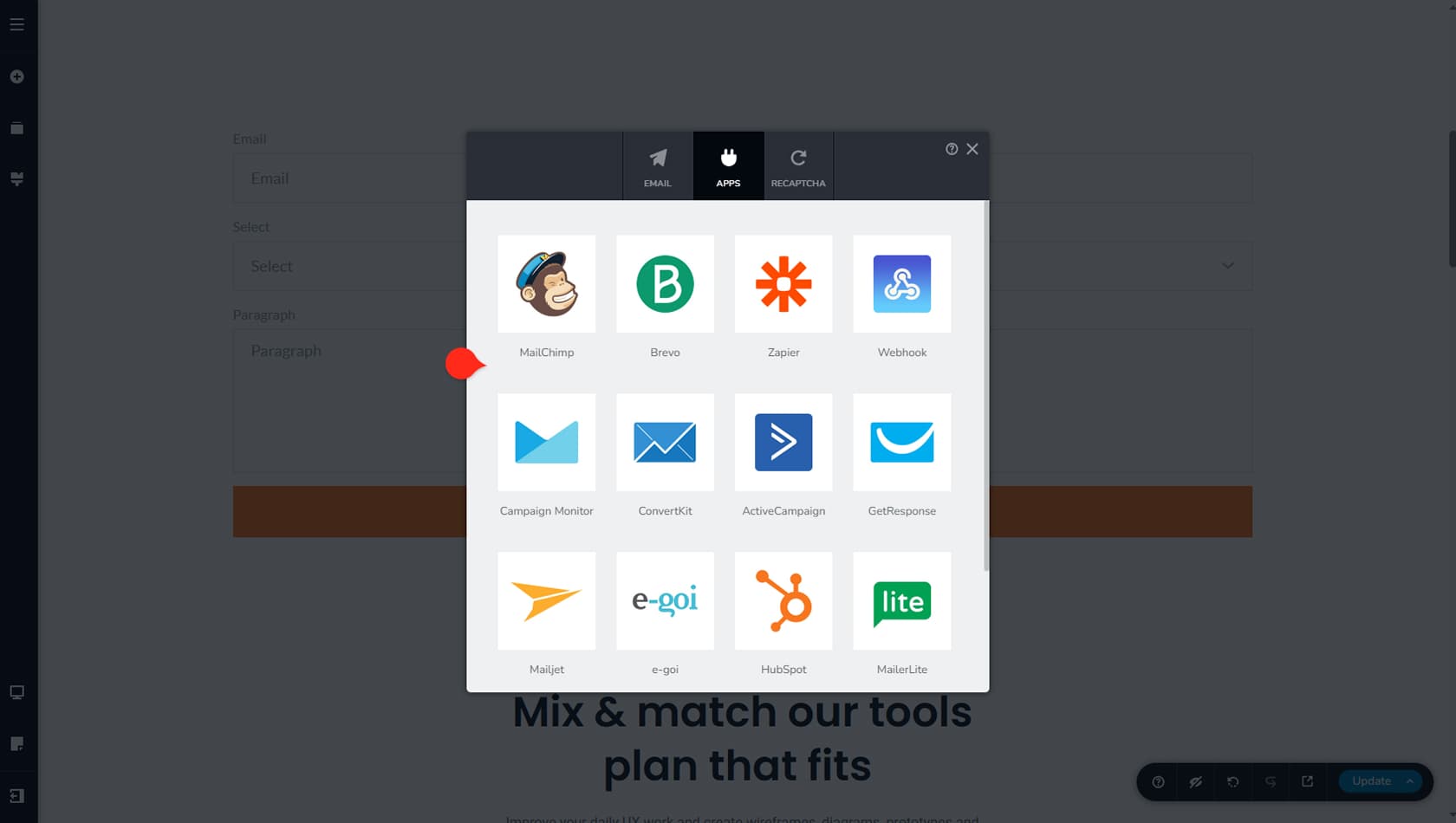
In the Apps panel, you can choose which service to integrate your form with. Available options include MailChimp, Brevo, Zapier, Webhooks, CampaignMonitor, ConvertKit, ActiveCampaign, GetResponse, Mailjet, e-goi, HubSpot, MailerLite, Drip, and Constant Contact. Each integration has its own setup requirements, such as API keys or account details for the selected app.
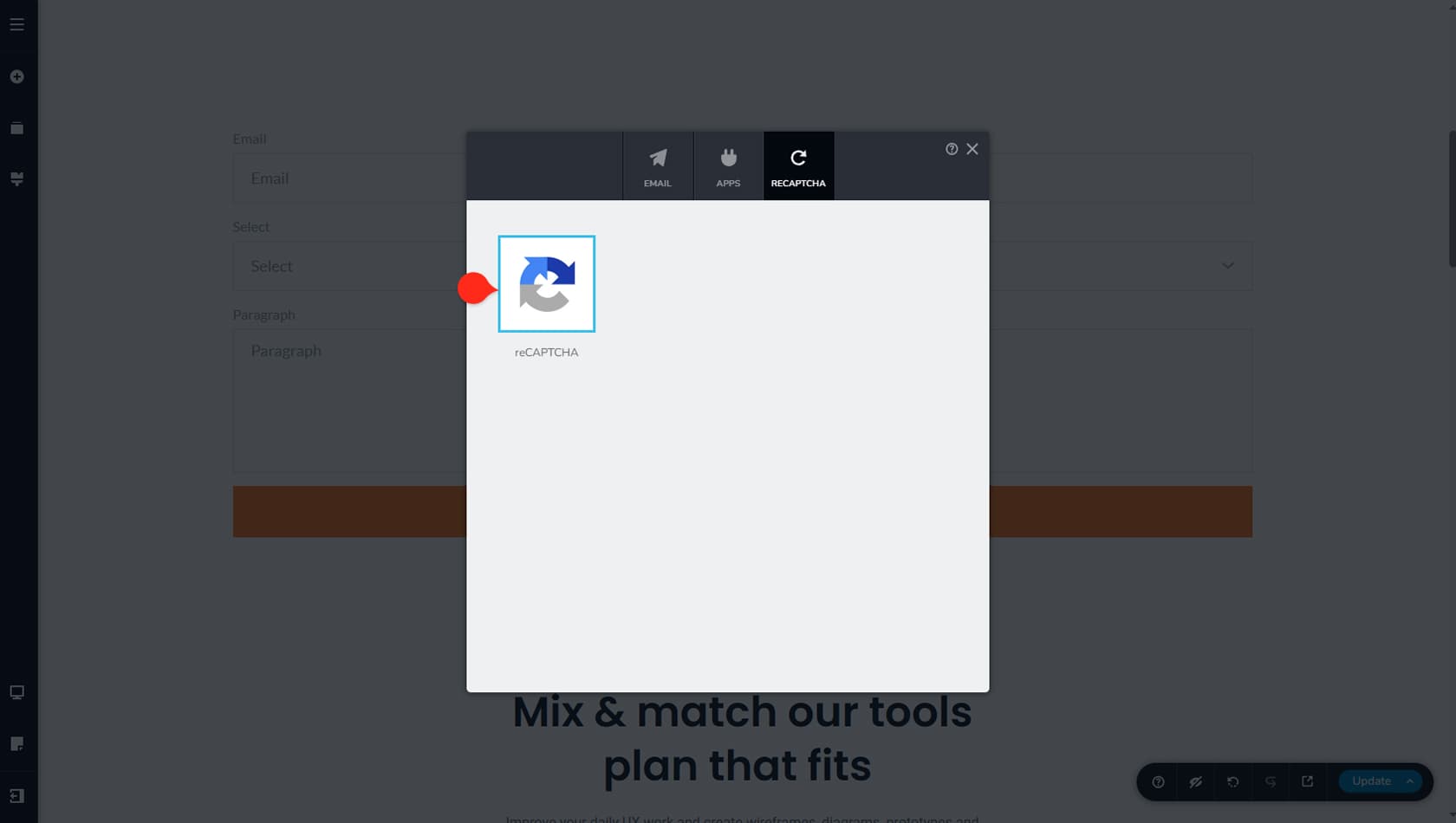
Finally, you can set up reCAPTCHA for your form to help prevent spam and bot submissions. To enable it, you’ll first need a Site Key and Secret Key from Google reCAPTCHA.