Popup Builder
The Popup Builder lets you create attention-grabbing overlays that can be triggered from links or other interactions, making it easy to highlight important messages, promotions, forms, or announcements without redirecting visitors away from the page. Used thoughtfully, popups can boost engagement, guide user actions, and surface key information exactly when it matters most.
How to Import or Create a Popup
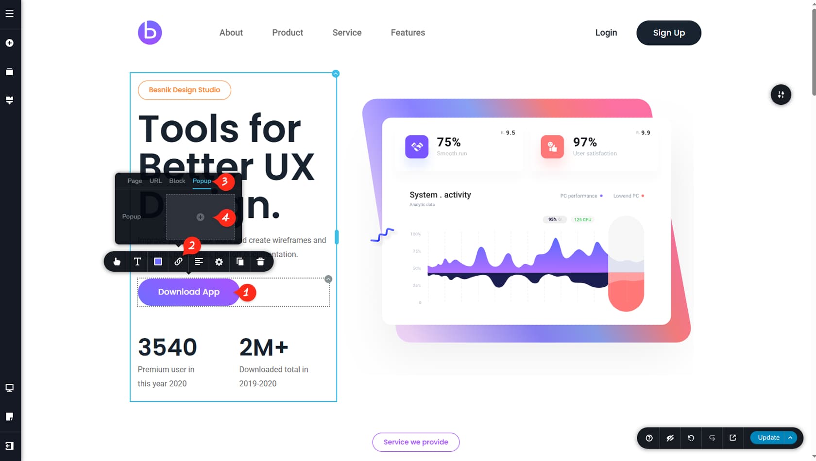
First, note that a popup can be connected to many different widgets. For this example, we’ll use a button.
Use a Widget
Drag and drop the widget you want to link to a popup, then click it to open the toolbar.
Link
Next, navigate to the Link icon. Any widget that includes this icon can be connected to a popup.
Popup
In the link options, select Popup.
Create New
You’ll now see an input field under the Popup tab—click it to create or import your popup.
Popups List
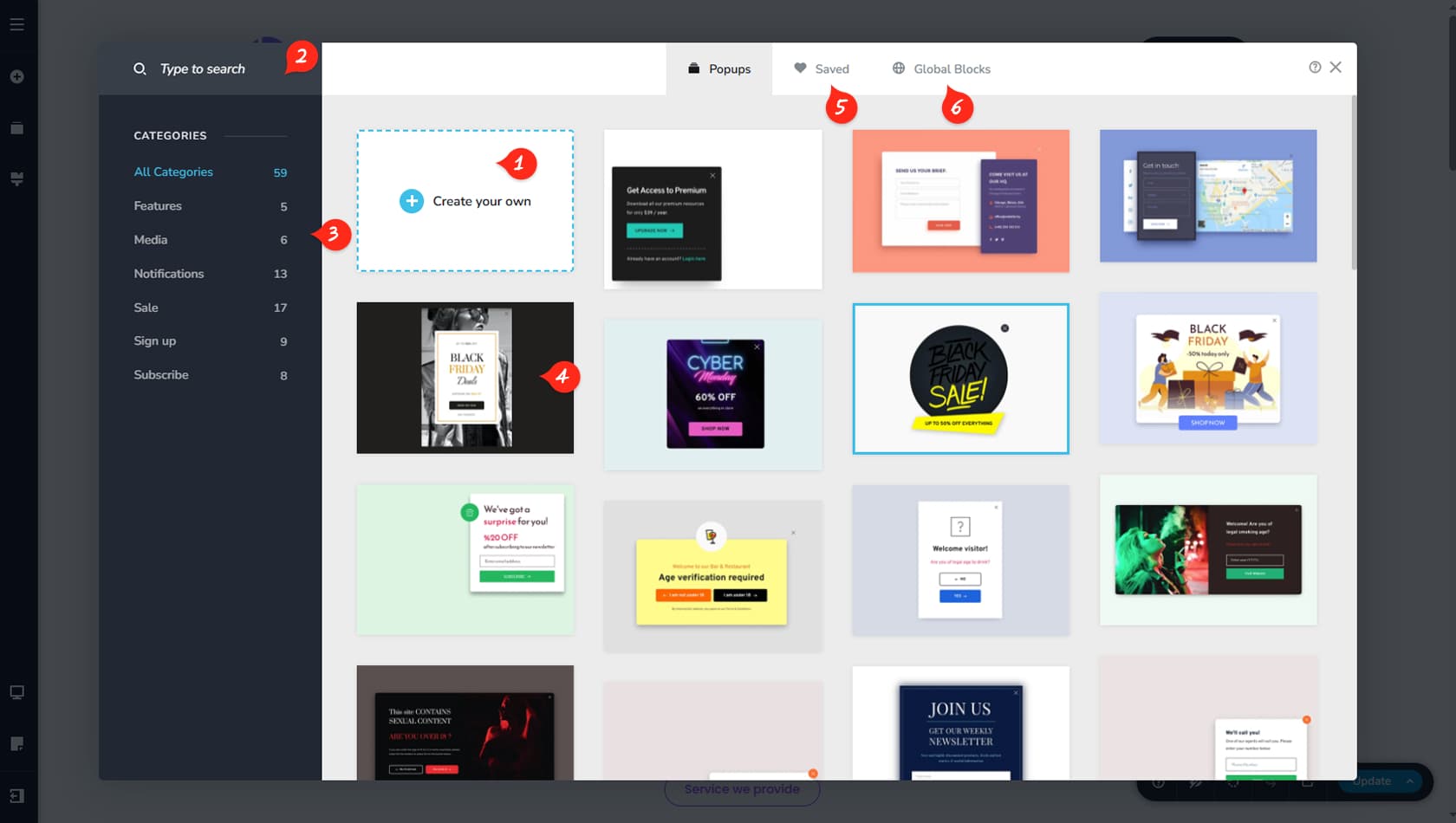
Once you open the Popup panel, you’ll notice many similarities to the Blocks panel. From here, you can immediately begin creating your own popup.
Search Popup
You can also search for popups that match your keywords using the panel on the left.
Popup Categories
You’ll notice multiple categories of premade popups available for import.
Import Premade Popup
To import a premade popup, simply click the one you want.
Saved Popups
Here you can also view your saved popups—similar to Saved Blocks, but dedicated to your Saved Popups list.
Global Popups
You’ll also find your Global Popups here. More details are available in the “Global Popups & Triggers” article.
Popup Options
Popup Toolbar
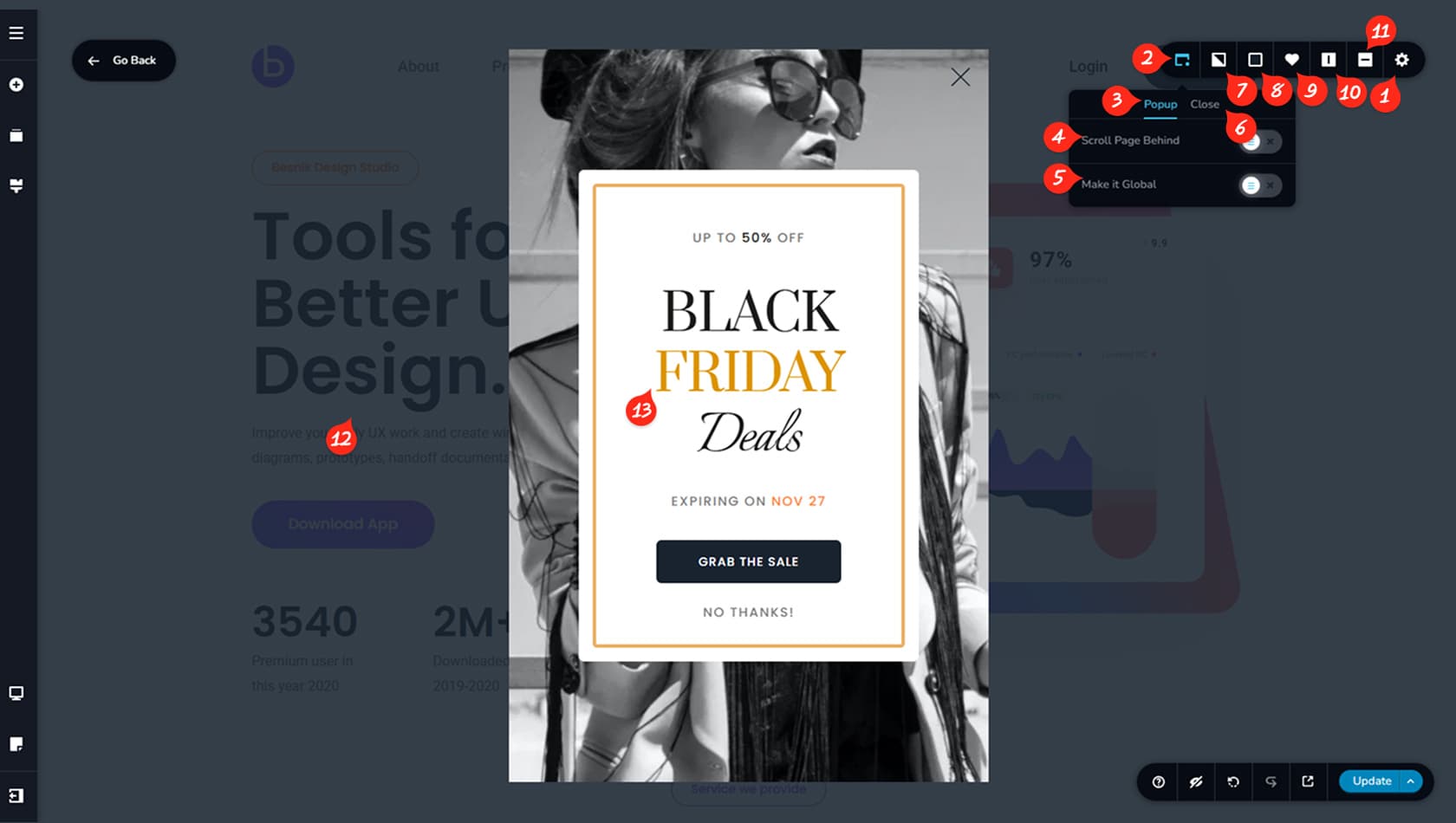
Once you enter the popup interface, you can begin adjusting its settings by clicking the toolbar icon in the top-right corner.
Popup Options
Use the left-most toolbar icon to open the Popup panel.
Popup Tab
Select the Popup tab to reveal the available options below.
Scroll in Background
First, you can allow the page to keep scrolling in the background.
Make it Global
Next, you can convert the popup into a Global Popup.
Close Options
In the Close tab, you’ll find several ways to control how the popup is dismissed, including toggling close on background click and enabling a close icon button.
Popup Background Image
From here, you can also set a background image for your popup block.
This controls the popup’s outer background, not the background of the popup’s content area.
Popup Background Color
Here you can set the popup’s background color and adjust its transparency. If a background image is applied, the color will act as an overlay.
Save Popup
From here, you can save the popup just like any other block.
Horizontal Alignment
This option lets you align the popup content area horizontally to the left, center, or right of the screen.
Vertical Alignment
Here you can vertically align the popup content area to the top, center, or bottom of the screen.
Popup Background Area
This represents the popup background area, which appears over your website. If the background is transparent, the page behind it will remain visible.
Popup Content Area
This is the popup content area. It behaves like any standard builder area, allowing you to drag and drop widgets inside and customize them as needed.
Content Area Size
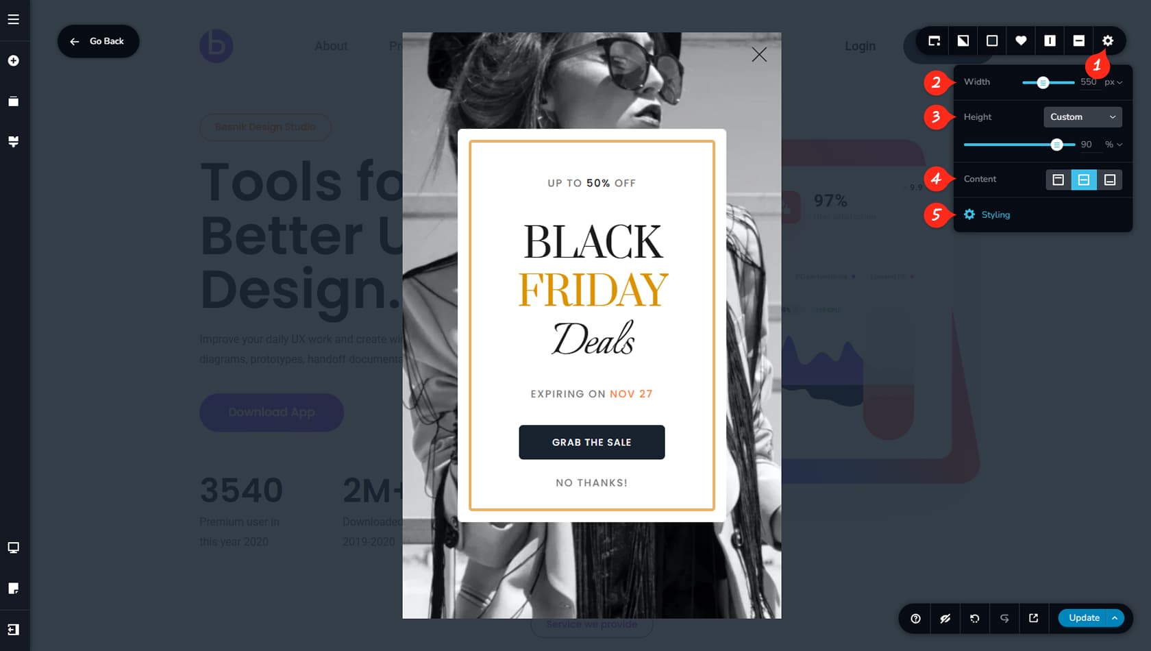
From the wheel icon on the right, you’ll find dedicated size controls for the content area.
Content Area Width
You can set the content area’s width using either pixels or percentages.
Content Area Height
You can define the height in pixels or percentages, or switch it to custom, auto, or full-height.
Content Vertical Alignment
This option lets you vertically align the widgets inside the content area to the top, center, or bottom.
Styling Panel
From here, you can open the Styling panel and apply Custom CSS to your popup.
Content Area Options
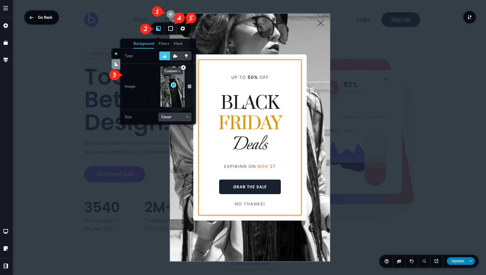
Content Area Toolbar
From the grey icon in the top-left of the content area, you can open the toolbar for additional content settings.
Content Area Background Image
From here, you can access the background image panel.
Select Image
You can select a background image from your Media Library and set it to Cover, Contain, or Auto, just like in the Image widget.
Content Area Colors
You can also define the content area’s background color, border, shadow, and hover color options here.
Content Area Styling & Effects
From this option, you can open the Styling and Effects panels to adjust padding, margins, animations, and more.
Close Icon Options
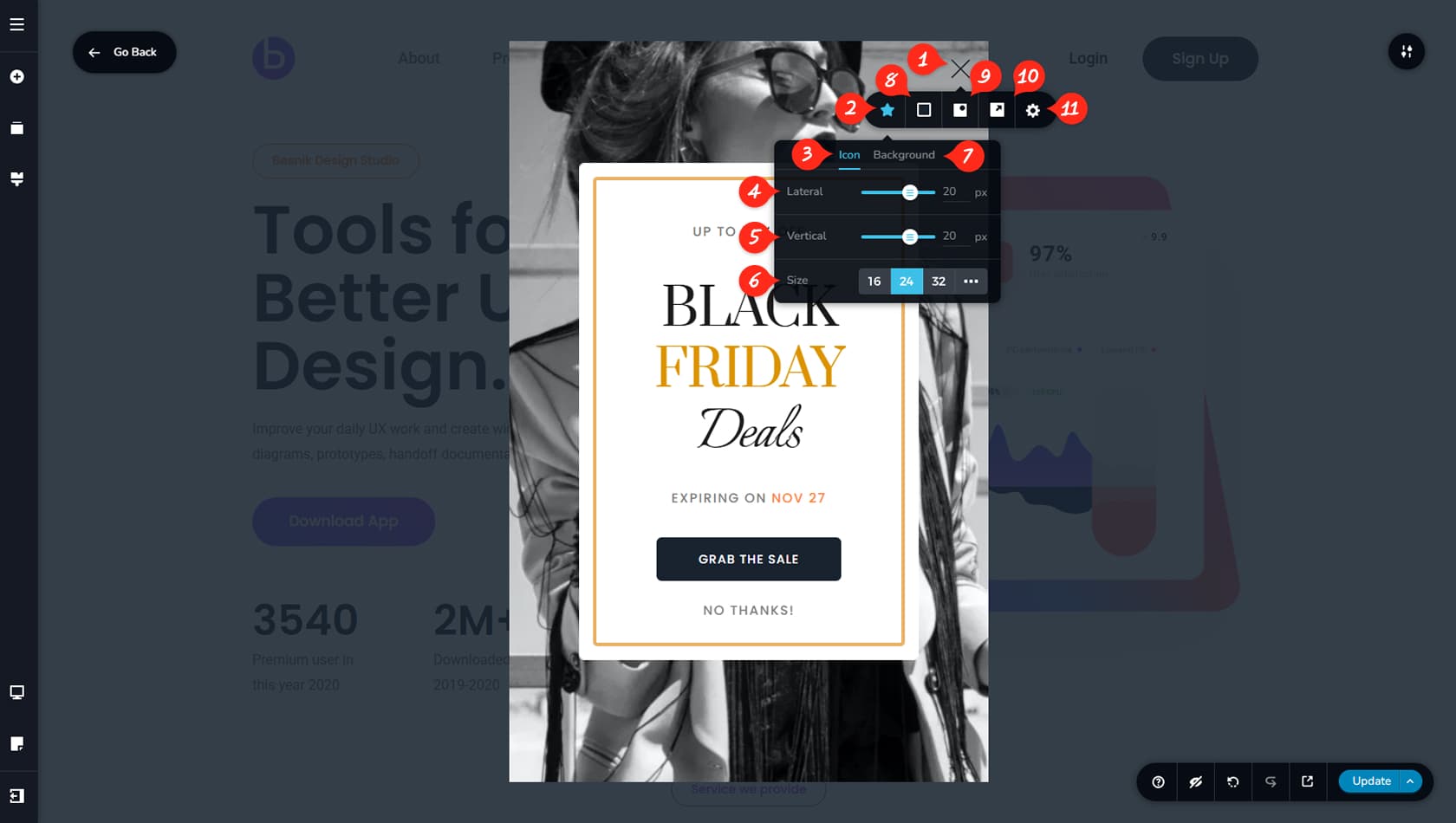
Close Icon Toolbar
The close icon includes its own set of controls. To access them, simply click the icon.
Icon
From here, you can open the icon panel.
Icon Tab
Within the Icon tab, you’ll find multiple options that control its size and position.
Lateral Distance
You can adjust the icon’s distance from the lateral edge of the content area.
Vertical Distance
You can adjust the icon’s distance from the vertical edge of the content area.
Icon Size
You can modify the size of the icon.
Icon Background
From here, you can apply a background to the icon and adjust its background size and corner radius.
Icon Colors
From here, you can change the icon’s colors.
Outside / Inside
From here, you can choose whether the close icon appears inside or outside the content area.
Icon Corner Position
From here, you can select the corner where the close icon will be placed.
Custom CSS
From here, you can add custom CSS to the close icon.