Builder Overview
Our builder is a visual, no-code website editor that lets you design and publish websites in real time, directly in your browser.
Everything you see on the screen is what your visitors will see on the live website. You can add pages, insert blocks and elements (also called widgets), adjust styles, and manage content visually, without writing code or dealing with hosting, servers, or updates.
The builder is designed to be intuitive for beginners, while still powerful for advanced users who need more flexibility and control.
In this article, you’ll get a high-level understanding of how the builder is structured, how its main areas work together, and how to navigate the interface before you start building.
The Editor Interface
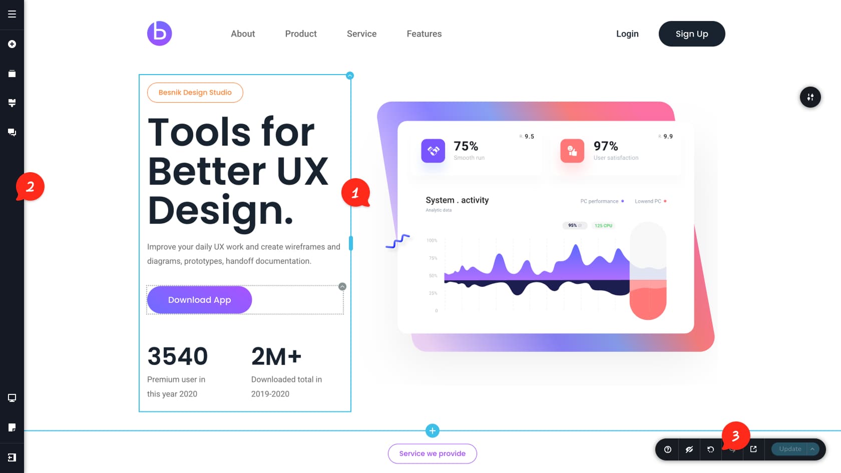
Editor Area
The content area, also called the editor, is where you build and design your website. It contains the page structure made up of blocks, also known as sections, columns, and rows, along with widgets, also called elements, such as text, buttons, and images.
Left Sidebar
The left sidebar gives you access to the main tools used to build and manage your website. From here, you can manage pages through the CMS, adjust global website settings, add widgets and elements to your pages, control global styling, switch between responsive views, and access other key features.
Update & Preview Toolbar
The Update and Preview toolbar is located in the bottom-right corner of the screen. It is primarily used to save changes made to your page, but it also includes options to publish updates, save the page, undo or redo actions, preview the page in a browser, and toggle hidden blocks on the page.
The Content Management System (CMS)
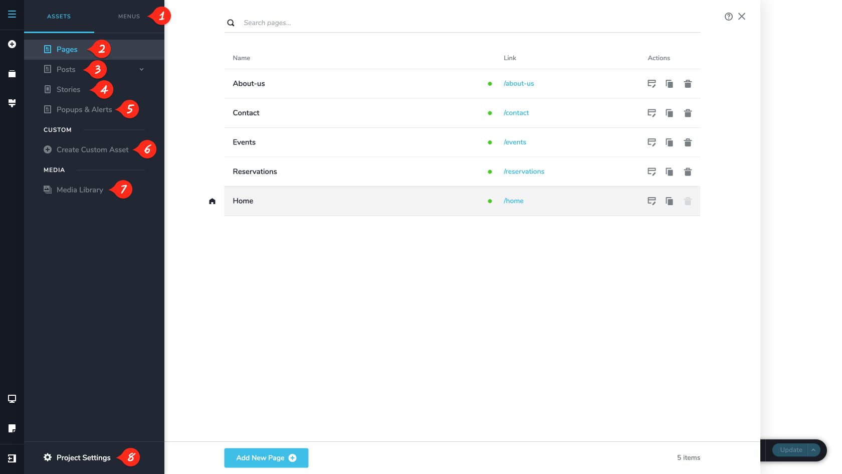
Menus
The menus panel allows users to create menus from the existing assets, search for a specific one to add it to the menu, rename them, set any page as homepage or set them to open in a new tab when accessed. See the Menus & Navigation article for more details.
Pages
The Pages tab shows all pages in your project and provides quick actions like edit, duplicate, and delete. You can also open page settings to change the page name, slug, and description, or set the page as the homepage. For step-by-step instructions, see “How to build a page”.
Posts
The Posts tab lists all posts and supports quick actions such as edit, duplicate, and delete. Each post also has its own settings, where you can update the title, slug, featured image, and excerpt. You can search posts and manage them by category using the Categories sub-tab, where categories can be added, duplicated, or removed.
Stories
Stories are short, multi-page sequences, similar to a mini newsletter or brochure. The Stories tab lists your stories and lets you quickly edit, duplicate, delete, and update each story’s name and slug. Learn more in the Web Stories article.
Popups & Alerts
The builder lets you create custom popups that can be triggered by links. The Popups & Alerts tab shows all your popups and allows quick editing, duplication, deletion, and updates to names and slugs. For details, see the Popup Builder article.
Custom Assets
Pages, posts, stories, and popups are all considered assets. Alongside these default asset types, you can create additional custom assets from this panel. Custom assets follow the same structure, so you can edit, duplicate, delete, and rename them from their dedicated tabs. Learn how to build them in “Advanced Custom Fields Assets”.
Media Library
The Media Library contains all uploaded files, including images, audio, video, and documents. You can also add new images from Stock Photos via the Unsplash provider. From here, you can upload, delete, browse, and view file details across the project.
Project Settings
Project Settings is the main area for configuring project-wide options. Here you can manage things like the favicon, project cloning, SEO settings, business settings, sharing settings, system pages such as maintenance mode, translation options using Google API keys, and custom CSS.
The Widgets/Elements Panel
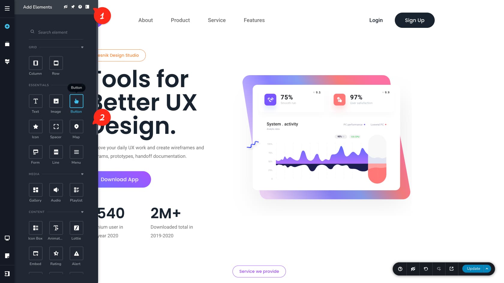
Panel Options
These icons let you manage the Widgets panel. You can hide widgets you do not use and pin your most-used widgets to the top for quick access. Finally, all panels can be aligned right or left.
The Widgets Panel
The Widgets panel includes all available widgets you can add to your page. Widgets are the building blocks of the editor, letting you create layouts and content one piece at a time. This documentation includes a dedicated article for each widget, covering what it does and how to customize it. To add a widget, drag and drop it into the editor area.
Reorder Blocks
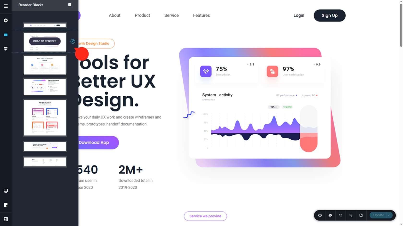
This panel lets you rearrange the blocks on your current page by dragging and dropping them into any order. You can also delete a block using the icon on its right. As you edit, the panel automatically generates block thumbnails, so you can easily identify the block you are moving or removing.
Global styling
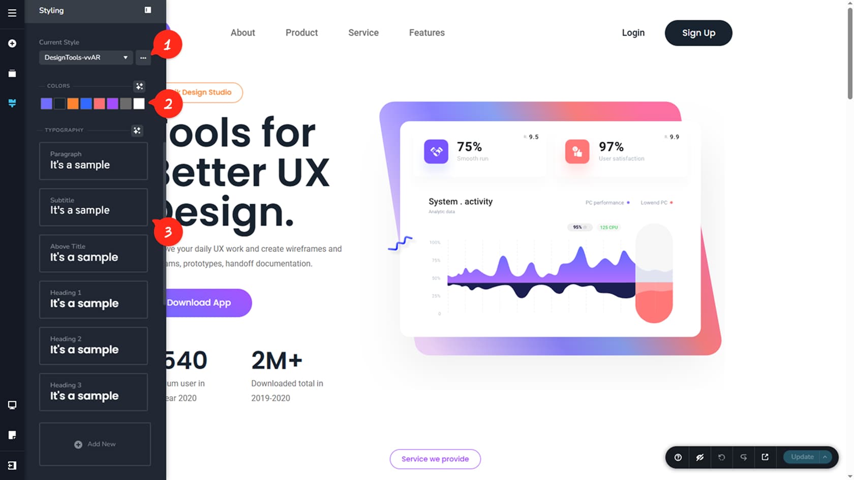
Global Styles are a key feature that lets you define a consistent set of colors and fonts for your entire project.
For a deeper dive, see the Global Styling article.
Style Presets
Style presets let you apply a complete look across your project with a single selection from the dropdown. You can switch presets, duplicate them, rename them, or delete them from the icon to the right of it.
Global Colors
The Global Colors tab lets you define eight project-wide colors. Whenever a widget includes color settings, you can choose one of these eight colors. If you update a global color later, every widget using it will update automatically.
Global Typography
The Global Typography panel lets you create consistent font styles across your project, including font family, size, weight, line height, and letter spacing, with separate settings for tablet and phone. By default, you can configure styles for paragraphs, subtitles, above titles, headings (H1 to H6), and buttons, and you can also add your own custom text styles. When you adjust a global style, all widgets using it update automatically.
Responsive View
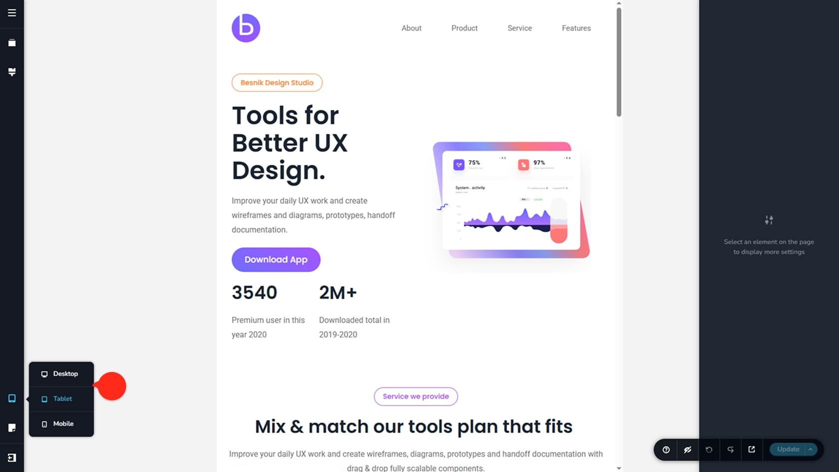
The Responsive panel lets you switch between three views: desktop, tablet, and phone. Any edits you make to widgets in tablet and mobile view apply only to the currently selected view, and global style typography is applied separately for each view as well. While in a different view from desktop, however, you can no longer add new widgets, only change the existing ones to fit the resolution.
Page Options
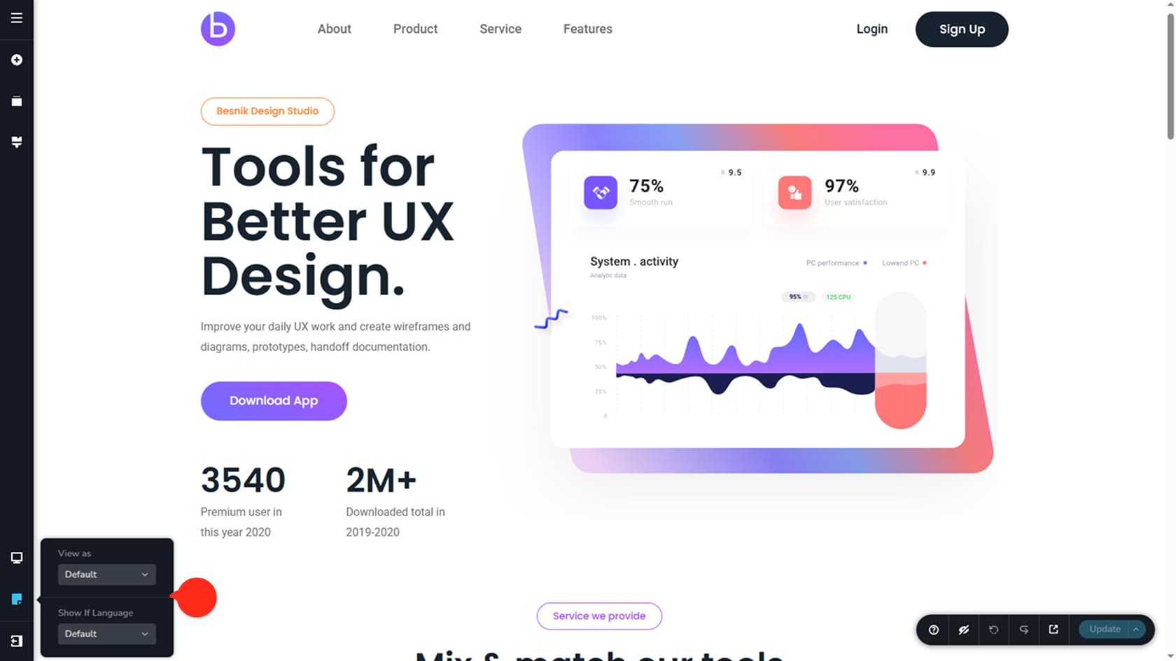
The Page Options panel helps you see the page as if you are not logged into your account in order to visualize it from a user’s perspective. You can also see the page from different languages if these are set up via the Translate tab in Project Settings.
More Options
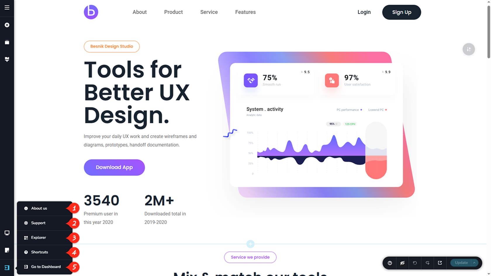
About Us
The About Us tab redirects you to the product details of the builder you are using.
Support
The Support tab redirects you to the product’s support page of the builder you are using.
Explorer
The Explorer tab generates a block sitemap for the page you’re currently editing. From this panel, you can navigate to any block you wish, reorder blocks, hide them or delete them.
Shortcuts
The Shortcuts tab opens up an image of the builder’s keyboard shortcuts for different builder quick actions.
Dashboard
The Dashboard option exits the current project and returns you to the dashboard of your current CMS.